Color for Interior Design and Decorating. Interiordezine.com
|
|
|
- Colin Rodgers
- 6 years ago
- Views:
Transcription
1 Color for Interior Design and Decorating Interiordezine.com The complete interior design and decorating color ecourse information with further reading from interiordezine.com Lee Brown Copy write Dezine Holdings Limited

2 Color for Interior Design and Decorating Here are the topics we will cover Looking at an interior with a designer's eye How we see color The Color Wheel Balance, Tone, Weight and Size Texture and Materials Common and Period Color Schemes Color Trends Make it Interesting Collating and Creating your Color Scheme Thank you and summary of ecourse
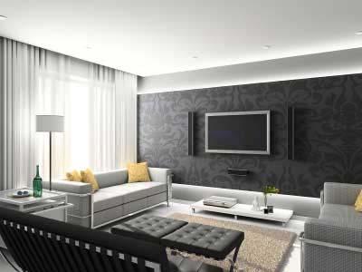
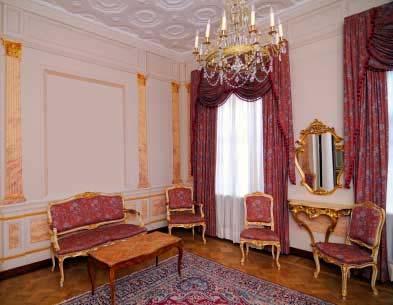
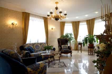
3 Looking at an Interior with a Designer's Eye In today's lesson we will learn about looking at an interior with a Designer's eye. I need you to do one thing for me before we start this lesson. You now have to take off your everyday hat and glasses and put on your designer's hat and glasses! You can buy them from any design store! (No just joking, it is only a figure of speech, but you will have to change the way you look at things from now on.) You need to start taking notice of what you see when you look into a space. No more glancing around and saying "Oh, this is nice - how lovely, what a beautiful vase". You need to look at the space, strip it back and see how it was created. Find out what catches you eye first (often called the focal point) - then where it is directed, think about how the space makes you feel and why? You need to start training your brain to critique, because along with the color theory you will learn in this course, critiquing others is the fastest way to learn and improve your skills. You don't just have to do this with physical interiors; you can use magazines, books and web site photos. A great way to practice this is to print off an interior photo - start drawing lines to the same color, see how they are placed - do they balance the room or are they all grouped together, it's amazing how subtle some things can be, but they are really important parts to the interior and give the color scheme that extra something. Try it out on the following photos to get you started, then go and look for more of your own. (If you have purchased your certificate, you could use your free ebook on interior decorating color ideas)
4

5 So for homework I am going to ask you to go and get yourself a scrapbook and a notebook. Take the notebook with you everywhere and start looking with a designer's eye. Don't take notes while you are in someone's house, but jot them down after you have left. Use your scrapbook to stick photos from magazines, print off pictures from web sites and write notes on them. You don't have to do it all today of course, this is an ongoing journey and your scrapbook and notebook will guide you to improving your color skills and will be a great resource for those tricky jobs that sometimes give you designers block! It may be able to spark some creativity. Further Reading Article - Color and Nature The Observation of Color in Nature to Improve our Design To unleash the creativity of a designer, simply start observing your surroundings. Take a stroll through the park, what do you see? Trees, grass, water, ducks, leaves, flowers. That is what everyone sees but look a little closer, look with a designer mind. Look at the way the bark covers the tree trunk, observe the myriad of colors within one small piece, retrace the form, feel the texture and see how it contrasts to the smoothness of the leaves.


6 Look how the sunlight can make the bark look different from when it is in the shade, observe the effect of shadow. You can use these observations to learn how color, light and texture work in the interior. Another example is a flower, look closely, there is often more that one color in a single flower, and it frequently goes by unnoticed. This simple use of juxtaposition means that the secondary color intensifies the main flower color. Another example - a pond of water, the shadows created by the clouds in the sky, the different depths of water, and once again the juxtaposition of other items in the pond combine to create a fantastic monochromatic scheme of blue/green. We need to slow down our hectic pace and deadlines that drive us to create without thinking and take the time to appreciate what is around us, this acts as our catalyst to design. How many times have you had a mental block and no matter which way you look, there seems no solution? Many! A simple stroll in the park can be all that is required to clear you head, get the blood moving around the body and gives you time to observe where design begins, at nature. How do you use this? Carry around a note book and jot down your observations, what colors look great together, how the different textures of similar items create a subtle design, how the light can highlight or obscure, how much of a different color do you need to make a statement, how a mass of wild flowers with hundreds of different colours can work together to form a subtle single entity, how the curved flowing lines of a Willow tree are softer than the brutal severe lines of a Pine tree. With these observations think how you would relate them back to your work, and how they can work in with people; after all we are the main reason for design, to create environments in which we can perform specific tasks comfortably. To conclude, like anything in life whether you are a scientist conducting and experiment, a doctor assessing a patient, a baker surveying his dough, you must observe to achieve your desired result. So start now! End of Article
7 Article - Color and Nature How nature plays a big part in choosing colors for our home interiors. When was the last time that you actually took a good look at your surroundings when you are out for a walk? They become all too familiar, you may perhaps note changes as the seasons alter, precious pink blossom in spring, bare brown naked branches in winter, crunching golden leaves in autumn, and luscious green grass in the summer, but apart from that we become blaze. It will change the way you decorate if you actually take some time to stop and look in detail about how nature combines color, the juxtaposition of a vibrant yellow stamen in a brilliant red tulip intensifying each others color, the subtle monochromatic color changes of brown in the bark of a tree, the constant debate over the color of water in the lake, is it blue or green? Colorful flowers float in a sea of green foliage, silver grey stones and pebbles on the river bed shimmer to look metallic in the sunlight and like charcoal when they are wet. I could go on and on. If you are looking for inspiration to create original and harmonious color schemes for interiors or exteriors for that matter, then it is as simple as taking a walk in the park. Take a camera and snap shots that catch you eye, zoom in on insects on flowers, ducks on the water, birds in the tree, flowers and shrubs. Then observe how the colors interact together to create a statement or just live together in harmony, providing a subtle backdrop for other more daring versions of nature. Green I define as a neutral color, you may say no, black white and grey are the neutrals, yes they are in a scientific way, but in nature green is most definitely the most versatile neutral color, it sits well with every color. When I say green, you are probably thinking grass green, that is one version, but green can be as deep and vibrant as a lime or as subtle as a silver green lichen. Try experimenting with come color swatches, use greens as you base and add accents and see what sort of combinations you can come up with. It is good fun and a way to try out new ideas. You can try doing this with brown too; it is surprising how versatile this color can also be.


8 This photograph shows green with multiple colors and also has a little bit of green foliage included! Brown is also a like a neutral color for adding any other hue. You have now had a good look around you at color; now try thinking about the combinations of texture and pattern and how they are affected when you put combinations together. Examine the different textures of similar items and see how they can create a subtle design, or how the light can highlight or obscure texture, how much of a different color do you need to make a statement, see how a mass of wild flowers with hundreds of different colors can work together to form a subtle
9 single entity, how the curved flowing lines of a Willow tree are softer than the brutal severe lines of a Pine tree. These are probably things that you have never taken the time to observe, but they are very relevant to how we create good design of new product, and create comfortable interiors. Then look even closer, look now with a designer mind. Observe the way the bark wraps the tree trunk, see the myriad of colors within one small piece, retrace the form, feel the texture and see how it contrasts to the smoothness of the leaves. Look how the sunlight can make the bark look different from when it is in the shade, compare it to the effect of shadow on the tree. Try this with other aspects of nature, keep notes and photographs and you will be surprised how often you draw down on this information as inspiration for choosing colors, textures and patterns to create harmonious schemes and ideas. Think of yourself as a scientist who has been conducting an experiment with color, texture and pattern; in order to make any progress you need to observe, then analyse your findings, then you will be able to relate them back to your work, and how they can work in with people; after all people are the main reason for design, to create environments in which we can perform specific tasks comfortably. For example a chair looks and feels more comfortable when soft curves are used, similar to those of the tulip chair, womb chair or egg chair. Examples of these chairs So next time you see a new product in a magazine, think back to your observations and see if you can see how it is related to nature. End of Article

10 How We See Color Color is a lot more complicated than you probably imagined. To learn about how we see color we need to learn about light and how it is composed. Go and read about Newton's Experiments with light and the visible spectrum now to get you started. Article - The Colors of Light and the Color Spectrum Through Isaac Newton s fascination with the behavior of sunlight passing through a prism, we can today understand the colors of light. He set up an experiment in 1666, using a hole in a window shade to admit a ray of daylight into a darkened room, where a glass prism was placed so that the ray would pass through it. On doing this, the ray of light was refracted (bent) on travelling through the prism and emerged as a spreading beam of multicolored light, the colors of the rainbow and in the same order, were seen on the white wall beyond. From these observations of light emerging from a prism Newton concluded that white sunlight was a mixture of different types of light, with each being of a single pure color and that each color was refracted (bent) at different degrees, violet by the most and red by the least. Newton's experiment showing a ray of light travelling through a prism, being refracted and emerging as a spreading beam of multi colored light.

11 The Electromagnetic Spectrum If you can t read this visit These colors he identified as Red, Orange, Yellow, Green, Blue, Indigo and Violet. Each hue is today thought to correspond to a portion of the range of wavelengths of radiant energy that can be distinguished by the human eye, what we can see is called the visible spectrum. This is only a tiny portion of the electromagnetic spectrum, which ranges from high energy x - rays to low energy radio waves. At either end of this visible spectrum are white and black. White we now know from Newton reflects and contains all the other colors within it, and black absorbs all the light. In continuing to experiment, he found that by introducing a converging lens after the prism, the lens would mix the colors and white light was achieved once more. Newton experimented further to block out some colors and recombining others, creating colored mixtures of light. These colors were quite different from any found in the naturally occurring spectrum. Newton introduced a converging lens after the prism which mixed the colors to achieve white light again. The major discovery was that the color of everything in Nature depends on the type of light it sends to the eye. This also depends on the individual colors of the light that the surface of the object reflects, absorbs or transmits and the nature of the light falling on the object.
12 The balance of spectral colors that produce specific hues is complex and can be stated in the form of tables of numbers or displayed as a graph, stating the proportions of light each spectral color reflects. Generalizing, if a surface looks strongly colored when viewed in white light it is reflecting certain colors and absorbing others. We view a red Ferrari on the street; it has absorbed all forms of light except the red, which it is reflecting back to us to tell us that it is in fact red. End of Article The major discovery from this was that the color of everything in Nature depends on the type of light it sends to the eye. This also depends on the individual colors of the light that the surface of the object reflects, absorbs or transmits and the nature of the light falling on the object. Now that you have read that article and understand how we see color we can talk about what interferes with that! Firstly artificial lighting changes the appearance of color. A halogen light is the closest to daylight and provides the best real view of color and a cool color fluorescent light will make the color appear washed out. So when choosing colors always make sure where possible that you can view them ïnsitu or where they will be in the finished scheme. To understand this further, watch this video Secondly Juxtaposition. This is a big word, which basically means putting things side by side. If a color is placed next to another it can either enhance the intensity of the color or reduce it. To have a look at how this works, go and visit Juxtaposition of colors. This is useful knowledge to have because it means we can start playing around with fun and bold colors but subdue them slightly by adding another color with them or make them look even better by combing two bold colors together to make them look more intense. Article - Using Juxtaposition of Colors in Interiors Juxtapose is defined in the dictionary as to put things side by side. Our interpretation of a color can be changed when certain colors are juxtaposed. A bright color will make the color that lies next to it appear more like its complementary color.


13 The effect of juxtaposing contrasting colors creates movement and vitality. Picture Left Primary and Secondary background colors juxtaposed with a gray feature. The colors seem true without altering their appearance. In a room situation small highlighting colors can be made more intense when surrounded by another color, likewise they can be made more subdued depending on the scheme being used. The diagrams show numerous examples using colors from the color wheel, primary, secondary and tertiary combinations. Have a look for yourself and see how they change depending on what color they are positioned next to. Picture above Primary background color juxtaposed with Secondary color feature. Picture Left Secondary Background color juxtaposed with a Primary color feature. Picture Left Primary and Secondary background color juxtaposed with Tertiary color feature. End of Article
.")
14 Technical Color Schemes This area of color is the nuts and bolts or the foundation to which all color schemes are based and created. Primary colors, red, yellow and blue are the colors that all other colors are derived from. Secondary colors are what you get when you combine two primary colors, green, orange and violet (purple). Tertiary colors, blue - green, blue - purple, red - violet, red - orange, yellow - orange, yellow - green, are achieved by combining a primary and an adjoining secondary color. Learn more about primary colors by video here. Article - Primary, Secondary and Tertiary Colors The scientist and naturalist Moses Harris created the first color wheel to classify red, blue and yellow as the three primary colors. This was in 1766, just a hundred years after Newton s discovery. Moses worked with pigments rather than lights following a discovery by a French painter that all hues could be reduced to mixtures of red, yellow and blue pigments. He developed and illustrated his theory. Moses Harris, the first color wheel to classify red, blue and yellow as the three primary colors.
 hues orange, purple, and green. The mixture of primitives and compounds provided two intermediate stages.")
15 In the centre, the three pigment primaries (primitives) red, yellow and blue from which all colors could theoretically be mixed. He then derived the secondary (compound) hues orange, purple, and green. The mixture of primitives and compounds provided two intermediate stages. This created 18 colors; these were then graded into shades (darker values, which he created by optically mixing more closely placed black lines) and tints (lighter values, normally created by adding white, but he showed wider spacing between the black lines). His classification theory was widely accepted by artists by the mid 19th Century. Johannes Itten s 12-point star, with white at the center. The colors are defined by tone and saturation. In the early 20th Century, the German painter, teacher and art theoretician Johannes Itten, expanded Harris theories and that of Phillip Otto Runge. Runge had attempted a three-dimensional model of color using a sphere. The pure hues were the equator; the central axis was a grey scale from black at the bottom to white at the top. The colors were graded from black to the pure hue to white in seven steps. Theoretically, the intermediate mixtures were inside the sphere. Itten adapted these theories and expanded them by opening up the sphere to form a 12-point star, showing white as the centre. This star included 12 colors (hues) 3 primary, 3 secondary and 6 tertiary. He defines these by tone (light or dark) and saturation (depth of color).


16 The Primary Colors red, yellow and blue. The primary colors red, yellow and blue cannot be created by mixing any other colors together. The Secondary Colors orange, green and violet. The secondary colors are the result of mixing two of the primary colors together creating orange, green and violet. The Tertiary Colors red-orange, yellow-orange, yellow-green, blue-green, blue-violet, red-violet. The six tertiary colors are derived from mixing one primary and one secondary color together. The color wheel is the combination shown in a circle. From this wheel we can create what I call a technical color scheme. I call them technical because they are the mechanical base to work from. I will expand on how, soon. See the color wheel video and read more information on the color wheel below.

17 color wheel complementary split complementary Article - The Color Wheel We have already learned in traditional color theory about primary, secondary and tertiary colors. We will now explore today s conventional 12-hue color wheel of pigments. The 12 Hue Color Wheel in segments, a tool to use when selecting color schemes. Color Terms (Left to right) Tint, Shade and Hue Hue is the name of a color, i.e. blue or green, it is the distinctive wavelength of a color.
18 Tint Color with white added, describes the range from a pure hue to white. Shade Color with black added, indicates the range from a pure hue to black. Tone Color with grey added, these are the range from a pure hue to grey. End of Article Article - How to Use the Color Wheel Color Schemes We use the color wheel as a tool to show the different color relationships and combinations that are possible. To follow are the well know combinations of color: Complementary Color Combination Complementary (contrasting) these are colors that are directly opposite. When they are mixed together, they will produce grey. Using this combination enhances each color creating a strong sense of visual movement when the colors are side by side. Split Complementary Color Combination Split Complementary select one color, then use one color either side of its complementary color. This often provides a more pleasing color scheme than a true complementary.
 Composed of two or more harmonious or pleasing colors closely related that lie next to each other on the color wheel.")
19 Triadic Color Combination Triad Three colors that are equally spaced from each other i.e. the points of a triangle. Tetrad Color Combination Tetrad a contrast of four or more colors. Analogous Color Combination Analogous (related) Composed of two or more harmonious or pleasing colors closely related that lie next to each other on the color wheel. This color scheme provides a pleasing effect on the eye. Dual Complementary Color Combination Dual Complementary Two colors side by side and their two complementary colors opposite them on the color wheel.
20 Monochromatic Color Combination Monochromatic (tonal) Using any shade, tint or tone of one color. It provides a peaceful and restrained color scheme. Achromatic A colorless scheme possessing no hue, using only black, white and grey. (A variation of this is possible, making a warm or cool achromatic by adding a hint of red yellow or blue.) Other Color Schemes Primary the simplest or most basic color schemes. The pure hues of red yellow and blue. They are often used for children s play equipment and surrounding environments. Neutral Hues that have been neutralized by adding their compliments. The addition of black and white expands the neutral palette. Clash Select one color, then use one color from either side of its complementary. This provides a clash color scheme that has an assertive aggressive effect. Remember that the color wheel is just a tool. It is a very useful tool and a good way to learn, but as with any artistic professional, experimentation and being innovative can be very rewarding. By understanding what you achieve with the color combinations from the color wheel, you can push the boundaries to create something quite original and daring. End of Article You will have noticed I have not mentioned black, white or grey yet. That is because technically they are not colors. We learned in our last lesson that all color comes from white light. Black white and grey are called neutrals. Back to the technical color schemes, as you saw in the article that there are numerous color schemes derived from the color wheel, but what isn't explained often enough is exactly how to use this information. If you look at how Munsell combined hue, value and chroma in the Munsell Color Notation System, he believed that his system was a good tool for
21 creating color balance and harmony, and could be used to select more exact color combinations. Article - The Munsell Color Notation System From experimentation with light we have learned that the three primary pigment colors cannot be made from mixing any other colors, and that by mixing the 3 primaries we create the secondaries and then mixing one primary with one adjoining secondary color we create the tertiary colors. The ability to mix all other colors from the three primaries is only possible with printer s ink and photography. The Munsell Color Notation System Therefore, in paint, by mixing, it is not possible to create all colors from any three primaries. The American Artist Albert Henry Munsell published a system in which he proposed a five pigment primary system, the principal hues using green, blue, purple, red and yellow. He wanted to create a rational way to describe color using an alphanumeric notation system rather than a haphazard color naming system. This is currently the most adopted way of communicating about color and forms the basis for measuring color in the world today. The Munsell Notation System can be described as the three attributes of color. Hue, Value and Chroma. Any color can be viewed and broken down/identified by these. The attributes are given symbols H, V & C and are written in the Munsell Notation form. H V/C i.e. 5R 6/8
22 Hue Hue is the color and the way that we can tell one apart from the other i.e. red from blue. Munsell created a five color principal system Red, Yellow, Green, Blue and Purple and a 5 color intermediate system. Yellow / Red, Green / Yellow, Blue / Green, Purple / Blue, Red / Purple. Using these hues he created a circle divided into 100 compass points, each primary and intermediate color was placed at 10 intervals, creating a hue each sector around the circle as shown on the diagram. Each color had a letter to identify it, R - Red, YR - Yellow Red, Y - Yellow, GY - Green Yellow etc. He then documented a numeric system from around the outside of the circle. (Zero is not used; it begins at 5, which is red). Munsell believed that his system was a good tool for creating color balance and harmony, and could be used to select more exact color combinations. Value The value defines the light or darkness of a color. It is the neutral axis thatt shows us the grey level of a color. In the Munsell System, the value scale ranges from 10 Pure White to 0 Pure Black. The colors between are greys, and all combined, they are called neutral colors and have no hue. The neutral value is notated with an N. This 3 dimensional arrangement is called the Munsell Color Space.

23 The scale, shown above, shows that 5N is middle grey, 0N Black, 10N White. The value of a hue in Munsell Notation is placed after the hue identification, for example 5BG 3/ Blue Green at the value level of 3. Chroma Chroma is the factor that shows the difference from a pure hue to a grey shade. This is the most difficult part of the notation system to grasp, as it does not have the same type of order as the previous two notations. High chroma colors are described as highly saturated and strong, low chroma colors are called weak or lack lustre. An exercise to clarify the theory is to start with a paint hue, for example red, and a grey paint of the same value. Mix them adding more red each time, put a stroke on a piece of paper after each addition, this creates a graduation of red colors that increase their intensity until they reach their full saturation at that level of the value. This graduation is shown on the next page, on the value axis with the chroma axis extending from it at a right angle
24 The Munsell Color Space The way to show this notation is after the value amount. I.e. 10YR 7/10 this shows Yellow Red hue with a value of 7 and a chroma of 10. This is shown in a 3-dimension form known as the Munsell Color Space. Munsell's original concept was based on a sphere or orb, but as each hue is worked through to full saturation, we see that the symmetrical theory does not work. The neutral colors are the vertical axis with black at the bottom graduating through to the greys and white at the top. The individual hues are then positioned around the neutral axis. The chroma scale increases outwards from the axis, and just to add to the complexity of chroma, chroma is not the same for every hue at every value. The full chroma for individual hues is achieved at different places. The reds, blues and purples are the stronger hues that have higher chroma values at full saturation at mid levels on the value scale, whilst the yellows and greens are weaker and average the fullest chroma saturation close to the neutral axis but at higher values. Therefore, the Munsell Color Space looks more like a tree than a sphere or orb. To conclude, the success of Munsell s Color Notation allows us to define thousands of colors in an alphanumeric language that can be internationally communicated. It is commonly available in books and standards, and a very useful tool to have. End of Article

25 The color wheel basically shows you the technical combinations, from there when you choose what type of color scheme you want to use; you can make the hues lighter or darker and start experimenting with how they look. If you have managed to understand how the Munsell Color Notation System, it is very difficult, you can play around with the chroma values, and think in three dimensions and experiment using different color scheme combinations. Start experimenting with color combinations
26 Balance, Tone, Weight and Size There are so many factors as you are starting to realize in creating a color scheme, that it almost drives you to throw your arms in the air and say "what else do I have to think about to choose a simple color scheme?" Well, there is more I'm afraid. Balance, Tone, Weight and Size are all factors that need to be considered. Don't worry, we have all struggled to remember these things - soon they will become second nature and you will be making fast and accurate color scheme choices before you know it! There are a few of us born with the wonderful skill of being able to work naturally with color, the rest of us have to work hard at it! So remember when the going gets tough, you are not alone, keep going, you will get there with hard work, determination and education. Color Tone Let's start with Tone. If you look at an interior with half closed eyes you will be able to see the different tones of color around the room. It is important that you have a variation of tones to give your interior color scheme interest and variety. Read more on tone in the article. Article - Color Tone The lightness and darkness of a color basically describes Tone. The tone is affected by two parts the value, the amount of black or white it contains and the intensity/saturation, the amount of color it contains. The combination of these produces tone. The ability to understand tone will be the difference between a dull and boring scheme and a great well-balanced pleasing scheme.

27 Picture Left This black and white photograph is very boring as the tone is very flat. Through half closed eyes we only see the gnomes beard and the rest is the background - a large gray mass. Picture Right Half close your eyes and look at the same photograph that has been digitally altered. You will now see the lattice fence in the background, a palm in the mid ground and the grass of the foreground. There are definite changes in tone to be seen. Tone can be used to alter proportions of a room like color. The deeper the tone of color the less light can be reflected from it and this causes the color to appear closer than it really is. The lighter the tone the more light reflection and the color will appear further away. When using a monochromatic scheme, it is essential to vary the tones of the color or the scheme will appear boring and uninteresting, as there is no sense of depth or balance. The best way to view tone is the same way as an artist, through half closed eyes. By doing this you can view the tonal range. Looking at black and white photographs is another way to learn. Half close your eyes and view the changes in tone more sharply. End of Article

28 Color Size The appearance of size of an object can change depending on the color it is. A yellow table appears larger than a blue table. Read more in the article about color size. Article - Psychology of Color - Color Size Colors affect the way we feel, they heighten and lower our senses, feelings and emotions. By gaining an insight into some basic principals of color psychology and learning how color affects us we can begin to use them in interior decoration to successfully create spaces that achieve the mood we want to create. The green block appears smaller than the yellow. The red block looks smaller than the white. Color Size Color changes the apparent size of objects. The colors that look heavy also look small. Using the colored blocks again, all of equal size; red will look the smallest and white the largest. End of Article

29 Color Weight A similar thing can be said of the appearance of weight, with two items of equal weight the darker colored item will appear heavier. Read more about color weight in this article. Article - Psychology of Color - Color Weight We know that colors effect our emotions. We feel stimulated by bright red and feel calm with soft blues. Therefore being able to understand some basic principals of color psychology can help us to learn how to express our emotions or to summon them. Color Weight It is interesting to look at color as having a weight. Red seems to appear the heaviest, followed by orange, blue and green (all of which have a similar weight), then yellow and finally white. Dark colored stacked blocks on top of lighter blocks look unstable as they appear heavier (left), the lighter colored blocks stacked on top of darker appear more stable (right). When looking at colored blocks piled on top of each other, if the heaviest color is on top they look unstable. Now if holding the blocks separately in your hands to compare the weight, your mind cannot register the difference in the colored blocks weight.


30 The red block appears heavier than the white, but while holding them we cannot feel a difference. End of Article Color Balance Balance is important as it allows our eyes to feel comfortable when looking at an interior. It means we have color placed in the room in more than one place and not all grouped together in on spot. Read more on color balance in this article. Article - Understanding Color Balance No matter what your color preferences are, bold or subtle, balance is the most important secret in achieving your desired interior designed effect. It is also the most difficult to describe as it comes down to how your eye perceives the space around you. The large patterned fabric upholstery becomes a focus of this room. It is heavy and enclosing, especially at night creating an imposing atmosphere, but the large windows mean vast amounts of natural light can enter during the day and the light reflects off the white walls and provides a perfect backdrop for the antiques and collectibles in the room, removing the focus from the fabric.

31 We have learned from pattern and texture about scale and proportion; these are major factors in balance. What we are ideally trying to create is a harmonious space and this is achieved because we feel comfortable, why do we feel comfortable? Because we can enter the space and not feel over or under whelmed by what we see. For example heavy floral patterns over everything in the same color feels oppressive, or the entire room being painted white with all white accessories and we feel like we are in a hospital surgery room and frightened. We can enter another room and see that some one has used a warm two tone gold subtle striped wallpaper, a patterned red and gold fabric for the drapes, a different color way, green and gold. The scale of the pattern on the sofa, the gold and red colors are also depicted in a painting over the fireplace and the carpet is soft warm and inviting shade of red. They have thought about the colors and how they are to be seen as a whole. By selecting two or three colors and distributing them around the room in different weights they seem to flow through the room. A one off color will stand out and be the centre of attention, as it does not relate to anything else in the room. A room with equal amounts of three different colors to the walls is not pleasing to the eye. There is no sense of balance. The left wall is very heavy and enclosing, dominating the space, it does not tie in with any of the other décor.

32 Picture Right - This room is balanced as only two colors have been used on the walls, one being used more and is therefore dominant, the pale blue. The yellow acts as a feature behind the bed and accentuates the yellow in the bedspread. If you imagine a room with four walls, if you then painted each wall a different color, there would be no balance. If you painted two opposing walls the same color you have created a balance, or even one wall a different color to the others. But the first example doesn t let your eyes rest, and makes you feel uneasy, it does not create a pleasing balance. This bedroom has used a bold tulip design in high contrasting colors to make a statement with the room. It has been used as a throw on the bed, the cover of a chest at the foot of the bed, and as upholstery on the Morris chair. Pillows in matching colors compliment the scheme. The pattern has been dispersed around the room to balance such a bold design.


33 The navy blue has been selected as fabric for the blinds to further balance the weight of the colors. The room is large enough to carry a large pattern. Remember that once you have selected the colors and fabrics and have them all in your space you can move them around to get the balance correct. The houseplants in pots placed on the box windowsill provide pattern and a sense of rhythm; this is achieved by using identical pots and plants and spacing them evenly between the window mullions.


34 The placement of the chairs in this symmetrical space creates a focal point without distracting from the view beyond. The placement of the chairs in this symmetrical space creates a focal point without distracting from the view beyond. The look is balanced and pleasing to the eye. The chairs are made of timber slats, meaning the light can still filter through them. The blue cushions add to the symmetrical balance, and the blue flowers on the table complete a triangle grouping of color in this otherwise monochromatic schemed room. A close up of the chairs shows that they are made of timber slats, meaning the light can still filter through them. The blue cushions add to the symmetrical balance, and the blue flowers on the table complete a triangle grouping of color in this otherwise monochromatic schemed room. A good way to practice balancing a room is by using an existing space, moving the furniture around, putting new accessories in and observing how the space feels.


35 Try it again using different colors and accessories, does it change the mood, do you feel more relaxed? You can experiment with a room like this, bright cushions in orange lime and cobalt, an orange floor rug and matching vibrant pictures on the wall. The same room blue, burgundy and cream have been used to accessorize and create a more soft subtle feeling. Another way to sharpen these skills is to critique magazine photographs of spaces. Select a picture and note down if they look balanced, why does the space work, is there anything you would add? These skills come from practice, practice and more practice. Try it when visiting people, do it mentally of course, don t tell them they need to move their sofa and reupholster their chairs! Or you could lose friends fast. End of Article
36 So as you can see from learning about color, we start to open up the scope of what we can achieve by using color in an interior. We can start to change the way we perceive a room simply with the choice of color and the placement of color. Here are a few more ideas on using color to change the appearance of space. Article - Using Color to Change the Size of a Room Do you want to lower your ceiling, but don't want to employ a builder? Then don't, employ a painter instead! By painting your ceiling a dark color you automatically perceive that it is lower. That is because dark colors advance. So of course to make your ceiling appear higher, paint it in a light color - preferably white! It seems so simple and it is. In general to make walls advance towards you, paint them a dark color. To make them recede away from you, paint them a light color. Advancing Color

37 Receding Color If you have a rectangular room and want to make it look squarer, then paint the two smaller end walls a darker color and have the long walls a light color. This will bring the end walls forward and make the room appear more symmetrical. If you want to create a cosy room, choose a warm dark color. This will make the space feel warm and the dark color will enclose the room making it feel intimate. To make a large open and spacious room, white (or as light as possible) would be the best choice, as white reflects light and the room appears larger. Changing the perception of a room's size is easy! Just Use Color. End of Article Article - Making the Most of Your Bedroom Space Using Color I love color. And while not everyone may share my passion for it, I do believe that everyone should be aware of the simple but startling changes color choices can make to a room. This article doesn t focus on color schemes, but more on how to change the shape and make the most of a space using clever color choices.

38 Light colors create space, and obviously, light. If you have a small room, or one that doesn t receive much natural light, painting it a lighter color will instantly create a sense of space. Spacious Bedroom Painting the ceiling of a room darker will lower it, and shorten a tall, lanky space. This look is strengthened further by extending the ceiling color down the wall to a picture rail or Scotia. This can be useful in disproportionately small rooms with tall ceilings, to balance the space. It can also create a cosy feeling of warmth. Coupling the dark ceiling, continued onto the wall with a dark floor will visually lower the ceiling and bring them closer together. But be careful, as this choice can create a slightly claustrophobic feeling if not done thoughtfully. If you have a small but fat room, a cool color on the end wall and warm, dark colors on the side walls will make the room appear narrower and deeper. This can be balanced by using the dark color on the bedspread or wall hangings on the dark walls in the lighter walls hues. The opposite can be achieved by painting the end wall a dark shade and the side walls lighter. This dark color will advance as you enter the room, making it appear shorted. Dark colors on the lower part of the wall will draw the eye down, giving it the appearance of a wider room. Shape can also be changed with wall patterning effects. A vertical pattern will create height, drawing the eye up, ideally towards a light or white colored ceiling.
39 Horizontal patterns, especially coupled with a light colored back wall will make the room look long and spacious. Don t underestimate the effects of flooring either. The direction of a linear floor can have a big effect on the shape of a room. Carpet and tiles, especially those laid on the diagonal can increase the appearance of your floor space. Whereas dark flooring with a light colored rug will decrease floor space appearance. Often overlooked by amateurs is the base of your color. For instance, white is not just white. Very light sunny rooms would need a white with a grey base, to reduce any possible glare, whereas a darker room would need a warmer base. Don t forget the effect furnishings can have on your space. Use accents or a shade of your chosen color in cushions, bedspreads, artwork or whatever takes your fancy to add balance and continuity to your room. Creating a whole new space with a few simple color changes is easy if you know the tricks. Buy some paint test pots and start making the most of your bedroom space, no matter how big or small it is. Open and spacious with accents of orange. End of Article

40 Texture, Materials and Pattern It's fine talking about color, but actually combining different shapes, sizes, finishes, fixed items like walls and joinery, and large items like furniture can add a different perspective to our color. We aren't just looking at a few paint chips and swatches; we are combining big and small things, large areas of space, and small areas of trim. We are talking about working with everything we can touch in a room, from the floor to the ceiling. Texture Texture along with color is how we create interest in the interior space. We can basically divide texture into two areas, rough and smooth. Read about rough and smooth definitions and properties in the article. Article - Using Texture and Pattern to Make the Most out of your Color Selection Texture - this is the visual or tactile surface characteristic of something, be it fabric, timber carpet or glass. Tactile means that it is perceptible by the sense of touch. Every surface has a texture. There are two types of texture rough and smooth and through using texture; we can create quite different effects. Rough textures linoleum flooring, molded textured glass, timber look textured wall covering, plaster look handmade wallpaper, worsted wool patterned fabric, rough sawn timber boarding, brick, boucle wool blend upholstery fabric, wool carpets, perforated slim line blind, tread plate vinyl flooring, non-slip floor tile. The hard smooth shiny textures tend to look cold to the eye and to the touch; the rough thick surfaces have a warm look and touch.
 chrome, plastic, lacquer paint finish, Vinyl upholstery, High Gloss paint finish, chintz fabric these elements suggest a harder crisper formality to")

41 Some examples of rough textures are brick, timber, wicker work, carpets, coir and sisal, suede, linen, furs these elements create a rustic natural homely feeling. Some examples of smooth are glass (not patterned) chrome, plastic, lacquer paint finish, Vinyl upholstery, High Gloss paint finish, chintz fabric these elements suggest a harder crisper formality to a room. Smooth textures black granite, paint finish, leather, prefinished hardboard, chrome tap, aluminum blind, glass tile, polished aluminum tile, polished brass tile, modern clock, 100% silk, stainless steel with checker design, gloss granite laminate, prefinished board, polished copper tile, 100% plush wool carpet, prefinished melamine board, red fabric polyester & polyurethane composition. The ceramic tile floor, stainless steel balustrade and handrail, painted walls all create hard surfaces.

42 They are juxtaposed with soft surfaces carpet on the stair treads and a floral display, balancing the space. It is important to balance color with texture and pattern to provide a harmonious environment. Combining rough and smooth textures and using these to contrast with each other creates balance. Obviously there are times when a smooth shiny look for example is the desired end result. Burger King / Hungry Jacks restaurants have red vinyl seats, black and white chequered glossy tiles and trim, white shiny prefinished wall panels which creates the effect required a clean crisp fast food restaurant but these items alone create a very sterile atmosphere for its patrons. They have not forgotten the requirement of balance and have managed to use pattern in the form of mass coverage of the walls in 50 s period prints to achieve a more inviting and harmonious dining space. Comfort is an effect which can be created by clever choices in soft textures, using soft fabrics like velvet or cotton on sofas, rugs over hard flooring and by scattering cushions and throws over chairs. Creating comfort with the use of an area rug over timber flooring, cotton upholstered sofa and cushions. Juxtaposing hard and soft accessories creates balance. A stone sculpture with a green leafy fern beside it, a cane coffee table with a glass vase of fresh

43 flowers, or an antique copper etching over a brick fireplace. When using texture you have to be very aware of the absorption/reflection of light altering the quality of color. Smooth textured surfaces reflect light and rough textured surfaces tend to absorb it. The planning of lighting is always important but especially when using texture as too bright a direct light will flatten out texture and cast little shadow, losing the surface definition. A more indirect lighting scheme will emphasize even subtle textures, and is far more effective. Size, scale and proportion should be taken into consideration with pattern. You can generally get away with using small patterns on large pieces of furniture, but the same cannot be said for the reverse. Large patterns on small items of furniture can weigh them down and look too overpowering and dominant as well as out of proportion. A small pattern or texture is generally a better choice. It is often wise to use two or three different pattern sizes, small medium and large, and relate these back to the items that you will be using them for in the room. I.e. a large floral pattern on the sofa, with small floral print cushions, medium width striped walls with a medium floral for drapes and a small stripe for the footstool. Large pattern on sofa, combined with a stripe in the cushion and on the footstool (not shown) While making these selections we must also remember that pattern will make a room look smaller no matter what size pattern or color way you use. Don t panic, remember there are no hard and fast rules with pattern, you can use geometrics with florals, textures and stripes, it is all a matter of balancing the weight of the patterns to the items they will be covering and the overall look that you are trying to achieve.

44 The grouping of pictures on this wall creates pattern and a focal point in a large space with many smooth textured surfaces. Note how the Oriental rug adds pattern to the floor and introduces other colors and textures to soften and compliment the overall scheme. You can make a single patterned item be the focal point of a room that has no special architectural features to highlight, i.e. by using a monochromatic textural scheme of creams, using linens, leathers, rattan chairs, suede walls, simply place a woven woolen rug of geometric design using beiges, creams and a huge dollop of red in the central square in the center of the room with the furniture surrounding it to create a feature/focal point of the room to great effect. End of Article Now that you see how texture combines with color you need to think about your choice of materials, for example - a simple wall. If you want to put a buttery yellow color on a wall, you could use paint, wallpaper or paint effects. The problem arises when you have numerous types of finishes for the same paint color, you could use matt, semi gloss, or gloss, these all create a smooth texture, but to make it even more confusing you can now get specialist paint finishes like suede, metallic looks, sandy, gritty looks of various weights that create a rough plastered textured look. Why is it confusing, well because all these finishes are the same color but they all look different due to the way the light reflects off their finished textured surface. So you need to be very specific when you specify what color you want and what finish it is to be. Learn about paint, wallpaper, timber, carpet, tiles, metals, fabrics, (these cannot all be added to this document as there are over 50 online pages)
45 Tiles can be the same color but could be available in three different finishes for example, honed, polished or structured. The honed finish looks matt, the polished shiny, and the structured has a random raised and lowered surface making it appear dull. These three finishes create a different appearance of the same color due to the light reflecting off them. So ensure you specify exactly what type of finish in your finishes schedule. It would be a disaster if you specified a polished tile for the shower floor. The three finishes have three different jobs to do. Honed - general flooring, polished - vertical surfaces, borders, counter tops, and structured - wet areas that require non-slip properties. Pattern We have touched slightly with pattern when we talked about texture above, as textures make patterns but when most people talk pattern they see florals, bold geometrics, stripes, checks, tartans, dots and spots. Read more about pattern in the article to follow. Article - Visual Choices in Curtain Selection - Pattern and Texture Pattern and Texture This term usually creates the image in your mind of large bold 1960 s patterns. It does encompass these but it can also be as simple as a small contrasting colored dot on a fabric. There are so many patterns that we will keep it simple. The important thing to remember when purchasing a patterned fabric is that there will probably be a pattern repeat, this means that you will require more fabric as a pair of curtains need to have the same continuous pattern each side. (Pattern repeat the length of fabric before the pattern repeats itself). Patterns can be fun with curtains! So don t be afraid of selecting a pattern for your curtains. Take children s rooms for example, there are so many different patterned fabrics available in different themes that it would be a shame to deprive your child of the fun they will have looking at them. Children s rooms can tolerate more patterns than adults for example. Children tend to play in their rooms and are very active they sleep because their bodies tell them that they are worn out.
46 Floral and polka dots used here are very busy, but as the remainder of the interior is kept simple, the patterns are not overpowering but well balanced. Adults generally work all day and want to be able to enter their bedroom unwind, relax and sleep without being stimulated and distracted by intense color or bold and busy patterns. There are many pattern designs today that have co-ordinates that you can mix and match, fabrics, borders, sheers, wallpapers, borders even bedding linen. This is a simple, can t go wrong way to use pattern as a designer has already made the choices and selections for you, but you may be able to see a similar room somewhere else, something to consider. A general rule for pattern is to not let it overwhelm the space. It can be a focal point of a room but ensure that there is a balance with the rest of the room so the weight of the pattern doesn't look lopsided.


47 Patterned co-ordinates used here in this living room. A pleasing balance of stripes and florals in the same color way. Pattern and texture combines to work well here, a small motif on the sofa, a larger one on the cushion and a subtle stripe for the wallpaper. A soft and gentle continuation of color and a new silky texture of curtain add a softer feel to the heaviness of the bold orange sofa and cushion.
48 For example A spare bedroom, with pale pink walls, pale gray carpet and a pale mauve bedspread. A hot pink and purple paisley pattern is used for the curtains; it looks great but over powers the room with its intensity. To balance this, pillow slips are made of the same fabric to go on the bed and a squab upholstered for the chair that sits in the opposite corner. This then creates a triangle of pattern and means that it balances the room, as your eye is not immediately focusing on the drapes solely. This has used a monotone scheme using various shades of pink. Laura Ashley is a name that you will all know; she managed to achieve wonderful combinations using small motif patterns in different color ways and weights together in the same space. End of Article Patterns are fun and used correctly enhance colors and interiors, they can be as subtle as a pin dot motif, or as bold as a one meter purple iris flower on a white background. Whatever they are the key to using them correctly is making sure the pattern styles are similar. For example the large modern printed cotton iris flower I mentioned previously, teaming it with a gold fleur de lys jacquard upholstery fabric would not work. A cheeky printed cotton purple and green stripe with a white background is the same contemporary style and would work. Using the same colors is another key way to tie in patterns, but as I mentioned above consideration to the pattern style is imperative. A good example is a girl's bedroom, with a hot pink valance on the bed with white polka dots, hot pink white and mint green striped roman shades, white and mint green checked bed spread with hot pink pillows with mint green tassels and beads sewn on. This look is very contemporary for a little girls room and uses multiple patterns but in the same color way. If we added a floral pale pink rose chintz fabric for the over curtains then the look would instantly fail as the chintz has a different texture, color and pattern style. Hopefully that will get you thinking about using pattern more often, as a great pattern and color combination can look stunning!

49 Color Trends Color Trends are forecast three to four years in advance so that new textiles, products and designs can be concepted, colored, manufactured ready for when the color trend emerges. In my experience colors tend to be in fashion from start to finish for about five years. There are transition phases, this is where the mass manufacturers copy all the designs and flood the market with them, that is when you know that the color trend is on its way out as it will be "over done" and people will quickly tire of seeing it. New color trends and forecasts are important to know but not the only thing that influences your color scheme selection. They will dominate what is available in the retail stores, but you can always count on the old stable companies to keep producing traditional, classical and period style paint colors, fabrics and furnishings. Let's face it, the paint companies will never run out of Spanish White! Blue a popular color for color schemes, and one way or anther it is always in fashion. The way I use trends in colors depends on the project in hand. For commercial projects I tend to use more trend focused colors as I know they will probably revamp in about five years, but for residential homes where there is a large personal financial outlay of money and the scheme will probably remain for at least ten years, then I tend to use what suits the home and family, and use accents of trend colors that can be updated inexpensively every few years.
50 As I am not a color forecaster, I have not written any articles for our websites on this topic, so I will send you to a few other websites to take a look at /Color_Forecast_2009_All_Things_Bright_and_Beautiful.aspx
51 Make it Interesting I look at myself as an interior designer and decorator and compare some of my skills and design process to that of an artist or painter. We start with a blank canvas and slowly we layer on the paint (in my case the finishes) until we have the look we want to create, we can also remove certain pieces when we see that our creative vision has gone too far. So as a painter creates a work of art to provide visual pleasure to the viewer - the interior designer or decorator creates even more as they create an encompassing feeling and a mood to an interior space. Light and airy, warm and cozy, neat and functional, smart yet casual, traditional and stable. Interior designers and decorators dictate how we want the person inside the interior space to feel. Yes, color evokes feelings and it is important to become familiar with these because it really can be awful if you unwittingly make a space difficult to live in by your color choices. For example red in the bedroom - this color whilst a romantic color actually increases your heart rate, warms you up, makes you feel hungry and these feelings are not really what you want when you are trying to unwind and relax in your bedroom. Learn about the color meanings in the articles to follow. Articles - Color Meanings Article - The Color Red Red is the color of roses for Valentines Day, romance and lust, red is an exciting color, stimulating and exciting. No wonder the extrovert that wears a red suit to a business meeting gets noticed, not only for their boldness in color choice, but the sense of power that it carries. Red is brave and carries good luck; it is a very popular and important color in Asian societies. How do we use it in the home? With caution if you want to use it in bulk, if not, scatter it everywhere! To make a room feel cosy you can use red for the walls, it will enclose the space, but it does make it more intimate.


52 Red can be broken up and diluted as such, as shown here by the addition of taupe and gold in the fabric pattern. I wouldn't suggest red for a bedroom as it increases your respiratory rate, and what you usually want to do in your bedroom is lower your rate, relax and sleep. But you can use it as accents and that is where red really excels. I have seen a few commercial schemes that have taken some design ideas from the 1960's, the rooms are pure white and have red leather sofas and red pendant light fittings, they look spectacular, red is the focus and it draws you in to sit down and then look up at the lights. Simple yet effective. You may not want to be so dramatic in your home, but red can be a great color for focal points or features. A touch of red A red wall around a fireplace immediately hints of cosy warmth, even if it is not lit. A red wall in the entry of your home suggests bold opulence. One area that red has probably not been thought of for is the dressing room, a private

53 space in your home, red flatters the skin and you will look your best while you are putting on your makeup and getting dressed. Below are some meanings of the color red The Color Red, it's Meanings and Associations Red is a powerful color, fabulous for the dining room, and making a huge comeback for living rooms as bold accents of red make a very assertive statement of style. It is not often used in large areas for bedrooms as it is a stimulating color, but used to highlight and create the element of romance, love and passionate luxury through the use of drapery, bed linen and accessories. Red is a positive color to use for clothing stores as it does flatter the skin color, is impulsive and adds the element of luxury. Red provides a feeling of extreme and courage and is used a lot in sports areas and gyms. It is the color of extroverts and very popular for front doors as it is rich, opulent and bold, as well as easy to see!
54 The Color Red, it's Meanings and Associations Warm, Stimulate, Generate Aggression, Angry, Assertive, Exciting, Strength, Excitement, Vitality, Physical Power, Flatters Skin Color, Advances, Opulence, Power, Danger Signal, Stop Signal, Arouses, Hot, Passionate, Rich, Celebratory, Luck, Love, Romance, Courage, Fire, Vigorous, Luxury, Bold, Brave, Increases Blood Pressure, Increases Respiratory Rate, Aids Digestion, Increases Strength, Bullying, Physical, Impulsive, Sensuous, Extreme, Athletic End of Article Article - The Color Orange Orange, the happy cheerful color. We often overlook using orange as we find it bright and bold and too brilliant to use in our homes. But wait, where does peach and apricot come from? Yes, the color orange. They are a tint of orange. Now you can see that we do actually use orange a lot in our interiors. It is a warm and happy color and useful for old people's homes and institutions as it is an anti depressant and decreases hostility and irritability as well as being cheerful and fun. It is good for use in classrooms, or where large groups of people congregate as it improves social behavior. Orange is a fantastic color to use as an accent. Throw around some bright orange cushions to brighten up a dull color scheme, add some orange flowers to a vase to enliven the room. Use orange as a feature wall to create a focal point, add a purple vase on the table and you have a striking feature. Using color in small amounts is a good way to introduce strong hues into your home. It is used frequently in rest homes and care facilities as it is warm and cheerful, lively and welcoming, generally in the form of a pale apricot to the walls and drapes. Orange is a popular color choice for teenager children's bedrooms as it is happy and active and has anti depressive properties. Orange and brown was a popular color combination 20 to 30 years ago, but has now been replaced with orange and pink, and orange and red, more bold and creative options.


55 Orange as a feature wall - stunning! The Color Orange, it's Meanings and Associations Orange is a great color to use where there will be large congregations of people as it decreases irritability and hostility and improves social behavior. It is useful in large learning institutions like universities and schools.
56 Orange, it's Meanings and Associations Warm, Anti Depressant, Happiness, Joyfulness, Cheerful, Assertive, Dynamic, Spontaneous, Liveliness, Welcoming, Social, Pleasure Seeking, Extroverted, Exuberance, Decreases Irritability And Hostility, Emotional, Active, Boldness, Improves Social Behavior. End of Article Article - The Color Yellow Color is vital element for interior decoration in your home. Without it our house would be dull, and so would our lives. We use color to empower us, to cheer us up, to raise emotions, to color our world and personalise it. There are many meanings for the color yellow, the most obvious ones being sunny, warm and radiant. We use yellow more than we know it, cream is yellow, it is yellow tinted with white. Cream is an extremely popular color as it is warm but not overpowering, it is friendlier than stark white and we use it in every room and a lot outside the house too. I used to do a lot of design work for office fit outs and I used yellow frequently. It is an innovative color and sharpens the memory, perfect for the office environment. Yellow is the happiest and cheerful color to use in interior design and decorating. Yellow is a great color for using in bedrooms, dining rooms, hallways, in fact you can use yellow almost everywhere. Obviously not vibrant sunshine yellow but variations of yellow for example deep gold for a dining room aids digestion, soft butter yellow is warm and cheerful for a baby's nursery, bright yellow is positive and innovative when used in a meeting room. Yellow is a positive color and useful in teenager's bedrooms, it sharpens the memory and is good for studying. Yellow is fabulous for retail shops as it is eye catching and welcoming. Too much yellow in a room can cause irritability so try and break it up with other colors. Blue and yellow provide a seaside feeling, yellow and white - a crisp and clean look.

57 Gold is yellow, rich and luxurious, a perfect accessory as seen here in this tieback tassel. Gold is yellow and we see that everywhere in decorating, it is positive, radiant and eye catching. It is wonderful for using as accessories like tie backs, valances, lamps, vases, cushions and in paintings. Too much yellow in a room can cause hostility, so ensure that you break it up with accent colors. My favorite range of yellows to use is the ochre yellows, muddy yellows and antique golds, they have a personality of their own, they look like they have some history on their side and work well with timber furniture.

58 The Color Yellow, it's Meanings and Associations The Color Yellow's Meanings and Associations Warm, Sunshine, Raises Spirits, Enlivening, Light Source, Airy, Radiant, Hope, Inspiration, Optimism, Warming, Positive, Welcoming, Enriching, Cheerful, Eye Catching, Debate, Innovation, Discrimination, Increases Hostility And Irritability, Stimulates Circulation, Stimulates Appetite, Wisdom, Aids Digestion, Annoyance, Sharpens Memory, Egotism, Communication, Introspective, Caution, Irritability. End of Article

59 Article - Green -The Color of Growth Green is a hue or color, but it is also a great neutral. It teams up well with most colors, as you can experience by looking in your local florist's window. What do you see? Green with almost every color that you can think of, and they always look stunning. Green is a restful color and used to keep actor's nerves steady before they go on stage, the green room, as it is called. Green is thought of as traditional, the green and red of Christmas ornaments and decorations. It is a color that is often associated with wealth, and many top schools and university's have green as their color of choice. This green is usually a dark forest green, strong and secure. Look out the window here, the green foliage just brightens up a cool and dull bathroom. Green also expresses regrowth and rejuvenation, a sense of moving forward, a crisp and freshness. This green is lighter and sharper in hue, lime almost. Something tangy to get things moving. Soft mint greens are restful and calming, great for baby's nurseries or hospital rooms. If used in large expanses, it can appear insipid and look washed out so keep that in mind.

60 Green teams up well with strong and vivid colors, providing a stable backdrop for these colors. It can work equally as well with soft subtle colors, but can overpower them, so getting the correct balance is important. The Color Green, it's Meanings and Associations Green is a fantastic color for interior decorating because it is like the neutral color. Neutral you say, yes! If you look in nature you will see green everywhere, and it is teamed up with every color in the rainbow and it always looks stunning! Green is used backstage "the green room" for its nerve calming association, is ideal in bathrooms and bedrooms as it has relaxing and calming properties. It is elegant and wealthy when matched up with velvets and silks. It is not good for skin color rendition so don't use it in beauty parlors or hair salons, or even clothing stores for that matter. Green is a color that can be used with a wide brush, and highlighted with bold accents, just like flowers popping out from under their leaves.
61 Hot pink, crimson red, brilliant blue, yellow and violet. Green, it's Meanings and Associations Cool, Relaxing, Restful, Discreet, Security, Harmony, Calming, Steady Nerves, Severe To Skin Colour, Balance, Elegant, Sophisticated, Envy, Jealousy, Inexperience, Quietly Social, Wealth, Refreshment, Compassion, Rejuvenation, Balance, Growth, Birth, Expansiveness, Moderation, Conventional, Normalcy, Tradition. End of Article Article - The Color Blue Blue is one of the three primary colors, red, yellow and blue. That means that all other colors can be made from them. Blue and red makes purple, blue and yellow makes green, etc. Blue is a very popular color and is what I call a safe color to use with interior decorating. It is always in fashion, the shade of blue changes but not greatly, and we can therefore use it with great confidence in our designs. It is a calming color, great for using in bedrooms and bathrooms. It is useful for children's bedrooms as they can simply alter the color of the accents and accessories as they get older and change the way blue looks. Using two tones of the color blue works well in this bedroom. For example, blue and butter yellow when they are babies, blue and mint green for toddlers, blue and orange for young kids, blue and white for high school kids. You can go as far as your imagination.

62 What color do you think of when I say blue? I think cobalt blue - rich and bright, others think navy blue - dark and authoritive, many think powder blue - especially those who are pregnant! Our perceptions of blue are quite different. By adding a neutral to blue we can get a wide range of blues, adding black we get navy blue, adding white we get the powder blue. Bear this in mind when you are matching colors with blue, if white has been used then it is often best to stick to that tone of color to coordinate with it, for example, powder pink, pale lemon, mint green as these work well together. Blue, it's meanings and Associations Blue is one of the Primary Colors. It is the easiest color to use when making color schemes. It is striking as a blue and white combination - blue and white china, or the ticking on a mattress. It is open and inviting when teamed with yellow, it creates the perfect beach illusion. Matched with "lollypop" colors candy pink, mint green and pale blue, creates the perfect calm and serene environment for children's rooms.
63 Blue is the ideal color for reception areas as it is formal, conservative and balancing. The most common use for blue is in monochromatic color scheme, where blues of different shades, tints or tones are combined. This creates a wonderfully tranquil space, sedative and heavenly, ideal for bathrooms or adults bedrooms. The Color Blue's Meanings and Associations Cool, Tranquilizer, Healing, Peace Bringing Properties, Relaxing, Restful, Openness, Expansiveness, Sedative, Formality, Water Association, Fresh, Airy, Sense Of Wellbeing, Refreshing, Lowers Blood Pressure, Justice, Slows Respiratory Rate, Antidote For Red, Conceptual, Responsible, Serenity, Loyalty, Dogmatic, Pragmatic, Rigid, Manipulative, Conservative, Authoritative, Astute, Balancing, Masculine, Spatial, Heavenly. End of Article Article - The Color Purple or Violet Interior design and decorating can be broken down into many areas; color is one of the most essential. Color can change how an interior room feels, from changing the perception of temperature, the size, weight or heaviness of the space and most importantly evoking our emotions Therefore it is vital that Interior Designers and Decorators have a solid knowledge of colors and their meanings. Purple or violet is not seen commonly in today s homes, it is a color which suggests royalty and spirituality, so perhaps it can be a bit intimidating around the house! However we do use it in different forms. By adding white we create a tint of purple and these colors are known as mauves, lilacs and lavenders. These softer more restful versions of purple are used in our homes, especially in bedrooms and bathrooms as they promote day dreaming and inner calmness. Purple look fabulous when used in fabrics, especially when teamed up with its complementary color yellow. It is elegant and well balanced and perfect for a formal living room or dining area.


64 Purple or Mauve is calming in this bedroom. Purple is ideal as accents, when used in a triadic color scheme with green and orange, it provides a statement of well thought out supremacy of other color schemes, it is striking yet still well balanced. Striking Combination Try using purple, it can be fun when you know how!

65 The Color Violet / Purple, it's Meanings and Associations Violet or purple is a regal color, something we don't see a lot of in interiors. It is mostly seen in the pale form of mauve or lilac. Violet is great for girl s bedrooms as it is peaceful and calm. It is a creative color so works well in working, or learning areas. When teamed with yellow, its complementary color it creates a very forceful statement, is dignified and regal. This combination looks stunning as an upholstery fabric on a dining chair. Violet, it's Meanings and Associations Well Balanced, Restful, Promotes Peace And Calm, Serene, Regal, Dignified, Elegance, Day Dreaming, Spiritual, Royalty, Supremacy, Quietness, Reverence, Lowers Blood Pressure, Quietens Overactive Glands And Organs, Internal Dialogue, Philosophical, Lateral Thinking, Creativity. End of Article

66 Article Black, the Color of Sophistication Black is a neutral, not a color, you can find out about what this means here, but for this article we will call it a color. Black is a fantastic color for interior decorators, the Japanese use it frequently with rich glossy lacquer paint finishes, highlighted with red. It is an excellent color if you want something to disappear, use a matt black and it often goes unnoticed. Black, being a neutral can team up with any color, and can have a striking effect. Think of the bumble bee - yellow and black stripes! Black with metallic gold, silver, copper and brass creates an opulent look. It is often used for joinery hardware to create an elegant accent. Black teamed with red and white is always a stunning, eye catching color combination. Black is a popular color for leather furniture, it looks sleek and smart. It looks very smart and powerful in corporate offices especially when teamed with chrome and glass. We often think of black as dark and morbid, but used with warm colors it can be sophisticated, mysterious and provide a sense of intimidation, very useful in offices as previously mentioned. Black doesn't show off the form of objects very well as light is absorbed rather that reflected from it. Therefore if you have a sculpture, lamp or something which the form is important, then choose a different color or use a high gloss to achieve some light reflection. Black is a masculine color and men do tend to gravitate to black, especially if it is a sports car! But black is now becoming more popular with women,

67 especially when teamed with hot pink, teenagers love this for their bedrooms, it gives them a sense of drama to their rooms. Of course there is black teamed with another neutral - white. The ever popular black and white chequered floor vinyl that has been around on our bathroom and kitchen floors for years is still popular as it creates a sense of drama, it is solid, it is easy to see the dirt, it looks elegant, and it is high contrast and is still a timeless choice. Black has so many good uses, as a decorator don't rule out black as dead! The Color Black, it's Meanings and Associations Black is not technically a color, it is a neutral, but we will call it a color for ease of use! Black is a dramatic color, it provides the greatest contrast when teamed with white. It is a useful color to hide or camouflage things that you don't want to highlight as it does not reflect light from it. A black granite bench top creates a look of sophistication and elegance in the kitchen.
68 Black lacquer is very popular in Japanese design, combined with red and white, it provides a very striking look. It is a good color to use on the floor as it is dark and grounds the color scheme. Black and white checked floor vinyl (or tiles) will always be popular for bathroom floors as it provides high contrast and provides detail to the floor of often small areas. Popular black and white floor Black is not a popular choice for wall colors as it is very enclosing and intimidating, but works well as an accent color. Black is used often for light fittings, accessories and door hardware to provide a neutral color from which to work your color scheme around. Black, it's Meanings and Associations Bereavement, Death, Morbid, Dramatic, Sophisticated, Mystery, Uncertainty, Fright, Intimidated, Elegant, Intimidating, Dignity, Fatigue, Worldly, Stunning, Powerful, Aloof, Cold, Slimming, Finality, Enclosing, Dark, Expensive, Neutral. End of Article

69 Article - The Color White White is not really a color, it is a neutral, but we will call it a color for ease of reading. If you read about Sir Isaac Newton and how he discovered the color of light you will then get a good understanding of color and how we see it. White light actually contains all the colors within it; we just can't see them as they are being reflected. The neutral "colors" range from white, through the grays to black. White is the most commonly used color in interior design, especially in areas where bathing, cleaning and food preparation are prevalent. This is due to the fact that you can see anything that appears on white and wipe it up, keeping the surfaces clean and germ free! White combines well with black to form a stunning high contrast look. Yellow and white create a crisp fresh feel and red and white suggest a nautical theme. Blue and white gives a timeless look, and it just keep teaming up white with any color and you can't fail. That is why it is so popular! White - ever popular for bathrooms, especially in traditional marble. White gives us the impression of cleanliness and good hygiene, this is another reason why we like to use white in a bathroom and kitchen, if there is any dirt, you see it so it gets cleaned up. White reflects all light so it makes spaces appear larger and that is why it is used on ceilings. White is not technically a color, it is a neutral, but we will call it a color for ease of use! This is probably the most used color in interior design!

70 Most ceilings are white, most bathrooms are white, and a good proportion of bathroom and kitchen fittings and appliances are white, probably due to the fact that everything goes with white. The Color White, it's Meanings and Associations The classic look of blue and white china is forever popular. White is refreshing and cool in hot environments. White is an excellent backdrop for displaying artwork. White is a color typically used with modernist interiors, so that the forms of architecture are the main focus. White is very useful when starting out in decorating or design. Start with white walls and gradually build up color around it, this is the safe way to get confidence using color.
71 White looks stunning when teamed with black, black and white checked floor tiles or vinyl for example. The Color White, it's Meanings and Associations Cleanliness, Hygienic, Simplistic, Safe, Clinical, Joy, Innocence, Hope, Purity, Enlightenment, Individualism, Idealism, Indecision, Optimism, Cool, Refreshing, Sterile, Stark, Open, Expansive, Reflective. End of Article Article - The Color Grey Grey is a neutral and the color you get when you mix any primary colors together. Gray is not technically a color, it is a neutral, but we will call it a color as it is easier to use in this context! It is very useful in interior decorating.
72 It is subtle and stable to use, it is not dramatic like black or white, the other neutrals, therefore it is good to use with other colors as it does not dominate them. An example of this is using hot colors, hot pink, hot blue, hot green. These look funky and fun on their own but can be a little garish, with the addition of grey they become compromised and drawn back into line and make a statement but a more subtle one. The grey wallpaper is the focal point of this contemporary room. Grey is often used in industrial design, look at the color of your keyboard, laptop, mobile phone, calculators, medical machinery, they are often grey. This means that they will suit any interior. Metal finishes are often grey, aluminium, light grey, wrought iron, charcoal grey, and stainless steel - various finishes. We see a lot more grey than we recognize. Cutlery is stainless steel, some light switches, light fittings, connection bars for flooring junctions, door handles, door stops, I could go on and on. There is an abundance of grey in every home, and if lives happily unnoticed, blending in with its surroundings. Gray is often a drab color; it goes by unnoticed unless it gets teamed up with a color of some substance like hot pink or brilliant orange. Gray is very popular for exterior color schemes as it is not offensive and combines well with a great deal of colors.


73 The Color Gray, it's Meanings and Associations Concrete is a very popular look at the moment and that is very gray, used for flooring, exterior walls, driveways and fences and teams up well with green landscaping. A disciplined interior

74 The Color Gray's Meanings and Associations Steady, Resignation, Stable, Negotiable, Dignity, Indecision, Protected, Deliberate, Guarded, Disciplined, Negotiable, Compromise, Cool, Neutral, Safe. End of Article Article -The Color Brown Brown is a warm and safe color, it encapsulates or desire to have natural things around us. Brown is often the color we call wood or timber; it is grainy and fundamentally earthy. Because it is natural it goes with almost any color. Designers love brown! It has replaced the neutral gray at the moment, and is everywhere you look. Chocolate brown leather sofas, with thick look-alike fur throws and cushions. Brown Flockati Rugs, with sheepskin cushions. Traditional brown, leather sofas, caramel carpet, and warmed up with peach cushions on the bed! I feel that we may have seen this look before! Anyway, fashion and trends do have a way of coming back into style with just a little change or twist to make us think it is all brand new!

75 Brown is currently being teamed up with hot pinks, creams and caramels, teal blue and dusky pinks, lots of metallics and bling bling decoration, beads, glass chandeliers, crystals, feathers, lace, buttons etc. Brown is a safe color and homely, it is always around us as I have mentioned, most of our furniture is made from timber, and is brown, timber doors, timber floors, you don't need to look far to find something brown. Unless you are in a home that was once brown and received the decoration of "paint it all white", in that case, what was once beautiful timber is now probably covered in layers of thick glossy enamel white paint! Expensive to retrieve. There are some wonderful uses for brown, teamed with white it provides a high contrast look and is frequently seen in fabrics and wallpapers. It is seen a lot in ceramics and earthen ware, great for decoration, house plants and exterior pots and sculptures. The Color Brown, it's Meanings and Associations Brown is the color we swore we would never have in our home again! It has taken 20 years to get rid of it and guess what, it is back! Nicely named, chocolate brown now frequents our living rooms again.


76 This time not matched up with orange but more subtle natural tones of caramel and tan, cream and white. It even looks quite stunning beside dusky pink. Oh yes, brown is back with a vengeance. In reality it never died, how many people have brown leather lounge suites or dining chairs, most timbers take on the "brown " name, so it never really dates, it is just how it is teamed up, and I quite like the current combinations of candy teal, brown and white or candy pink, brown and white. They provide fun whilst retaining stability. Brown sturdy bottles create a wonderful decorative piece.
77 The Color Brown's Meanings and Associations Earth, Restful, Coolness and Warmth Simultaneously, Rich, Casual, Earthiness, Natural, Embraced, Tranquil, Safe, Encompassed, Dull, Homespun, Reliable, Shrewd, Stable, Sturdy, Ultraconservative. End of Article Now back to making it interesting. A color scheme needs to reflect the people it is designed for and by taking a client brief - as I always stress in all my ecourses, means you can understand what your client expects of you and the color scheme. Free downloadable form on taking a client brief, article on the importance of a successful design - a good client brief Article - The Key to Successful Interior Design is a Good Client Brief What is a client brief? I recently had a conversation with a friend who has been renovating her own home. She asked me why I was so busy I informed her I was preparing to inform students on a couple of topics. She was especially interested in this one! What on earth is a client brief? She asked. Then put on the spot, I quickly set about explaining it in about one minute. Here is the extended version! Anyway, here was my explanation. A client brief is where the designer finds out exactly the parameters of the client s project. The designer is then able to provide a positive solution to their requirements. It sounds simple and it is. So why do so many designers get it wrong? My theory is that they take what the client says at face value. They are often in a hurry and want to get the project started or vice versa. A light bulb went off in my friend s head, she suddenly exclaimed, Oh, I ve done it myself without even knowing what it was! How extraordinary!


78 Over years she had collected pictures of interiors that she liked, newspaper cuttings, magazine pages, brochures, photocopies of books and she had collated them into a scrapbook of her home ideas. She didn t have a house at that stage, but knew exactly the things she liked and how she wanted to create her own style. She is artistic and collected ideas that caught her eye. She felt very proud of herself as she told me that along with her husband, they have almost finished creating their dream home from her scrapbook of ideas. She liked bold colors She had used it to show builders and suppliers of product and materials the look that she was trying to create. I was very impressed. Not wanting to burst her bubble, but I did. I then explained that she had been very lucky that the style that she had envisaged all those years ago was child friendly as they have three children under five sharing their home, and luckily it is not fussy or pretentious and allows for a few children as accessories! But this is where the scrapbook theory can come undone. It is a wish list, unquestioned and not considered. She liked using patterns and texture with simple forms So back to my theory on why so many designers fail to satisfy their clients needs I think is because they are not nosey enough! I don t know if you use

79 that expression we do at home as my daughter pokes her nose into everything that comes and goes out of the house. It means knowing everything that is going on. In other words you take off your designer hat and put on your detectives! No, this isn t a plot for a reality TV program, but it is quite a good idea though. It simply means that you have to really dig deep and find out how your client really lives (or works if it is a commercial project but for continuity I will stick to the residential example). She liked to keep things simple! Who does a mad clean up before guests come around? Throw miscellaneous things into drawers and cupboards never to be found again so that all your horizontal surfaces are clear and your home looks spotless? I am extremely guilty of this habit. Our household is very busy, we have two designers who work from home, one six year old budding artist and a four-year-old demolition trainee and a cat who barely has space left to make a mess! This means that we have an abundance of paper with beautifully painted pictures drying around the house, piles of paper, books, and magazines stacked up in areas around the house where we stop to work. For us it is normal but others see it as a complete mess, and scarcely believe that we are designers. Our reply is that we are so busy making other people s homes look good to worry about our own! Anyway the point that I am trying to make is that I am untidy! Yes says my husband but no, I want to make the point that people often have two sides the side that they show us when you let them know you are coming to visit and the real side that you see when you just drop in! That drop in side is what the designer detective needs to unearth to show how the client and family really live. Then they will have a feeling for the type of design that will work for them. You need to dig deep to find out what they really need as well as want.

80 I always use this example as I feel it is an abundant problem here in New Zealand, is that we follow like sheep! People see a kitchen design in a magazine and then everyone has to have it. The designers follow the European trend and everyone gets coerced into the same design. Then even more magazines are published with almost identical kitchens, it is absolutely crazy. We don t study and learn design to be the same as everyone else we strive to create something different, unique and most of all personalised for our clients needs. Example of the style that is predominant in our magazines I believe strongly that the key to successful design is taking a good client brief. Just like the construction of a building, you need a good solid substrate and foundation on which to start building and that is the client brief. The great thing is that after a while this will become second nature and you will be putting your hand up to give a talk on it next year! The more you practise getting inside people s heads the better you get at communicating with them and instilling trust for them to open up with their ideas. Design is teamwork, anyone with an ego that thinks they know it all might as well stop now, good design is about communication between you and the client, and you never stop learning as a designer, but I guess you all know that, that is why you are here extending yourselves. Congratulations by the way! Anyway, long gone are the days when a designer had a style that people came to you for, they now need you to create them their own! They need to be able to tell you if you are not heading down the same path, not find you unapproachable and end up with a design that they dislike that they feel has been forced upon them, this will not be good for them and it will always end up with you, your skills and your business obtaining bad press to others. You definitely do not need this. As they say, more people spread the word if something is bad than something is good, as they feel emotional about it, it has upset them!
81 You have probably already learnt about this topic, but it never hurts to have another opinion, even if you are happy with the current way you take a client brief, you may find a few extra bits to add in that are useful from today. Ok, shall we start at the very beginning, the first meeting. This is where you need to find out all the nitty gritty details of the project. I have sent you a form as an idea of how to collate all this information. Date Client name Address Contact details including phone fax and Draft outline of design and documentation needed Define the budget available Estimation of fees and engagement letter Size of project Number of family members, pets, Lifestyle (professional, family orientated, teenagers with lots of friends, babies, loads of pets, retired and relaxed, home office etc) Current style of the house, The type of construction, Type of project - the overall content of the project (i.e. renovate the kitchen and bathrooms). Individual rooms to be developed Expected flow and arrangement from client Expected timing of project Particular tastes colors, Other consultants needed, Permission letters to research relevant records and plans Confirm consents required Type of contract required to confirm timing Receive any legal documents, titles, existing plans, building owner details etc. It all seems totally boring and it is, but it is necessary as it is the bones of the project. You then need to take one item at a time and expand on them either straight away or at your next meeting. For example Family Members - how many? What ages? What are their needs? This is especially important for the bathroom area - privacy, showers, baths, double basins, and additional toilets. Equally important to construction too, sound proofing to walls, locks on doors, window stays to stop any kids falling out or teenagers sneaking out windows! Do you have any other quirky things you have found? Current Style of the house, if it is a 1960's bungalow, what kind of style are you wanting to portray in the home? Is the whole house going to be updated eventually or simply the kitchen and bathrooms? Look for long-term plans as
82 well as present as these can affect the look of the whole house if it doesn't flow cohesively. Some house styles limit design creativity, as they don t lend to change well, for example heavy dark exposed timber beamed ceiling with thick heavy stippled plaster. Difficult to change the look of this without major work or relining the entire ceiling. Then the windows and doors inside are often heavy dark timber too. Have you had any horror styles that you found difficult to work with? The type of construction, this is vitally important for structural purposes, for example you may want to put granite bench tops in the kitchen, these are extremely heavy and if you had a timber framed floor would need additional engineering support for the floor, the same applies if you wanted to add marble to the bathroom floor on the first storey, again very heavy. If you want to lay tiles or vinyl over timber floorboards is another example. Whether internal walls are load bearing, you may want to remove them. You will need to find out about the state of the plumbing system and electrical wiring. These have a major impact on the budget if you don t find out about them at the start of the project. Any other reasons? The Budget - this is a major part of the brief, a good designer brings his or her project in on budget, and this keeps everyone happy! It means that when you do your initial planning you are realistic as to what materials, fittings and fixtures are affordable, and you can set a priority list and use it to get the best quality project for your money. I have just written an article in my blog about quality of finishes. I visited a home of a friend recently, they had just bought it. It was an expensive home, well designed and laid out, open plan and flowing, but do you know what hit me as I walked in? Printed cotton drapes, not sophisticated Toile de Jouy printed cotton, but the kind you find in a cheap you find it all here store. My jaw dropped, mouth opened and I think I swallowed a fly, because I nervously choked! I was flabbergasted at the expense spent on the construction and then throwing up some silly flimsy bits of fabric resembling curtains seemed to totally strip the home of it s value, lower the design integrity severely and I had to walk around the rest of the house with by head looking at the carpet, which was good quality by the way. So what I am saying is that you need to allow for everything, and then add 10% for a contingency. Let s face it no matter how hard we budget there are always unforseen things that crop up, and I think in this case the money for the curtains was stolen! You need to let your client know that you will hold a contingency for the budget, just to ease their mind when these problems arise. Remember one change to the project may cost $ which is ok, but 10 changes and you are up to $5,000.00, and it can happen so quickly!
83 One thing that often arises relating to budget is the Jones factor, similar to the New Zealand Sheep example! It basically means that the client wants what the Joneses have. They are the most difficult to control as they are basically spoilt children. This is a treadmill in our consumer society, we all have to have everything, especially if the neighbours have it, and we have to have it or better. The reality of it all is that most people do not have the budget to keep up with the Joneses! My husband has this expression and I hate it, I will tell you why later, but it is a good thing to remember. There are a lot of people with a champagne taste and a beer budget! Do you know what happens to these people, yes, they are never happy, they are always trying to keep up with the Joneses and they never will; they cannot make a decision for themselves. But do you know the sad thing? The Joneses are probably trying to impress someone else, they probably don t realise their already high position in the Consumer social class! Back to the earlier note: Why I hate the expression? Because I love champagne and drink beer, no really, white wine, but not champagne! Never mind the expression does explain a lot of people s ideals and fantasies about their appearances. Remember that people s home is an extension of themselves. If the client wears designer clothing labels then they will probably have their home full of designer furnishings. Does this make there house a home? Or does it make it a clone of Ikea or Ralph Lauren? Actually I am a little out of my depth here with designer clothing and furnishing labels where you come from! But you know where I am going to here. No it doesn t, a home exudes personalities and this is where we come in. We are the facilitator of personal style. We listen, we consider, we analyse, we communicate, we experiment, we provide ideas, we rework ideas, and we get to the soul of the client and we help them express themselves through their home. This is what I want you to remember when you think of the client s budget. You have the skills to create amazing interiors on a small budget, but the client has to be working with you and have realistic goals for the final outcome. The Overall Changes - in other words, the scope of work. What do they want to do with their renovations? Is it simply a repaint with new carpet, drapes and furniture or more extensive construction and cabinetry work involved? List up what they want to achieve, what changes are required and to what rooms, what contractors will be involved and their input. This all helps when you want to define the budget and start prioritizing. This is often where you have problems; the husband wants his garage lined and carpeted, speakers for his stereo, and a bathroom added to it. (Perhaps he wants his bed moved in too!) The wife wants a new kitchen and study to do her handicrafts! How do you find out what they really want and which takes priority if they can t even work it out? You don t want to start being a marriage guidance councillor. I have had a few clients who used me as a pawn to get what they wanted, unknowingly to me but they were both putting words in my mouth and trying to get what they wanted by suggesting to each other that I thought it was a wonderful idea to add a fireplace to the kitchen or a big screen TV in the bedroom for example. It s all about communication and teamwork. You also

84 don t want to get into the situation where you have started the project and the client decides to add things to the scope, Oh, while we have the fireplace wall under demolition, we might as well add a recess for the plasma TV above, these little client inspired ideas can throw your budget, so try and pre-empt them! Think about the spaces you will be working in and look to the future, try and foresee what they might want and ask before you get started. Lifestyle - this is important when it comes to finding the right style of decoration. You need to find out how the occupiers of the home work on a daily basis. It is no use having a stark white kitchen with clean sleek horizontal surfaces when you have toddlers and babies and you spend all day making food for them. Getting everything out and putting it away again and again. You need something with user friendly appliance storage, easy access and a more softened look if you are going to spend most of the day in the kitchen. Same thing for a mass of teenagers you would need to allow a large space for a huge refrigerator, as they will also eat all day! The biggest thing to remember here are that the ideas that the client has and the practical ability of it working for them may be quite different, you as the designer need to work around what they envisage as the end result and make sure before you start that it will actually work for them. How? As I said earlier, use your detective skills, call in when they aren t expecting you, visit at meal times, Saturday morning is always a good time to see how a house flows, call in when it s raining or muddy outside, observe how the occupants live and how they move about and their habits. Do they pick up after themselves, or leave a cookie trail? The cream shag pile carpet the mother is dying to put in the living room just won t work if she has a home full of teenage boys and their friends who walk in the door without wiping their feet, taking shoes off and eat in the living room with their burgers and coke. It spells recipe for disaster, so you would probably have to direct this decision to a compromise and perhaps have a firmer, darker, tighter weave loop pile carpet with perhaps a cream shag pile rug under the coffee table for example! A win, win for everyone. Now then, the most important part - the aesthetics! What style or look you or your client wants to achieve. This can also be the most difficult as it is the creative side of decorating. All the rest has been "accounting", vitally important to any project but not the fun side of decorating that we all enjoy. So we will look at one way of finding a style that is right for your project - use it as a catalyst to get your creative juices working.
85 Take the brief that you have already created and sit somewhere with your client having no distractions and start jotting down ideas, scribbling sketches, flicking through magazines and books together, (you will find that after picking out a few examples in magazines and books that you start to get an idea of the style that your client is predominately drawn to, the schemes will have a similar theme), looking at color and fabric and flooring samples and swatches, photos of the existing space and items that you are going to keep from your existing room to work with. Start putting things together haphazardly, picking out things that catch your eye, put them all together and start again over. Continue this process a few times until you run out of ideas. Then leave the room for a while take in some fresh air - very good for the brain. Go back into the room and see what scheme or idea catches your eye first. Take that one and start to work with it. Ask questions. What caught your eye and why, should this be the focal point, is this the look that you were aiming for in the brief? Will it work correctly in your space? It is a bit like a flow chart. If yes, then keep working on it; look for other items and accessories that coordinate with it. If no, then go back and find another idea and start working with that. It sounds daunting and a little bit scary and of course the old favorite too hard! It is difficult the first few times until you get your confidence. So to make your life easier, don't practice on a real project. Experiment on some rooms in your house using a friend as the client, without actually decorating; come up with some different schemes for different client briefs. Eventually you will do all this on autopilot, but it helps to have someone give you a starting point! My friend with the scrapbook would be a great person to work with as she had ideas and a realistic budget. So to sum up what I have tried to express, is to take the time at the start of a project to get deep down into your client s lives and find out what they really need, not just what they think they should have! At the end of the day we often don t know ourselves until someone points it out to us.


86 We all have our own system for achieving a brief, but we all want the same outcome. A happy client without an overdraft for design work and a home that they feel comfortable living in that expresses their personalities. The owner of this room looks interesting! Love the orange. An interesting story to be told from this interior. World travels perhaps?
87 Living in the Caribbean? End of Article Once you have done this you can then take a look from the outside and see in to what the client's life really symbolizes. It could be the style and period of their home and furnishings, the house location - nestled in the native bush perhaps, the souvenirs from world travels, their love of boating and all things nautical, rich family bonding, love of antique furniture, collection of hand panted elephants! Who knows what the client may be into until you take that brief, and from your brief you can select colors that express your client and work with their theme or interest to make their color scheme uniquely personal and special to their individual needs. Let's face it, if you look at many of the glossy magazines, not all but many that are selling a lot of advertising, all the interiors are staged with trend focused colors and nick knacks, they don't look lived in or have a personality. An interior color scheme should make you feel welcome when you walk into a home; it should express the personality of the owners and make you feel comfortable. I will give you one experience that really reminded me of the importance of using color to suit the owners. I went to a house warming party once, admittedly I didn't know the couple that well and they were recently married. The interior was open plan, timber floors to the living area, white kitchen and red everywhere else. Light fittings, paintings, cushions, rugs, flowers, carpets - you name it, it was red. I felt uncomfortable right from the beginning. I couldn't relax, I felt short of breath, so I had a walk around, and could not find anything personal in the place. It really was horrible. I had to go home early.
88 Creating, Collating and Presenting Your Color Scheme This is the topic that we have been building up to; everything you have learned so far has been the building blocks of creating a color scheme. You have to have a great deal of color theory behind you before you jump head first into creating color schemes like a professional. Here is a step by step summary of how to go about creating a color scheme, creativity is a very personal experience, so after reading this, experiment with your own system until you get just what suits you best. Step 1. Ensure you have your client brief. I.e. what you want to achieve. Find a downloadable client brief form here and an article telling you the importance of a good client brief. Taking a good client brief will outline the budget, the design parameters and the ultimate goals for the project. Step 2. Ensure you have decided on the style, theme or look that you want to achieve. Step 3. Perhaps a Caribbean theme Write up a finishes schedule. This defines all the areas that you need to provide a finish, product and color for. There are two articles on how to create
89 a color scheme on our website I have not included these as they are similar, but they do show an example of a finishes schedule. So you can find them at the following links. Step 4. Now that you are armed with what you want to achieve, you can begin to source your products, materials and colors. There are numerous ways to do this and they all depend on your circumstances. a. If you have a design office and have sales representatives calling on you, you will no doubt have a design library full with products, information, brochures and sampling. You can start your souring here. Then if you can't find what you want then you can call the appropriate sales representative and give them a brief to find what you want and bring the sampling to you. This method saves you time out of the office, money for traveling around looking and searching in the wrong places! b. If you are working from home and don't have direct access to products and sampling then make sure you use your time wisely. Use the telephone and the internet to look for products, filter them out this way and get them to send you samples, if they won't, then find out where and how you can access them. This will reduce your legwork! Once you have these company's details, make sure you keep a record of them, so it will save you time on your next job. c. If you are doing a color scheme for yourself, then unfortunately, more often than not you have to put in a lot of legwork, going around the retail stores looking for what you need. Make sure you keep a notebook or record of what and where you got the samples from as you will need to know this information to put into your finishes schedule and for when you have to return the sampling if necessary,( some company's charge you if you don't return samples and swatches, so it is prudent to keep track!) Step 5. Now that you have all the samples / products, examples or photos of them, you need to start pulling your color scheme together. Like most processes there are always more than one way to achieve your end goal. If you are working on a renovation or makeover you will often have existing elements to consider like sofas, chairs, artwork and area rugs. These can to a degree dictate which colors you can use but don't feel tied down to these. Keep an open mind. The best way is to pick out something you want to be the feature or focal point of the room and start working your color schemes from there. Starting with the largest areas of color - the floor, walls, large furniture pieces, window treatments. You can use the color wheel to sort out what type of color scheme you want and how many colors you need. Now remember to
90 consider all the areas we have learned about in your previous lessons when you are flicking through your samples trying to make decisions. Now, if you are starting a color scheme from scratch you have an open book! Mind you, this can be quite daunting if you are just starting out. Most designers say always start with the flooring and work upwards. I think this works if you are experienced and can visualize an end result, but if you need a little inspiration if you are tackling this scenario for the first time, then you can't go wrong with looking for a fabric first. This could be used for upholstery on chairs or sofas, or as window treatments of blinds or curtains. I find that fabric designers have real flair at combining colors and this can provide you with a very good starting point, you can pullout a few colors using your color wheel knowledge and work your scheme around that. Step 6. When bring your samples together, make sure you look at them as they would be in the interior. For example, place the flooring sample on the floor, the wallpaper against the wall, hang the drapery fabric from the window. If you can do this in the space that you are designing even better as you will see the true light that you are working with, and we know how important light is to color.

91 Step 7. Don't be too hard and fast with your color scheme to start with, pull things out, replace them with others, experiment, often something you had not thought of as being of any value can be enhanced when juxtaposed with another product. Wallpaper could leap to life sitting beside a fabric at the window for example. Step 8. This is where I will probably differ from many designers in my views on this topic, but in my experience what I am about to say works and saves you a lot of time, negotiation and heartache. "Don't provide your client with multiple options". Why not? I hear you ask. Because they have employed you to be creative, so back yourself and do it. In my experience options creates indecision and more often than not they try and combine a little bit from here and there and your wonderful design and creativity is compromised. I'm not saying you can't make changes to your color scheme, as this s not where I'm coming from, I am saying stand behind your design, provide a bit if flexibility in the scheme, perhaps making the colors lighter or darker for example, but don't do three totally different schemes as you will pay in the long run. Step 9. Now that you have chosen your products and materials and are happy with how they work together, just double check a few things that you have learned about, the texture, color weight, and make sure that you have covered all these areas. Is there interest in your scheme? If not how will you achieve this?
92 Go back and start pulling different products into the scheme to make it have more impact. Step 10. Once you are sure that you have your scheme organized, write these into your finishes schedule. There is an example on the pages that you linked to at the beginning for you to use as a starting point and then you can customize your own. If you have any special considerations for any products i.e. indent - the supplier needs six weeks delivery time from another country, make sure that you note these factors on the schedule (they aren't on the example one). If you are working on a full interior design project there will probably be a specification that goes with the plans or blue prints. The specification will cover all legal aspects of the supply and installation / application, guarantees, workmanship etc so your finishes schedule should be included in this documentation. Step 11. Presentation. For this I can't stress enough - keep it simple. You don't want to distract from what you have put together by making it look like a piece of artwork on a board. Select a neutral background board, black, white or gray board or card. Take small samples or swatches of everything and create labels for them. This can be done with a key system, i.e. you number the sample and have a key on the board saying what it is and where it is going. Or you can make individual labels and place them beside the sample, this can be done on a computer, type them and cut them out, use a label machine or hand write them neatly. If you don't have a physical sample or have to give the sampling back to the supplier, take a photo or scan it and use this. It's not perfect, but it is better than nothing. This is often necessary for large items like drapery fabrics, blinds, pieces of furniture, artwork, granite or stone. Then on the board lay them out grouping them as you would see them from the bottom - flooring to the ceiling colors. This provides you with a good visual representation of how the colors will look when completed. Stick them down, I use double sided sticky tape, making sure that they are labeled and neat and tidy, place your business card at the bottom and the name of the project at the top. You are now ready to present your color scheme with your finishes schedule and your color board all prepared.
93 Common and Period Color Scheme Examples In today's interior decorating world we are spoilt for choice when it comes to color schemes, we can pretty much have whatever we want, but it wasn't that long ago that the period in time or where you lived dictated the colors that were available to you. Having a general knowledge of the typical characteristics of the styles and periods is useful, but not critical in your color education as you can always go and research the style if you need to recreate it or use it as an inspiration for a color scheme. What is important to your color education is understanding the color schemes that are created using the color wheel, as you will need to know this to be able to create professional color schemes as you will use it on a daily basis. From the Color Wheel Go and get a definition of these schemes created using the color wheel and see photograph examples of the color combination in use. Article - Achromatic Color Scheme Examples An achromatic color scheme is simply colorless scheme possessing no hue, using only black, white and gray. An achromatic color scheme - from black to white A variation of this is possible, making a warm or cool achromatic by adding a hint of red yellow or blue to the neutrals. This is easily done by a paint supplier if you want to use this type of color scheme to paint walls.
94 Black and White Bathroom Color Scheme Probably the most common of all achromatic color schemes is the black and white color scheme. Shown in this photograph in a very popular format. The black and white checker board flooring creating a stunning contrast to the floor and grounding the color scheme, then the remainder of the room is a crisp and fresh white, with a black dado decorative tile and black diamond tile insert into the tiles creating a feature to the walls and lowering the extreme height of the ceiling somewhat.


95 Using Marble's Natural Texture as Feature of Achromatic Color Scheme The texture of the marble floor and walls create the interest in this hotel disabled bathroom suite. The only color is in the timber mirror surround - do we class that as color or a neutral? Good question! Relief Provides Interest in Achromatic Kitchen Color Scheme
96 The moldings on the kitchen cabinetry provide relief and are the focal point of this intricately designed kitchen. The counter or bench top is a natural marble in grays, blacks and white and provides a defined break in the kitchen space. The black painted walls and black vinyl flooring mean that the white of the kitchen cabinetry literally jump out at you because of the high contrast. The only color added here are the copper pots hanging above the kitchen island and on the counter top. Achromatic Color Schemes are a simple color scheme to master, and the results are usually stunning. End of Article Article - Analogous Color Schemes Analogous or Related Color Schemes Composed of two or more harmonious or pleasing colors closely related that lie next to each other on the color wheel and therefore have similar hues. Example of Analogous color combination from the color wheel using green, yellow-green, and yellow. This color scheme is easy on the eye. Analogous color schemes use colors that are adjacent on the color wheel and so have similar hues. For example, green, yellow-green, and yellow are analogous. When using analogous colors in a color scheme, make one color dominant to provide the focus and use the other colors as accents.


97 Contemporary Use of Analogous Color Combination In this contemporary interior, the analogous color scheme is created using yellow orange, yellow and yellow green. It is bold but comfortable to look at. Most of the colors have a matt finish, so the addition of a high gloss acrylic light fitting and a leafy palm add texture to the scheme. Subtle Use of Analogous Color Combination

98 This modern interior has used a more subtle approach to an analogous color scheme using violet, blue-violet and blue fabrics used for the cushion accessories on the soft blue sofa and the hint of blue curtains. Relaxing and comforting color combination choice, this sofa looks inviting and restful and well balanced. Analogous Color Scheme for Trompe l'oeil Painted Ceiling This impressive Analogous Color Scheme for Trompe l'oeil Painted Ceiling has used the colors yellow- orange, yellow, yellow- green to great effect. They are soft enough so that they don't look to heavy on the ceiling, yet strong enough to show true definition and form. Analogous color schemes work well for creating spaces or interiors that you want to be comfortable to look and are popular for the use in kitchens, bedrooms, bathrooms and living rooms. End of Article Article - Complementary Color Scheme Examples A Complementary or Contrasting Color Combination is derived from choosing colors that are directly opposite each other on the color wheel. When they are mixed together, they will produce gray.

99 Example of a complementary color scheme from the color wheel - using blue and orange. Using this combination enhances each color creating a strong sense of visual movement when the colors are side by side but requires careful management to ensure that the colors are not too over powering. The complementary color combination is not the easiest to use, it requires a certain skill of placing the color into the interior so that it is well balanced. Below are some examples of using complementary color schemes. Caribbean Getaway Decorated using a Complementary Color Scheme This is a good example of how stunning a complementary color scheme can be when it is used to good effect. Here the neutral walls, floor and timber furniture create a simple backdrop of texture and the color of the sofa and table cloth fabrics become the focal points using the complementary color scheme of orange and blue. The orange is dominant as it has also been used in the flower arrangements to balance out the color within the interior.

.")
100 Contrasting Color Scheme to the Extreme I don't need to say much about this color combination, except that it is using the complementary color scheme combination to the extreme! Here is a scheme consisting solely of red orange and blue green. Bold and striking. See how intense the two colors look side by side (or juxtaposed). Together they bring out the intensity of the other's hue. Contemporary Interiors a Popular Choice for Complementary Color Schemes
101 A simple textured timber tiled floor and a large glazed wall set the background to enable this strong bold complementary color scheme to live in this interior. It is unusual to see such large expanses of complementary colors like the green wall and the red sofas, but as there is an abundance of natural light and a very large open plan space, they do work well here. The two colors are very intense but toned down slightly by the dark stained timber furniture and the white matt glass light fittings along the green wall breaking up the solid block of color, as well as the white area rug under the central glass coffee table top. Funky Outdoor Complementary Color Combination This color combination took me by surprise. I laughed. I thought it was very funky, not something that would suit my home but I see it has wonderful merit as a complementary color scheme. They have used red-violet and yellow green from the color wheel or as it looks to us now magenta and lime green. You can see that the magenta has been balanced by strategically placing it in the flower pots, and the lime green Adirondack chairs take on the focal point of the outdoor living space. The cat looks happy!

102 Mint Green and Pink Candy Stripes Forever Popular For a Girl's Bedroom This complementary color combination is derived from red and green on the color wheel. With the addition of white the hues become mint green and pink. You can see how the hues have been used in different strengths, hot pink as decorative cushions and a floral basket at the end of the bed to lift the subtle pastel combination whilst still keeping it soft and cozy. As you can see complementary color schemes can be used in a number of ways. Just remember that combining the two colors side by side will intensify their color, so be warned! End of Article Article - Monochromatic Color Scheme Examples A monochromatic or tonal color scheme is created by using any shade, tint or tone of one color from the color wheel. It provides a peaceful and restrained color scheme, and is an easy color type of color scheme to master. It is popular for use in bedrooms and living rooms.
 creating a pinker shade for")
103 Example of Monochromatic color scheme from the color wheel using blue. Red Monochromatic Bathroom Color Scheme This bathroom design is a good example of using a monochromatic color scheme. The main color is red and this had been used for the accents, the rubbish bin, the toilet brush, flower vases, and the remaining areas have used tints of red (added white) creating a pinker shade for the tiles and drapery fabric. The fittings and fixtures and walls are white but take on a pink tinge due to the red sheers at the window.
104 Blue Monochromatic Bedroom This bedroom is a typical example of using a monochromatic color scheme in the bedroom. Blue is one of the most popular colors for this. You can see it is simple yet elegant and uncomplicated, which is what a bedroom should feel like. The blue hue has been altered with a tint (adding white) for the stripe on the walls and a shade (adding black) for the bedspread. A monochromatic color scheme like this is a positive one to master, as you will use it frequently. Dramatically Elegant Bedroom in Monochromatic Red Wow, doesn't this bedroom look spectacular in this rich red monochromatic color scheme. This really is all one color! You can see the use of texture and pattern coming through in this color scheme which creates interest. The
 making them restrained and delicate, but with interior design and decorating, there really are no hard and fast rules, just")
105 stripes on the bedding, the patterned upholstery and the carved bed head, even the walls have a red washed paint effect. Often monochromatic color schemes have a lot of tints (adding white) making them restrained and delicate, but with interior design and decorating, there really are no hard and fast rules, just guidelines to get your creativity working! Keep Moving on the Stair! Orange, a color many don't dare to tackle. This staircase has a dynamic feeling of purpose, get onto it and get moving. It has an energy all of its own. If you think of adding white (tint) to the orange paint color and making a peach color, how would the stair feel then? More restful, but very boring. Bold uses of a monochromatic color scheme like this work in small areas of large open spaces like this; imagine this staircase coming off your living room and upstairs to your bedroom? Far too intense for home living! A monochromatic color scheme can be as soft and muted as you please or as bold and dynamic as you dare as you can see from these examples of using a single color in your color scheme. End of Article

106 Article - Split Complementary Color Schemes The Split Complementary Color Combination is created by selecting one color from the color wheel, then use one color either side of its complementary color. This often provides a more pleasing color scheme than a true complementary as it is still a strong contrast but not as intense. An example of a split complementary color scheme using blue-violet as the main color and yellow and orange. A Tropical Color Scheme Using a Split Complementary Color Combination

107 This Tropical or Caribbean color scheme is created using the split complementary color combination of red, blue and green. As we see those hues have been altered with the use of neutrals, to create pink, teal blue and jade green. The pink has been used as the dominant color, but as it is very pale the accent colors of teal blue and jade green in the fabrics create the focal point to the room. Successfully Combining Patterns and a Split Complementary Color Scheme Here we have a split complementary color combination example using patterns and texture to great effect. Red-violet is the key color, and the split complementary colors are green and yellow. As you can see here the true hues from the color wheel are no longer, the colors or hues are now muted and combined in patterns, textures and stripes to create a casual yet luxurious look.
108 Contemporary Bedroom Color Scheme Fun with Florals and Polka Dots This modern bedroom has used the split complementary color scheme to create a fun interior color scheme. The use of green, red-violet, red-orange is vibrant and unexpected. The red-violet painted inserts on the furniture form a striking base to add the floral bedspread with the fabric incorporating the redorange as the dominant color with accents of the red-violet and green. Then subtly, if you can call polka dots subtle, the curtains, bedding and decorative pillow are white with the three colors incorporated into the polka dots. This is a popular way of decorating young people's bedrooms today as it is vibrant but not over powering, modern and fun. A split complementary color scheme is an important color combination to learn as a beginner as it is a difficult color scheme to make a mistake with! End of Article

109 Popular Color Schemes These are color schemes that seem to last the test of time. You could call them common color schemes, but this implies that they aren't very good, so I think popular is a better name, which suggests well loved! Take a look at these examples and you will know what I mean, we will have all seen interiors that look similar to these popular schemes. There is nothing wrong with using a popular scheme, because they are often color combinations that people feel very comfortable about using, and that is a very important part of pleasing your client. Making sure that the color scheme feels safe for them. Not everyone wants a home that is "unique" or "outside the square" some people simply want safe and comfortable and you will be able to tell this from your client brief and working out their personality. We often forget the theory that less is best and try and make our design complicated to justify our job. Don't! Always look at the project with a holistic view and design accordingly, if you have to paint the entire interior white, then do it. You can have color and design flair in the remaining elements of the space. Article - Black and White Color Schemes Black and white color schemes are a classical look. They always appear sharp and high contrast making a statement with the interior. Black and white is a stable color combination for interior designers and easy to update and modernize should you wish to alter at a later date by adding some color as accents in the scheme. Take a look at some stunning black and white color combinations of interior below and get ideas for your color schemes. Black and White Fabrics

110 This example of black and white is also from a bedroom, similar with black and white floral patterned wallpaper and the pillows being solid black, solid white and white with a black floral motif. This is a simple color combination, the patterns becoming the focal point of the scheme. Black and White Wallpaper the Key Ingredient in this Bedroom Color Scheme Doesn't this bedroom look stunning? The black and white wallpaper creates a wonderful patterned backdrop to the white four poster bed. The crispness of the white bed linen is highlighted by the dark grounding black of the floor covering and the black blanket, just visible on the end of the bed. You couldn't recreate this using any other color combination; it just wouldn't have the same impact.

111 Traditional Black and White Bathroom Crisp and clean, white always looks stunning in a bathroom, but when teamed with black as shown in this bathroom, it takes on another dimension. The checkerboard black and white flooring adds drama and movement to the room, and this is followed through subtly with the black tile border and black tile diamond insert around the walls. The tree brings the interior to life and works well as an accessory here.


112 Black and White Kitchen Once again a black and white color scheme creating a stylish look. This kitchen is very elegant and not a common color combination in this format. Generally people chose to have the cabinetry white and the countertops black, but this arrangement is one step ahead of those kitchens as it really has a unique look. The black of the cabinetry is broken up subtly with white detailing to the molding and inserts on the cupboards and cornices. The crisp white counter top on the kitchen island looks stunning and really is the focal point of the kitchen teamed up with the decorative pendant light above. Black and White with a Twist of Lilac

113 Sometimes black and white can be too cold and sterile for us, so we use it as a starting point and add a splash of color. This black and white bedroom example shows how the room is basically black and white and the walls have been painted in a very pale lilac. The flowers in the vase are lilac in color and the cushions have lilac flowers on them. Not too much color but just enough to soften the black and white color scheme and make it more feminine and calming for the bedroom. A Touch of Yellow to Black and White Black and white color schemes sometimes need a little color to give them personality. Using yellow in the curtains adds life and teamed with the yellow glass vases humanizes the interior.

114 Red Cushions Liven up Black and White Chairs Red cushions take center stage in this scene. Remove them and there is no focal point. The focal point is sometimes the hardest thing to achieve with a black and white color scheme. End of Article Article - Blue and White Color Scheme Examples Blue and white color schemes are a popular color combination. They always look smart and they never go out of fashion. Perhaps the shade, tint or tone of the hue will change but the concept remains in fashion. Just think of all the blue and white ceramic designs in the world, starting way back in China, and still as popular today. See some photograph examples of blue and white interiors to give you ideas.

115 Blue and White Bedroom Color Scheme Using Pattern Blue and white used in a traditional form for this bedroom. Blue and white floral bedspread, blue and white striped curtains, and a combination of cushions and pillows on the bed in floral, solid blue with a white pin dot. I am ignoring the gray and white upholstery fabric on the seat at the end of the bed, I am not sure where this fits into the scheme, but I would take it out! I think the stripe of the curtain fabric would look much better here. Contemporary Blue and White Bedroom Soft and muted, this relaxing contemporary bedroom uses form rather than pattern or texture to create the interest in this space. However, I see a small amount of texture under the bed in the form of a shag pile rug in brown. Just a little bit of texture to break the hard lines of the remainder of the bedroom. The

116 blue is restful and calming on the walls and the furniture in white appears solid and functional. Basic Blue and White Boy's Bedroom Blue has always been the most dominant color for boy's bedrooms, and more often than not stripes are included. In this bedroom the walls are horizontally striped in a mid blue and white and the bed spread in navy blue with three narrow white stripes giving the illusion of a wider white stripe. The pillow is white with navy piping and to tie in the wall color another striped fabric has been added for a cushion and the signature cushion is monogrammed in the blue wall color. Subtle but effective use of blue and white. It creates a crisp and clean look that is timeless and will grow with the child. This is why blue and white color combinations are so popular! Blue and White Kitchen

117 Blue and white can be see frequently in kitchens, especially when teamed up with natural timber like the flooring and counter top in this example. It always appears crisp and clean and tends to coordinate with most appliance finishes, be it white, stainless steel, black or gray. The great thing about blue and white kitchens is that you can update them by simply adding a modern splash back in a contrasting color, or use canisters in a color or stainless steel, or glass and fill them with something colorful. Bathroom Blue and White Splash Back Detail As I discussed above about the kitchen, you can update the look of a blue and white color scheme by adding a modern or themed accessory. Here this bathroom vanity has been given a lift by fixing a blue and white glass seashell decorative tile as a splash back. It creates interest, introduces a seashore theme, protects the wall from water splashes and can be changed at a later date to upgrade the look again. Blue and White is a color scheme that is always in fashion in so many shapes and forms. End of Article

118 Article - Yellow and Blue Color Schemes Yellow and blue color schemes always have a happy, sunny appearance. They are warmer than the more traditional blue and white color schemes and just as popular. They are used frequently in kitchens and bedrooms. Take a look at the blue and yellow color schemes below to get some ideas on how the two colors can be combined together for successful interiors. Blue and Yellow in the Kitchen The blue and yellow accents in this kitchen spark life into neutral colored cabinetry and counter top. The window valance in blue and white toile de Jouy adds movement and life to the windows and is accessorized with yellow tassels. The blue vase with yellow sunflowers is a popular way to add color to a kitchen. You can see that creating a blue and yellow color scheme does not mean you have to paint everything blue or yellow. You can simply use accessories to enhance a neutral interior.

119 Yellow and Blue Bedroom Featuring Toile de Jouy Fabric A simple yellow and blue printed cotton toile de Jouy fabric depicting a wonderful French landscape design is used extensively as the decoration of this bedroom. The walls are kept simple in a very pale blue and a bold blue cushion stands out as a focal point sitting on the chair. I think that this color could also have been used to greater effect if it had been used for pillows on the bed and given the room more contrast and focus. The design is easy on the eye, and relaxing, which a bedroom should be, so I think the blue and yellow color scheme works well here.

120 Blue and Yellow at the Dining Table Here we can see how blue and yellow is popular for accessories. The dining table has been set for dinner and consists of blue glasses and napkins with blue and white plates sitting on yellow place mats. Blue and yellow, a popular interior color scheme option. End of Article
Decorating Living Space
 Decorating Living Space Some people seem to have a natural flair for decorating. Anyone can learn to apply the basic elements and principles of design to create attractive living spaces. Suggestions for
Color. Paint. Prepared by Mrs. Leslie Parkertaken from Housing and Interior Design Picture from various sources and are not my own
 Color Paint Prepared by Mrs. Leslie Parkertaken from Housing and Interior Design Picture from various sources and are not my own Objectives Analyze the psychological impact and meaning of different colors
Design Expressions: Fact Sheet 1. Color Basics
 Design Expressions: Fact Sheet 1 HR-LRA.148 Color Basics Color is a powerful design tool that affects a room s appearance as well as your feelings. It surrounds us, intrigues us and excites us! We plan
COLOUR SCHEMES. 2 - Choosing colour
 COLOUR SCHEMES Creating a colour scheme may seem difficult, but many manufacturers of paints and wallcoverings carefully coordinate their colour cards and design collections so that most of the hard work
4-H Interior Design Contest Packet
 4-H Interior Design Contest Packet Helpful Hints 4-H Interior Design Things to Remember 1. Do not cut paint samples with pinking shears. 2. All fabric samples are to be pinked or wrapped. 3. Make sure
Color Consultations Decomplexified
 Color Consultations Decomplexified A 7-Step Guide to Overcoming Chromaphobia, Paint-aholicism and Fear of Color Committment Copyright 2008 by Interiority Complex 1 Master the Basics Color Basics Terminology
4-H Fabrics & Fashions Home & Personal Living Space Room Anatomy
 OKLAHOMA COOPERATIVE EXTENSION SERVICE 4-H Fabrics & Fashions Home & Personal Living Space Room Anatomy Color Adding color is the easiest, fastest and often cheapest way to make a major change in a room.
INTERIOR DESIGN I 6/2017 Strands and Standards
 INTERIOR DESIGN I 6/2017 Strands and Standards Levels: Grades 9-12 Units of Credit: 0.50 Core Code: 34-01-00-00-210 CE Core Code 34.01.00.13.210 Prerequisite: Interior Design I for Interior Design II Skill
How to choose. Color. Common uses of color Simple color guidelines for your projects How light affects color The basics of color
 How to choose Color Common uses of color Simple color guidelines for your projects How light affects color The basics of color 1 Creating your vision As humans, we instinctively react to color. Countless
Interior Design Handbook
 Interior Design Handbook In this handbook, you will find all the resources you need to design a space. From the 3 Main Guidelines to how to create the perfect color palette, let this handbook serve as
With colours you can set a mood, attract attention, or make a statement. You can use colour to energise, or to cool down. By selecting the right
 With colours you can set a mood, attract attention, or make a statement. You can use colour to energise, or to cool down. By selecting the right colour scheme, you can create an ambiance of elegance, warmth
TOPICS The Color Wheel Color Terms Lighting and Ambiance Color Harmonies. Decorating
 TOPICS The Color Wheel Color Terms Lighting and Ambiance Color Harmonies Decorating How often has a home s { made simple } interior made you feel delighted? Calm? Exhilarated? Happy? Your home s interior
What are the Elements of Design?
 Elements of Design What are the Elements of Design? 1. Space 2. Line 3. Shape 4. Form 5. Texture 6. Color Each of these elements plays an important role in the overall success of a design, whether it is
Design II CRAFTS SUPPLEMENT
 Design II CRAFTS SUPPLEMENT 4-H MOTTO Learn to do by doing. 4-H PLEDGE I pledge My HEAD to clearer thinking, My HEART to greater loyalty, My HANDS to larger service, My HEALTH to better living, For my
ROLE OF COLOR IN HOUSING AND DESIGN
 ROLE OF COLOR IN HOUSING AND DESIGN WHY STUDY COLOR? The human eye can see as many as 6-7 million colors! This means is has a BIG IMPACT in the housing and design industry. In this lesson, we will understand
Colour your Personality
 Colour your Personality What do your home colours say about you? What does the colour of your home say about you? Pick the colour you use most in your home, and find out what it says about your personality.
ARCHITECTURAL ANALYSIS
 ARCHITECTURAL ANALYSIS YR12 GRAPHICS WHANGAREI GIRLS HIGH SCHOOL INFORMATION TO HELP WITH DESIGN PROCESS, NOTATIONS, & DESIGN HISTORY ARCHITECTURAL ANALYSIS When we analyse a building, we begin by scanning
The key factor in personalizing your home interior is to make selections that appeal to you, as trends will come and go.
 Let me begin with an important note. I create the 2019 Home Design Trends with the acknowledgement that interior design is extremely subjective and highly personal. You may remember I included this disclaimer
Sometimes we show colors in a wheel. Here you can see: the PRIMARY colors... red, yellow, blue the SECONDARY colors... orange, green, purple You can a
 Colon 9m out (Econ It s FUN doing things to make your room and your home more attractive. You ll learn many new things about fabrics and furnish ings as you choose them and work with them. It will be easier
elements and principles of interior design space line shape texture light color pattern scale & proportion balance rhythm emphasis harmony
 elements and principles of interior design space line shape texture light color pattern scale & proportion balance rhythm emphasis harmony Four color CMYK image full bleed contents 2 overview 3 space 4
Color Guide to Interior Decorating
 Color Guide to Interior Decorating Have you struggled with choosing a color palette for your home? Are your walls covered with test patches of different paint colors and nothing is quite working right?
EMILY: Well, with the help of Target's new global collection I've styled out three different rooms to show you.
 3 Ways To Go Global_1 A dining room set is visible. Two padded kitchen chairs are on one side of a wooden table. Two black wicker chairs are on either end, and a wooden bench with a blanket draped over
Home Staging Report. Page
 Home Staging Report Thank you for choosing Style By Stephanie for your staging needs! Home staging is a proven & essential marketing process that, if done correctly, will enable you to sell faster and
1. Decide what is the most important?
 The top 3 Decorating Mistakes Homeowners make and how to Avoid Them. Bonus: Maria s favourite go- to wall colours including commentary on exactly what you need to consider before you commit to one. 1.
What s your Style? Presented by Deb Waters
 What s your Style? Presented by Deb Waters Traditional Style What it is Takes inspiration from the Past! Sense of order, balance, symmetry Curves and softness Refined Colors Rich Wood Tones What it s not
House Beautiful Color: The Perfect Shade For Every Room By House Beautiful, Lisa Cregan READ ONLINE
 House Beautiful Color: The Perfect Shade For Every Room By House Beautiful, Lisa Cregan READ ONLINE Mark D. Sikes via House Beautiful It applies to furniture style, to pattern mixing, and most of all to
E L E M E N T S O F D E S I G N
 E L E M E N T S O F D E S I G N VISUAL IMAGERY Visual imagery is a type of nonverbal communication Language of sight Image communicates a feeling Each room s visual image communicates a personality or
Style. All Her Own. Designer Megan Young s North Carolina home is a lesson in mixing but not matching, buying what you love, and saying Yes! to color.
 Style All Her Own Designer Megan Young s North Carolina home is a lesson in mixing but not matching, buying what you love, and saying Yes! to color. by amy bickers photographs by laurey w. glenn styling
Interior Design & Styling: Greta Apap Bologna, Greta Design Photography: MAS Words: Lisa Borain
 THIS IS ME INTERIOR DESIGNER GRETA APAP BOLOGNA BRINGS HOMEWORKS A STRIKING APARTMENT OVERLOOKING PJAZZA TIGNÉ WITH A STRONG ARCHITECTURAL BACKDROP CONTRASTED BY SOFT, ELEGANT FURNISHINGS Interior Design
Choose Perfect Paint Colors for Your Home in Five Easy Steps
 Choose Perfect Paint Colors for Your Home in Five Easy Steps (Paint colors used in this photo are Benjamin Moore 1670 Labrador Blue, HC-92 Wheeling Natural, and OC-6 Feather Down) Beautiful paint colors
WELCOME TO NUKI. You can t use up creativity. The more you use, the more you have.
 WELCOME TO NUKI NUKI is a design brand established in 2016, dedicated to providing high quality work combined with great value. NUKI was founded with ambition at heart and technology at hand. With extensive
Happy Home with HEART
 Happy Home with HEART Maximised glazing on three sides provides natural light galore and gives this living and dining area an airy and spacious atmosphere. The French-born owner of this colourful abode
Elements of Design. Taken from Housing and Interior Design By: Evelyn Lewis and Carolyn Turner
 Elements of Design Taken from Housing and Interior Design By: Evelyn Lewis and Carolyn Turner Objectives Summarize the characteristics of good design Evaluate the use of the elements of design in residential
tiles and bathrooms INTERIOR DESIGN TRENDS FOR 2018
 tiles and bathrooms INTERIOR DESIGN TRENDS FOR 2018 1. A LOOK BACK OVER 2017 INTERIOR DESIGN 2. WHAT TO ASK YOUR INTERIOR DESIGNER FOR IN 2018 3. THE KEY TRENDS 4. THE BATHROOM 6. THE LIVING ROOM 7. THE
Soothing and welcoming, pastels add ambiance and a gentle
 Soothing and welcoming, pastels add ambiance and a gentle glow to any room. Given the range of hues, from light lemonade to delicate pink to soft minty green, you can enhance any style of room with these
VIRTUAL DESIGN CONSULTATION
 e l p m sa INTERIOR DESIGN VIRTUAL DESIGN CONSULTATION Client: Kate Smith Goal: Kate would like to know what colors to paint the fireplace wall and the brick that surrounds the fireplace. BEFORE PHOTOS
Create a Coastal Retreat
 Create a Coastal Retreat your guide to transforming your home into a coastal haven About Shannon GET TO KNOW ME >>> Hi, I'm Shannon I've been designing coastal havens for families like yours since 2000.
Home Studies & Home Design. Junior Certificate Home Economics
 Home Studies & Home Design Junior Certificate Home Economics Shelter Shelter is a home which protects us from the weather etc. It is a basic need. It provides us with a safe, secure and private environment
Dear Rosetta, In this proposal letter I have included the following documents for you to look over: my initial notes and ideas for the space
 1.8.2013 Dear Rosetta, In this proposal letter I have included the following documents for you to look over: my initial notes and ideas for the space my reasoning and ideas for the selection pictures of
Principles of Design. Floral Design
 Principles of Design Floral Design Principles The principles of design are the "guidelines" of design. These six qualities either please or displease the eye of the viewer. Harmony Unity Balance Scale
PLANNING MAKES PERFECT
 This traditional dining room with soaring ceilings and panelled walls is ideal for hosting large family gatherings. OPPOSITE: Layering patterns adds to the elegant, soothing palette in the living room.
Whole House Design - Part 2
 Whole House Design - Part 2 Well, the move has taken place and I am currently about three weeks into the decorating of my new home. I want to talk to you about the painting I did and start right at the
A treasured dining set was given an update with fresh fabric. OPPOSITE: A pretty entryway sets the tone for the rest of the home.
 When Tony and Elsie set out to build a home for their family of four, the space they envisioned was one that would fit the pace of their lives. With two kids, Isabella, 12, and Sebastian, 14, they needed
Designer Secrets. How to Define Your Style and Create the Nursery of Your Dreams
 Designer Secrets How to Define Your Style and Create the Nursery of Your Dreams By Mary Bauer When we design a space, we put some part of our self out into the world. It s an opportunity to allow our outside
Interior Design Palette Catalog
 Interior Design Palette Catalog Spring / Summer 2017 2 About Our Design Catalog Designblendz uses the power of Virtual Staging to transform any empty space into a furnished interior. With virtual staging,
There are a few tips to follow, and I will definitely go into more detail on them. But, first the TIPS!
 Guide to Better Landscaping Let s Begin: There are a few tips to follow, and I will definitely go into more detail on them. But, first the TIPS! 1. Placement and Reasonability 2. Quality Over Quantity
Getting Started. Two Types of Container Gardens. Advantages Disadvantages Advantages Disadvantages
 Getting Started Two Types of Container Gardens Grow Together Put Together Advantages Disadvantages Advantages Disadvantages Natural gathered look Plants intertwine together Ease of planting Good for large
drastic makeovers! trends 60 + reno tips CANADIAN ipad subscriptions $10,000 * giveaway living room CANADA S HOME DÉCOR & LIFESTYLE MAGAZINE
 CANADA S HOME DÉCOR & LIFESTYLE MAGAZINE HOME CANADIAN drastic CanadianHomeTrends.com trends makeovers! you don t want to miss these $10,000 * living room giveaway fabulous transformations FLIP TO page
Interior Design. 4-H Interior Design lets you: Use your imagination and creativity. Take a glimpse into new career opportunities
 4-H Interior Design lets you: Use your imagination and creativity. Take a glimpse into new career opportunities Wherever you live country or city; house, apartment, or mobile home; private bedroom or one
Home IN BLOOM SWEET DREAMS BY BN WALLCOVERINGS
 Home IN BLOOM Take a white room, add a flower to it and see what happens. And maybe you will want a whole wall of these beauties. It s the best way to make your home happy. SWEET DREAMS BY BN WALLCOVERINGS
ANNIVERSARY
 Lighting the way. TH ANNIVERSARY 1942 2017 Lighting in Design Applications Under Cabinet Lighting P. 8 Interior Cabinet Lighting P. 10 Drawer Lighting P. 12 Down Lighting P. 14 Mirror Lighting P. 16 Shelf
THE PRINCIPLES OF DESIGN. By C. Kohn Agricultural Sciences Waterford, WI
 THE PRINCIPLES OF DESIGN By C. Kohn Agricultural Sciences Waterford, WI Intro The elements of design were the visual qualities used in creating any design. The elements are what our brains use to make
Building blocks of a design. Pieces work together to create visually pleasing affects. The tools for designers. ELEMENTS OF DESIGN
 Building blocks of a design. Pieces work together to create visually pleasing affects. The tools for designers. ELEMENTS OF DESIGN LINE: One dimensional, only has length Used in design to control the eye.
OCtObeR/nOvembeR 2016 D e s i g n & D e C O R
 HOME D e s i g n & D E C O R Charlotte october/november 2016 mountain magic By Dana W. Todd Photography by Dustin Peck 18 Home Design & Decor Magazine October / November 2016 Do you believe in magic? The
Lesson A Elements and Principles of Design
 Lesson A Elements and Principles of Design In this lesson, you will: explore and analyze the use of the elements and principles of design as applied to home interiors. Have you ever redecorated your bedroom
Let s Colour Project Colour Guide
 Let s Colour Project Colour Guide Guide for local projects Welcome to the Dulux Let s Colour Project... If you have been successful in your nomination, now comes the fun part of choosing what colours to
Lighting Concepts: Residential
 Concepts: Residential Residential This IESNA chapter serves as a guide for lighting residential spaces. It is intended to aid in creating lighted spaces that are rich and varied and have adequate lighting
Zoe Gilpin. A guide to the Hamptons style
 A guide to the Hamptons style Zoe Gilpin Presented by The DIY Decorator Hi, Zoe from The DIY Decorator here to share with you an easy guide to mastering one of my all-time favourite interior trends, The
FILE - LIVING ROOM ACCENT WALL DOCUMENT
 08 April, 2018 FILE - LIVING ROOM ACCENT WALL DOCUMENT Document Filetype: PDF 468.12 KB 0 FILE - LIVING ROOM ACCENT WALL DOCUMENT Add a cozy rustic touch to the living room with an exposed brick wall We
MODERN FARMHOUSE. Style, color and design elements. Sandra Luttchens-Van Allen, CKD
 MODERN FARMHOUSE Style, color and design elements Sandra Luttchens-Van Allen, CKD FARMHOUSE STYLING has been around for many years, the updated MODERN FARMHOUSE STYLE has unique nuances 2 MODERN FARMHOUSE
1 Copyright Home Staging Resource Phone Fax
 1 The Elements of Great Design Overview Put your hand in mine and let us help one another to see things better. Claude Monet In Week One, you will get a crash course on interior design and decoration.
Use this guide as a workbook take notes, add to your mood boards what you find inspirational, and try these ideas to drive your revenue growth
 Use this guide as a workbook take notes, add to your mood boards what you find inspirational, and try these ideas to drive your revenue growth Contents 3 5 6 7 8 12 18 Introduction Velvet: Production &
Principles of Landscaping
 Principles of Landscaping 1. Definition of Landscaping Landscaping is a branch of horticulture and is an important field in which architecture, art and knowledge are combined to achieve beauty and utility.
BATHROOM RENOVATION CHEAT SHEET. Design your bathroom like a Pro
 Design your bathroom like a Pro 1300 908 890 info@hotspaceconsultants.com www.hotspaceconsultants.com If only designing your new bathroom was as simple as copying from a photo or showhome you ve seen and
EC Color in your Home
 University of Nebraska - Lincoln DigitalCommons@University of Nebraska - Lincoln Historical Materials from University of Nebraska- Lincoln Extension Extension 1956 EC56-1115 Color in your Home Magdalene
Welcome family and friends into your home with guest rooms that
 Welcome family and friends into your home with guest rooms that show you care. Your guests will feel extra-special in rooms with that professional, color-coordinated polish. Consider decorating your guest
8KITCHEN OUTDOOR PLANNING GUIDE OUTDOOR KITCHEN THINGS TO KNOW BEFORE INSTALLING AN
 OUTDOOR KITCHEN PLANNING GUIDE THINGS TO KNOW BEFORE INSTALLING AN OUTDOOR 8KITCHEN 1 TABLE OF CONTENTS 03 INTRODUCTION 04 05 06 07 08 09 10 10 11 YOU LL REGRET NOT GETTING A PROFESSIONAL DESIGN YOUR KITCHEN
Interior Design. Styles
 Interior Design Styles 1.American Traditional Style Formal design Fine furniture Fabrics like cotton, wool and linen Rag, hooked and braided rugs Fine hardwoods like cherry and walnut 2. Arabian Style
Elements of Landscape Design
 Elements of Landscape Design Sources by: C. Kohn Agricultural Sciences Waterford WI By: K.Tenneson Agricultural Sciences Los Molinos, CA Elements of Design The elements of design are the components and
Elements of Landscape Design. By C. Kohn Agricultural Sciences Waterford WI
 Elements of Landscape Design By C. Kohn Agricultural Sciences Waterford WI Elements of Design The elements of design are the components and characteristics of a landscape that add harmony, visual appeal,
Interior Decorator Design Services Sample Proposal
 Interior Decorator Design Services Sample Proposal Scroll down to read the first part of this sample. When purchased, the complete sample is 12 pages long and is written using these Proposal Pack chapters:
Wallpaper Can Transform a Space As Much or As Little As You Like
 Wallpaper Can Transform a Space As Much or As Little As You Like Dress your walls as you would dress yourself, suggests one designer BY JENNIFER TZESES ORIGINALLY PUBLISHED ON JULY 19, 2017 MANSION GLOBAL
classic a modern An Atlanta designer puts new twists on triedand-true in this traditional Southern home. Writer and Field Editor: Lisa Mowry
 a modern classic An Atlanta designer puts new twists on triedand-true decorating ideas in this traditional Southern home. Writer and Field Editor: Lisa Mowry Photographer: Chris A. Little 62 DECORATING
THE SECRET TO COLOR SUCCESS Exterior design made easy.
 THE SECRET TO COLOR SUCCESS Exterior design made easy. We make choosing color fun. Choosing the colors for your home s exterior should be fun but knowing where to start isn t always easy. We created this
WHEN SOUTH GOES West A CLASSIC RUSTIC FAMILY RETREAT IN MONTANA GETS A BIG DOSE OF TEXAS STYLE.
 WHEN SOUTH GOES West A CLASSIC RUSTIC FAMILY RETREAT IN MONTANA GETS A BIG DOSE OF TEXAS STYLE. By KRISTIN DOWDING Photography by KARL NEUMANN Styling by ERIKA JENNINGS Majestic Mountains With a breathtaking
Front Porch Ideas and More
 Front Porch Ideas and More PorchIdeas.com Maximize Your Home s Curb Appeal For Both Enjoyment And Value Welcome, Maximizing your home s curb appeal, whether to enhance the look of your home for your own
SPRING 2018 CANADIAN ARCHITECTURE & DESIGN STRUCTURE INDOOR OUTDOOR STYLE HOUSE BY THE SEA COSY AND COMFORTABLE HOME IN NOVA SCOTIA
 SPRING 2018 CANADIAN ARCHITECTURE & DESIGN STRUCTURE INDOOR OUTDOOR LIVING, CANADIAN STYLE HOUSE BY THE SEA COSY AND COMFORTABLE HOME IN NOVA SCOTIA TORONTO TRADITIONAL enchantment A continual play of
ASHFORD GEOMETRICSTM
 ASHFORD GEOMETRICSTM Circles and diamonds and squares. Oh, my! The simple geometric. Honest. Neat. Precise. Familiar shapes combine with artistic styling to create elegant, unpretentious designs. Timeless.
Colour Scheme By Nadia May, Ngaio Marsh READ ONLINE
 Colour Scheme By Nadia May, Ngaio Marsh READ ONLINE Colour Scheme has 2117 ratings and 114 reviews. Ivonne said: What passes for mediocre Ngaio Marsh is better than the best from many mystery writers.
March Landscape Artisan. Spring
 March 2013 Landscape Artisans Landscape Artisan Spring Containing Spring With winter s departure, we turn our attention outdoors, and what better way to enjoy the upcoming season than with versatile, colorful
Most homeowners can follow the basic tenets of design. The color scheme and furniture pieces provide the foundation for your home interiors, but what
 De tails. Most homeowners can follow the basic tenets of design. The color scheme and furniture pieces provide the foundation for your home interiors, but what about the details? Whether understated or
Cozy, Country Cottage Style England s Top Designers on How to Get the Look
 Cozy, Country Cottage Style England s Top Designers on How to Get the Look SEPTEMBER 14, 2017 6:14 PM by PIP USHER Photo: Courtesy of Sims Hilditch As evenings shorten and a chill cuts through the air,
WITH TARGET'S #PROJECT62. WOMAN: Modern design is big right now, but sometimes it can feel a little bit cold.
 target modern v2_1 The camera pans through a fully furnished room with modern furniture and big windows before the screen is washed out and blue text appears. Upbeat music plays. HOW TO GO MODERN WITH
THE SECRET TO COLOR SUCCESS. performance DRIVEN. Exterior design made easy.
 THE SECRET TO COLOR SUCCESS Exterior design made easy. performance DRIVEN MAKING COLOR SELECTION FUN Choosing the colors for your home s exterior should be fun but knowing where to start isn t always easy.
HOW TO LIGHT UP YOUR SUMMER EVENINGS
 HOW TO LIGHT UP YOUR SUMMER EVENINGS OUTDOOR DECOR TRENDS SPRING/SUMMER 2018 INTRODUCTION With the evenings getting fastly warmer and Summer right at the door, it is time to freshen up your garden decor!
Delicate touch. British artist and designer Carolyn Quartermaine uses her French home as an inspiring three-dimensional sketchbook
 British artist and designer Carolyn Quartermaine uses her French home as an inspiring three-dimensional sketchbook Delicate touch words kate constable pictures martin morrell 190 ELLE DECOration october
Choosing an Interior Color Palette
 Volume I Fall 2005 Text by Joan Brown Photography by Jack Daily Introduction Choosing an interior color palette can be a daunting task for both designer and client. This article describes a recent design
EASY ELEGANCE. European influences meet Southern style in this charming Georgia townhouse. Notes of Drama. Janie says that the charcoal
 Notes of Drama. Janie says that the charcoal gray walls envelop the music room with wonderful drama. She draped both ends of the room in a sheer charcoal fabric that is the same color as the walls so that
MODERN FARMHOUSE KITCHEN DECOR IDEAS. www. h u n t s k i t c h e n d e s i g n s. c o m
 MODERN FARMHOUSE KITCHEN DECOR IDEAS MODERN FARMHOUSE KITCHEN STYLE Modern Farmhouse Kitchens are a versatile style that can look as stylish as the most contemporary of designs, blending well with more
House of Tranquility. Elegant but practical, this Atlanta home makes sheltering a busy young family look effortless.
 g House of Tranquility Elegant but practical, this Atlanta home makes sheltering a busy young family look effortless. By Amy Panos photos Anthony Masterson produced by Lisa Mowry styling KIM FREEMAN h
Classically Modern. new traditional. Mona ross berman
 new traditional Mona ross berman Classically Modern It s a classic decorating dilemma: A young family with modern design sensibilities falls in love with an oh-so-traditional house. But loving a house
INTERIOR DESIGN. What You Will Do in Interior DesignE. Use your imagination and creativity. Take a glimpse into new career opportunities..
 Wherever you live country or city; house, apartment, or mobile home; private bedroom or one you share with a brother or sister there are things to learn and do to make your home more enjoyable. Interior
November December 2015 INSPIRING GIFT IDEAS HANUKKAH LATKES HOLIDAY ISSUE. CRAFTSMAN ANTIQUE A Midtown treasure
 November December 2015 INSPIRING GIFT IDEAS HANUKKAH LATKES HOLIDAY ISSUE CRAFTSMAN ANTIQUE A Midtown treasure Classic cover story Architecture, Contemporary Accents Story by Holli Weatherington Photos
What do you like about spring? Check all that apply. (If you don t live in an area with distinct season changes, use your imagination.
 SPRING Field Notes What do you like about spring? Check all that apply. (If you don t live in an area with distinct season changes, use your imagination.) The blossoms on the trees The grass turning green
3. Desk lamps are generally 12 to 20 high and are used to light a specific work area.
 page 1 of 5 Lighting is essential to the look and function of any room. And today there are more options in lighting your home than ever before. To help you choose the best type of lighting for your needs,
IDEAS FOR ADDING HOT FIX CRYSTALS TO DESIGNS. NOTE: Examples used are from BFC679 Art Deco Bling
 IDEAS FOR ADDING HOT FIX CRYSTALS TO DESIGNS NOTE: Examples used are from BFC679 Art Deco Bling Often when you purchase designs created to be used with crystals they will have guides that stitch to show
4362 Chuka Drive - Model Home Over 1900 sq. ft.
 A sense of formality and elegance is achieved through the strategic window placement, the incorporation of modern design elements and the use of bold, dark accents to compliment the light finishes both
VINEYARD STYLE. The Quintessence. A textured and colorful palette brings beach cheer to a classic Martha s Vineyard home on Lake Tashmoo.
 The Quintessence VINEYARD of This balcony, comfortable chair and ocean-hued stylings make for a charmed location to enjoy the magnificent waterfront vistas. STYLE A textured and colorful palette brings
Home. How to create an inviting home that embodies elegance and the art of graciousness. F E A T U R E > house & home 68 E S SENTIA L OIL S
 F E A T U R E > house & home Welcoming Home How to create an inviting home that embodies elegance and the art of graciousness. BY BRITTANY GLENN 68 E S SENTIA L OIL S EO_FEATURE_WELCOMING_HOME.indd 68
DYNAMIC REINVENTION. Photography InfInIty MedIa
 DYNAMIC REINVENTION The owner of this late Victorian semi in Belfast has taken on a substantial renovation project, retaining original period features & injecting unique style with retro touches shown