Electrolux Visual Identity Guidelines 2015
|
|
|
- Eugene Dorsey
- 6 years ago
- Views:
Transcription


1 Electrolux Visual Identity Guidelines 2015 Version 1.1 issued January 2015
2 Our aim is simple to inspire her and give her confidence that there are no limits to what she can achieve at home. Our visual identity is the platform we use to present this story to the world. 2 Our new identity Version 1.1 issued January 2015

3 3 Our new identity

4 Our Brand Symbol is our most valued asset it is heroized wherever possible, building recognition at every touchpoint 4 Our new identity

5 Our logo has been updated to create greater stand-out, particularly in-store and in digital 5 Our new identity

6 A more distinctive typeface modernizes the brand bringing our messaging to life 6 Our new identity

7 A rich, premium blue, combined with a refined supporting color palette, has greater stand-out and stopping power across all touchpoints 7 Our new identity

8 8 Our new identity
9 Contents Our visual identity captures the spirit of who we are and the basic elements of our identity: our logo, color palette, typeface, imagery and tone of voice are the key features of the face we present to the world to express our story. For color matching purposes always refer to the correct breakdowns on the color palette pages in this guideline. Do not match directly to screen or printouts of this document. 9 Contents Version 1.1 issued January 2015

10 Our brand doesn t live in a logo or in an advertisement. It is the sum of all perceptions about our products and services, built through consumer experiences and communications creating a set of expectations between us and our consumers. What do we offer? With Electrolux, there s no limit to what you can achieve at home. What our brand should demonstrate: Electrolux gives you new and better capabilities for great tasting food, a perfect clean and care at home. How our brand should make consumers feel: Inspired and confident whatever I do next will turn out the way I want it to! What makes us remarkable: We offer ingenious and progressive design that lets people do things better. We have over 90 years of experience designing appliances for Europe s best chefs and the finest hotels. 10 Our brand
11 Our brand Communication framework The Electrolux brand communication framework organizes our messaging and imagery into a single, logical structure that allows for simple, intuitive implementation across markets, functions and applications. Attract Engage Convert The logic of the brand communication framework is derived from the way in which our consumers experience the brand across all touchpoints. Consumers interact with the Electrolux brand in three distinct stages: 1 Attract Why would I consider this product? Emotionally demonstrate that Electrolux products deliver desirable results. 2 Engage What does this product look like and do? Provide a functional understanding of what the product is, what it looks like and what it does. I m just browsing Makes me consider the product Something to grab my attention Stand-out in a busy environment or screen 5+ meters away in retail I m interested and curious to know more Help me understand why this product is right for me Validation as to why Electrolux is the brand for you 1 meter away in retail You ve got me I really want to check all of the technical details Final checks before I buy In your hand reading the box in retail 3 Convert How does this product work? Demonstrate technical product features and persuade to buy. 11 Our brand Communication framework
12 Our brand Visual identity Our visual identity is an articulation of our brand story and should deliver against two distinct criteria: Functional and emotional. Functional: Stand-out Premium Modern Optimize visibility and recognition in a consistent way while being flexible and applicable across touchpoints and product lines. Create a clear separation from competitors in category and other brands across the broader marketplace. Emotional: Inspired Creative Passionate Communications must align with, and support the brand story and brand attributes. Our identity creates an emotional effect that strengthens the role of the brand, the visual identity, communications touchpoints and the role Consumer experiences play in driving consideration, selection and engagement. 12 Our brand Visual identity
13 Basic elements 13 Basic elements Version 1.1 issued January 2015
14 Basic elements How we present ourselves at retail will be different from how we present ourselves in a brochure or an app, but the core of who we are our basic elements will remain consistent across all of our touchpoints. Using these elements correctly will give us real and instant impact crucial to ensuring that we stand-out from the crowd. 14 Basic elements Version 1.1 issued January 2015

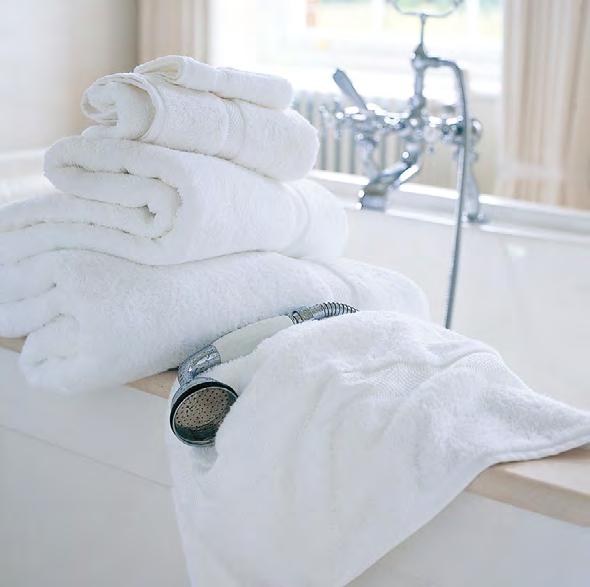
15 Basic elements 1/2 Logo and Brand Symbol Our logo comprises the Electrolux name and our Brand Symbol with a clear relationship between the two to ensure legibility. The Brand Symbol can be used in a number of ways to create maximum impact and recognition. 3 Typeface and messaging Electrolux Sans helps create our own recognizable style with clarity and simplicity, maintaining consistency of presentation across all of our touchpoints. How we talk is as important as how we look. Our tone of voice and defined messaging structure ensures we engage consumers in the right way and at the right time. 4 Color palette Unique to Electrolux, our colors create better stand-out and stopping power. Our core colors, Electrolux Blue and white, are complemented by a supporting palette of vivids, neutral lights and darks. 5 Pattern Three brand patterns, derived from the Brand Symbol add an extra level of distinction. 6 Imagery Inspiring, beautiful imagery that tells a story is at the center of our visual identity with a clear, logical structure to frame the way we use it. 1/2 3/4 5/6 A perfectly smooth blend, without stirring 15 Basic elements Overview
16 Logo Our logo is our flag. It is a sign of our commitment to designing great products to inspire and delight our consumers. The clean, geometric qualities are timeless and make it stand-out from the crowd. It is one of our greatest visual assets. 16 Basic elements Logo Introduction Version 1.1 issued January 2015

17 17 Basic elements Logo


18 Logo History 1 3 In 1959, Electrolux had the Design Laboratory in Chicago carry out a major study of its logo s identification value. The study concluded that a new corporate symbol and trademark should be designed to communicate the positive qualities of Electrolux and its products more effectively. The symbol and logotype were designed by Swiss designer Carlo Vivarelli and introduced globally in The Electrolux Brand Symbol is derived from a capital E and a square. Combined, it serves as a mark of excellence and remains one of our most recognizable assets. The 2014 version removes the tagline and ellipse, reconfigures the proportion of symbol to logotype and modernizes the typeface increasing visibility and generating better stand out. 1 Created in Carlo Vivarelli s update update Basic elements Logo History
19 Logo Composition Brand Symbol Logotype 1 Logo Our logo comprises two elements: the Brand Symbol and the logotype. It is a contemporary mark that has strong visual impact to increase brand visibility and recognition on key touchpoints. 1 2 Proportion The proportion of the logotype to the Brand Symbol is one half of the height, positioned in the vertical center. This clearly defined relationship ensures a balance of prominence of the Brand Symbol and legibility of the logotype at all sizes and all formats. Logo The logo does not include taglines or holding shapes creating maximum impact wherever it appears. The Brand Symbol can be used on its own to create large scale impact, but it must always be used near to or in field of vision of the full Electrolux logo. Refer to pages on Brand Symbol usage for further detail Basic elements Logo Composition
20 Logo Usage 1 Clear space A minimum clear space rule has been devised to ensure no other graphic elements appear too close to the Electrolux logo. This will ensure legibility and that it is treated consistently and with integrity. 1 The clear space rule should be adhered to wherever possible, although there are exceptions dictated by the scale or shape of a format, particularly in retail or product scenarios. These instances will be referred to in specific guidelines. 2 Minimum Size The minimum size rule is shown opposite. However, there will be some exceptions where there is restricted space, for example on merchandise or some digital applications. 2 Small use logo color When using the Electrolux Blue logo at small sizes, care should be taken to ensure it does not appear black. In these instances use the color values below. This should only be used for logos 125px wide and below. RGB value: 26/36/95 22mm 70px 20 Basic elements Logo Usage
21 Logo Alternative configuration 1 A vertical stacked version of the logo has been created for use on product applications. This configuration has been developed to ensure maximum impact for the Brand Symbol and is the only permitted variation of the Electrolux logo. 1 Vertical stack logo The Brand Symbol is the most prominent element with the Electrolux logotype aligning underneath to a fixed width. 2 Proportioning The Brand Symbol is the height of 3 E s from the Electrolux logotype. It is centered vertically and spaced 1 E from the logotype. A proportion of 3:1: Basic elements Logo Alternative configurations
22 Logo Colorways 1 There are two main colorways for the logo: Electrolux Blue and white-out. 1 Electrolux Blue Used on light colors, white out or metallic backgrounds. 2 White out May be applied to color backgrounds or images where legibility allows. 2 3 Black A black version of the logo is available where color production is limited. It is not to be used as a lead logo color in print, digital or retail. The color should always be 100% process black. The logo can be applied to a variety of colored backgrounds and imagery, but care should be taken to ensure clarity, prominence and legibility. Do not apply to images with complex, cluttered backgrounds that compete with the logo Basic elements Logo Colorways
23 23 Basic elements Logo Colorways

24 Logo Colorway don ts 1/2 1 Do not use against backgrounds that visually compete with the logo. Always ensure there is high contrast between the logo and the background on which is it used. 2 Do not apply a black logo within color applications, or on colored backgrounds. 3 Do not apply the blue logo to competing color backgrounds. 4 Do not use the logo in non Electrolux colors. 3/4 24 Basic elements Logo Colorways


25 Logo Print finishes 1 The Electrolux logo may also appear in a number of premium print finishes to heroize the logo in printed applications. 1 Foil blocking Using a silver foil for the Electrolux logo creates a strong premium feel for the application. 2 Spot varnish A clear spot varnish creates a subtle and sophisticated feel to the logo. Do not create mock metallic finishes with color gradients in print applications Basic elements Logo Print finishes

26 Logo Animation Animation provides a great opportunity to present the Electrolux logo in dynamic and engaging ways. The animated logo is used in digital and retail to create seamless omni-channel experiences. 26 Basic elements Logo Animation


27 Logo Animation 1 When animating the Electrolux logo we use premium feel lighting effects on a logo rendered to have a metallic finish. Simple movements and elegant lighting builds a modern and premium feel for the brand and adds dynamism. This connects the brand across retail and digital touchpoints. There are two versions available: 1 The Electrolux logo is rendered in a 3D premium, metallic finish revealing the Brand Symbol first before connecting with the name Electrolux. This version is also available on white. 2 2 In this version the Brand Symbol appears to form out of liquid metal, coming together to form the final Brand Symbol with a metallic finish, as above. 27 Basic elements Logo Animation
28 Logo Green leaf symbol Eco Green Building a green brand and keeping the Electrolux logo unified is an ongoing process that requires our constant attention. Our green leaf symbol represents Electrolux s commitment to a sustainable future, and it is crucial that we present it with a look and feel that is consistent in all communications and media. The green leaf has the potential to drive our sales even further. The Eco Green color is used within the green leaf symbol and can also be used as a background in retail on relevant POS. PMS 340 C CMYK 100/0/84/0 RGB 0/150/94 Illustrative examples of language cues: Eco Product 50% Less Energy Switch Up 28 Basic elements Logo Green leaf symbol

29 Logo Green symbol This page shows the Eco Green color applied as a background on two POS examples. It should be used in the same way as a vivid color from the supporting palette. Please refer to the section on supporting colors later in this document. Velit es ped maequi aliciet am volorem everia doluptis est. 50% Less Energy 29 Basic elements Logo Green symbol
30 Brand Symbol We have a powerful and unique asset in our visual identity the Electrolux E Brand Symbol. Heroizing the Brand Symbol across our touchpoints builds greater recognition in the minds of our consumers, making it a key identifier for the Electrolux brand. 30 Basic elements Brand Symbol Introduction Version 1.1 issued January 2015


31 31 Basic elements Brand Symbol Introduction


32 32 Basic elements Brand Symbol Colorways and backgrounds
33 Brand Symbol Colorways 1 The Electrolux Brand Symbol is a key identifier of the brand and should be heroized across all of our touchpoints, wherever possible. 1 Core colors In line with the Electrolux logo it can appear in our core colors of Electrolux Blue and white. 2 Limited use A black version is also available where color reproduction is limited. The color should always be 100% process black. When used as part of the brand pattern (see following section) the Brand Symbol appears in colors from the supporting palette. However when used on its own it appears only in Electrolux Blue and white out or black as limited use Basic elements Brand Symbol Colorways
34 Brand Symbol Hero 1 The Brand Symbol is part of the Electrolux logo and with its strong visual impact can also be used on its own. Heroizing the symbol builds awareness of the brand and increases overall brand visibility, particularly in a retail context. Care must be taken to ensure the Brand Symbol s integrity when applied. 1 Clear space and proportion A clear space rule has been devised to ensure that other graphic elements or applications do not appear too close to the Brand Symbol. The clear space rule should be adhered to wherever possible; however there will be exceptions dictated by the scale or shape of a format, for example on small merchandise or on narrow flags or banners and some digital formats. The recommended clear space guide is also used as a way of scaling the Brand Symbol to the maximum in any given format a space of 1/10th of the symbol. 2 5mm 16px 2 Minimum size To ensure legibility when applying the Brand Symbol, there is a recommended minimum size of 8mm. Described here are the optimum clear space measurements and minimum size rules. There may be exceptions to these where space is restricted. 34 Basic elements Brand Symbol Hero


35 Brand Symbol Usage 1 Our Brand Symbol is a unique and distinctive mark that is imbued with the values of our brand. Wherever possible the Brand Symbol is heroized to create recognition and stand out for Electrolux. The examples opposite show two instances: 1 Packaging A large-scale Brand Symbol over a benefit image creates a distinctive look for our SDA range. 2 Retail In retail situations an illuminated Brand Symbol grabs attention in busy retail environments Basic elements Brand Symbol Usage


36 Brand Symbol Heroizing Heroizing the brand symbol can be realised in a number of ways. On this page the examples show how large scale appearances of the brand symbol can create remarkable visual impact in event and retail situations. 36 Basic elements Brand Symbol Heroizing


37 Brand Symbol Heroizing Heroizing the Brand Symbol doesn t just mean using it at a large scale at every opportunity use the suggested techniques to draw attention to the Brand Symbol creating recognition, stand-out and a premium feel for the brand. In these examples a small scale Brand Symbol is still heroized through color contrast and clear space around the symbol, createing a unique on-shelf retail stand. Illumination can draw the eye from great distances in busy retail environments. This is combined with a fret-cut metal logo on the end of the island. Animating the logo and Brand Symbol add dynamism across our platforms. 37 Basic elements Brand Symbol Heroizing
38 Brand Symbol Relationship to logo 1A/1B We have three ways of defining how the Brand Symbol should be used: 1A/1B Direct association Wherever possible, the Brand Symbol and the Electrolux logo should be applied on the same surface, ensuring that there is a distinct size contrast and space between them. 2 Within close context of the logo The Brand Symbol may be used on its own with the Electrolux logo seen in the same field of vision, but on a different surface. 2/3 3 Limited use On some limited applications, the Brand Symbol can be used on its own. For example at events or product launches the Brand Symbol can be used to create engaging experiences. 38 Basic elements Brand Symbol Relationship to logo
39 Color Color is one of our strongest and most recognizable basic elements. Applied correctly it will give us standout in busy retail environments as well as a distinctive look for our digital and packaging applications. 39 Basic elements Color Introduction Version 1.1 issued January 2015
40 Color: At a glance 40 Basic elements Color At a glance
41 Color palette Overview 1 Electrolux Blue White The Electrolux color palette is divided into two distinct levels: Core and Supporting colors, each performs a distinct role when working with the visual identity. 1 Core colors Electrolux Blue and white are our core colors and appear on all of our communications primarily in our logo. The Electrolux Blue has a strong, premium feel that is contrasted with crisp, clean white. 2 Vivid Orchid Neutral light Berry Neutral dark Plum 2 Supporting colors The vivid palette is inspired by current color trends and create stand-out wherever they are used. They contrast well with Electrolux Blue and with the neutral colors. Vivid Orange Neutral light Oyster Neutral dark Aubergine Neutral lights and darks provide a set of colors primarily for backgrounds, that complement and contrast with the Electrolux Blue, creating a premium feel for the brand. Vivid Sky blue Neutral light Pistachio Neutral dark Slate The purpose of this section of the palette is to give flexibility for a range of design layouts and communications. They support and compliment the core colors when used in extra design elements such as typography and iconography. Vivid Duck egg Neutral light Gray Neutral dark Carbon 41 Basic elements Color Overview
42 Our core colors are Electrolux Blue and white Electrolux Blue PMS 282 CMYK 100/90/13/63 RGB 4/30/80 The RGB values given here are optimized for various screen formats. When using the Electrolux Blue logo at small sizes, care should be taken to ensure it does not appear black. In these instances use the color values below. This should only be used for logos 125px wide and below. Small use logo RGB value: RGB 26/36/95 White CMYK 0/0/0/0 RGB 255/255/ % 90% 80% 70% 60% 50% 40% 30% 20% 10% 42 Basic elements Color Core colors
43 Supporting colors Vivids Sky blue Orange PMS 7703 C CMYK 80/18/19/0 RGB 0/154/191 PMS 7416 C CMYK 0/70/66/0 RGB 235/104/82 Orchid Duck egg PMS 674 C CMYK 19/78/0/0 RGB 205/85/153 PMS 319 C CMYK 66/0/23/0 RGB 42/203/ Basic elements Color Supporting colors Vivids
44 Supporting colors Neutral lights Berry Supporting colors Neutral darks Plum PMS 664 C CMYK 13/15/8/0 RGB 225/218/225 PMS 5125 C CMYK 57/81/34/27 RGB 109/58/93 Oyster Aubergine PMS Warm Gray 1 C CMYK 18/16/20/0 RGB 215/209/203 PMS 262 C CMYK 69/90/36/38 RGB 82/40/78 Pistachio Slate PMS 7541 C CMYK 17/9/11/0 RGB 218/223/225 PMS 7545 C CMYK 75/55/41/32 RGB 65/84/100 Gray Carbon PMS 427 C CMYK 21/14/16/0 RGB 209/211/211 PMS Cool Gray 10 C CMYK 58/47/42/31 RGB 100/101/ Basic elements Color Supporting colors Neutrals


45 Color Usage vivids Using our colors in a consistent manner is an important part of building our visual identity. The vivid palette is inspired by current color trends and can be used for: 1 Typography Using vivid colors in messaging creates stand out on dark and light backgrounds. Part of a message can be highlighted with a color to draw attention to a function, benefit or detail. 2 Backgrounds Vivid colors can also be used as backgrounds to the Brand Symbol or logo. In the example opposite, a vivid color is used to highlight a benefit in the attract message which then connects with a lower-level POS communication, creating a harmonious display. 1 2 Tender on the inside crispy on the outside Delicious results cooking with steam Healthier dishes Cooking with steam preserves vitamins and uses less fats for cooking Faster results Combining heat and steam reduces cooking times by 20% Tender on the inside crispy on the outside Delicious results cooking with steam Lock in flavour Hot air crisps the outside whilst steam keeps the inside tender Lock in flavour Hot air crisps the outside whilst steam keeps the inside tender Healthier dishes Cooking with steam preserves vitamins and uses less fats for cooking Faster results Combining heat and steam reduces cooking times by 20% 45 Basic elements Color Usage - Vivids


46 Color Usage don ts 1 1 Avoid using a vivid color that clashes with imagery. In this instance the image of salmon would work better with the Orange color or neutral lights and darks. 2 Avoid mixing multiple vivid colors in close proximity. Obis sam harum facitam explige nihillor am Et comnit hillesequia quibusae voluptatures 2 Nulla ut dui et leo condim Nulla ut dui et leo condim Nulla ut dui et leo condim 46 Basic elements Color Usage - Don ts
47 Color Usage neutrals 1 Neutral lights The neutral colors are primarily used as backgrounds. particularly in retail environments, to avoid large areas of white. They complement the Electrolux Blue and can be used on typography when used on a contrasting background. The logo or Brand Symbol appears in Electrolux Blue when used on neutral lights. 2 Neutral darks As with the neutral light colors, neutral darks can be used as backgrounds across our touchpoints. The logo or Brand Symbol appears white out when used on neutral darks. 1 2 Tender on the inside crispy on the outside Delicious results cooking with steam Lock in flavour Hot air crisps the outside whilst steam keeps the inside tender Healthier dishes Cooking with steam preserves vitamins and uses less fats for cooking Faster results Combining heat and steam reduces cooking times by 20% Tender on the inside crispy on the outside Delicious results cooking with steam Delicious results cooking with steam Delicious results cooking with steam Lock in flavour Hot air crisps the outside whilst steam keeps the inside tender Healthier dishes Cooking with steam preserves vitamins and uses less fats for cooking Faster results Combining heat and steam reduces cooking times by 20% 47 Basic elements Color Neutrals
48 Color Combinations neutral lights 1/2 Nulla ut dui et leo condim Nulla ut dui et leo condim Nulla ut dui et leo condim Nulla ut dui et leo condim Nulla ut dui et leo condim Nulla ut dui et leo condim Nulla ut dui et leo condim Nulla ut dui et leo condim The examples opposite demonstrate the various color combinations available with neutral lights. This is a diagrammatic explanation of the colors it is not representative of an actual display. While the examples are illustrative, the principles can be applied across any piece of communication considering color harmony within a communication or display creates a more consistent and premium expression of the brand. Nulla ut dui et leo condim Nulla ut dui et leo condim Nulla ut dui et leo condim Nulla ut dui et leo condim Nulla ut dui et leo condim Nulla ut dui et leo condim Nulla ut dui et leo condim Nulla ut dui et leo condim 1 Light Oyster and Light Berry neutrals work as a background with Vivid Orange in typography or as a background to the Brand Symbol this is because the colors are warm. 2 Vivid Sky Blue and Vivid Duck Egg go well with Light Gray and Light Pistachio as they are cool colors. Nulla ut dui et leo condim Nulla ut dui et leo condim Nulla ut dui et leo condim Nulla ut dui et leo condim Nulla ut dui et leo condim Nulla ut dui et leo condim Nulla ut dui et leo condim Nulla ut dui et leo condim The color combinations demonstrate the flexibility of the color palette to be able to respond to market needs, seasonality, new lines or promotions while still retaining a unified, branded look. 48 Basic elements Color Combinations Lights
49 Color Combination neutral darks 1/2 Nulla ut dui et leo condim Nulla ut dui et leo condim Nulla ut dui et leo condim Nulla ut dui et leo condim Nulla ut dui et leo condim Nulla ut dui et leo condim Nulla ut dui et leo condim Nulla ut dui et leo condim The examples opposite demonstrate the various color combinations available with neutral darks. As with neutral lights look for color harmony, the warm neutral darks of Plum and Aubergine work well with Orchid and Orange in the vivid colors (1). The color combinations demonstrate the flexibility of the color palette to be able to respond to market needs, seasonality, new lines or promotions. Nulla ut dui et leo condim Nulla ut dui et leo condim Nulla ut dui et leo condim Nulla ut dui et leo condim Nulla ut dui et leo condim Nulla ut dui et leo condim Nulla ut dui et leo condim Nulla ut dui et leo condim The cool colors of Slate, Carbon, Sky blue and Duck egg also combine well (2). Nulla ut dui et leo condim Nulla ut dui et leo condim Nulla ut dui et leo condim Nulla ut dui et leo condim Nulla ut dui et leo condim Nulla ut dui et leo condim Nulla ut dui et leo condim Nulla ut dui et leo condim 49 Basic elements Color Combinations - Neutral darks
50 Color Usage don ts These examples show bad practice of color application: 1/2/3/4 1 Neutral dark backgrounds combined with neutral darks or Electrolux Blue in messaging cannot be read. 2 Two neutral darks combined does not create contrast within the applcation. 3 Ensure messaging and logo has contrast with the background to make it legible. Nulla ut dui et leo condim Nulla ut dui et leo condim Nulla ut dui et leo condim Nulla ut dui et leo condim 4 Neutral lights used with white out Brand Symbol renders it illegible. 50 Basic elements Color Usage - Don ts
51 Color Usage 1/2 The examples opposite show the color palette applied to a retail kitchenette illustration. The core Electrolux Blue appears in the unit header to display the white out logo. Obis sam harum facitam explige nihillor am Et comnit hillesequia quibusae voluptatures Obis sam harum facitam explige nihillor am Et comnit hillesequia quibusae voluptatures In example 1, a neutral light is used alongside an attract image with the Electrolux Blue Brand Symbol to draw attention from a distance. Electrolux Blue is also used in the message and a vivid color highlighting a key benefit. In this instance Orange connects well with the food image. 3/4 A vivid color has been used in examples 2 and 4 for extra stand-out and stopping power the vivid color sits well with the attract food image. A neutral dark is used in example 3 along with a white-out symbol here the vivid color used to highlight a benefit and connects with colors within the image. Obis sam harum facitam explige nihillor am Et comnit hillesequia quibusae voluptatures Obis sam harum facitam explige nihillor am Et comnit hillesequia quibusae voluptatures 51 Basic elements Color Usage
52 Color Logo and symbol colorways Electrolux Blue logo and Brand Symbol White-out logo and Brand Symbol Metallic logo and Brand Symbol The key principle when working with the Electrolux logo and Brand Symbol is to ensure legibility and contrast. The table opposite summarizes the permissible color backgrounds for the Electrolux logo. A black logo should only be used in limited situations where color restrictions apply. Electrolux Blue White Orchid Orange Sky blue Duck egg Berry Oyster Pistachio Gray Plum Aubergine Slate Carbon Eco Green 52 Basic elements Color Logo and symbol colorways
53 Brand Symbol Pattern To continue building equity into the Brand Symbol it can be used as a repeat pattern, creating distinctive backgrounds across Electrolux communications. 53 Basic elements Brand Symbol Pattern Version 1.1 issued January 2015
54 54 Basic elements Brand Symbol Pattern
55 Pattern Construction 1 1 Construction The construction of the pattern allows space between each symbol to allow it to be seen clearly. The pattern is a fixed piece of artwork and should not be altered. 2 Proportion to Brand Symbol To accommodate our wide range of communication platforms there are a selection of proportions available to use. These are the recommended proportions, some applications may require further consideration to ensure the integrity of communication and brand. The scale of the pattern should relate to the hero brand symbol used. The recommended proportions are equal to 8,6 or 4 symbols in the pattern to the height of the hero symbol. 2A/2B/2C 8 symbols 6 symbols 4 symbols 55 Basic elements Brand Symbol Pattern Construction
56 Pattern Proportion 1 The examples on this page show the preferred sizing of the pattern in the context of a pack. There is no fixed equation but care should be taken to ensure the pattern can be seen clearly with enough contrast between the Brand Symbol in the pattern and in the logo. 1 Correct proportion The brand pattern contrasts with the logo and is sympathetic to the format on which it appears. 2 Too small The brand pattern appears too small and is difficult to see. 3 Too big The brand pattern appears too large, does not have a premium feel and competes with the logo. 2 3 The Masterpiece Collection Blender The Masterpiece Collection Blender The Masterpiece Collection Blender 56 Basic elements Brand Symbol Pattern Proportion
57 57 Basic elements Brand Symbol Pattern Colorways

58 Pattern Colorways 1 The brand pattern is a tonal background this is the only acceptable instance where the Brand Symbol can appear in colors other than Electrolux Blue or white out. 2 1 Colorways The core colors of Electrolux Blue and white can be used for the brand pattern. In the instance of white the pattern will most likely appear as a spot varnish on a white base. 2 Alternative colorways The brand pattern is also available in all colors from the supporting palette. Only three colors are shown here but all colors are available. 3 Finishes The pattern can be used in different finishes such as gloss/matt varnishes and embossing/debossing adding a premium and subtle feel to the touchpoint on which it is used Basic elements Brand Symbol Pattern Colorways
59 Pattern Color adaptation 1 Symbol color is a 70% tint of the background color Background color is a 100% tint The colour tints within the Brand patterns can be modified for use across a variety of applications. The examples opposite show just one color to demonstrate the principle, all colors are available for the Brand patterns. If text is being used over a pattern, a higher percentage of color is recommended to ensure contrast and legibility. 1. Brand Symbol pattern. The background must always be 100% solid colour, the brand symbol can vary from 90 60% in increments of 5%. 2. Square pattern The square pattern is comprised of two different tints of square on a background that must always be 100% solid colour. Square pattern 1 can appear between 90 70% and square 2 between 75 50% ensure there is enough contrast between the square shapes to retain the depth of pattern. 3. Leaf pattern The leaf pattern is comprised of three different tints of shape, each of which can be adapted. Leaf 1 can appear between 90 80%, leaf % and leaf %. The background must always be 100% solid colour. Patterns use only tints of one color from the palette, never use multiple colors in one pattern. 2 3 Square pattern 1 is a 70% tint of the background color Square pattern 2 is a 50% tint of the background color Background color is a 100% tint There are three types of individual leaves for this pattern each type is a different tint of the background color. They can be altered for different uses they have to stay within the ranges given on the left. Background color is a 100% tint 59 Basic elements Brand Symbol Pattern Colorways


60 Pattern Applications 1/2 The examples on this page show four ways the brand pattern can be realised across different touchpoints. 1 Digital The brand pattern can be used as a background on our website, mobile app and other digital touchpoints. Adding an extra level of detail and giving a premium feel. 2 POS Our pattern can be used in retail to add an extra dimension to low level POS. 3 Window vinyl/events The brand pattern can also be used in event, retail, or pop up retail instances on windows or glass dividers as a way of branding a space or environment Basic elements Brand Symbol Pattern Applications
61 Pattern Retail 1/2 The Electrolux brand pattern can be used as a background on numerous touchpoints. In retail environments it should be used subtly to ensure it does not conflict with imagery or messaging. 1 Brand pattern is subtle and allows messaging and logo to be seen clearly. 2 Brand pattern is too bold and interferes with the legibility of message and logo. Nulla ut dui et leo condim Nulla ut dui et leo condim 61 Basic elements Brand Symbol Pattern Retail
62 Pattern Alternatives Two alternative patterns have been created using elements of the Electrolux logo. Using the shapes from within the Brand Symbol 62 Basic elements Brand Symbol Pattern Alternatives
63 Pattern Colorway They are also available in all the colors from the core and supporting palette. Please note only a selection of colors are shown on this page all colors from the palette are available. 63 Basic elements Brand Symbol Pattern Colorway
 applied in two")


64 Pattern Retail 1/2 These two example show the alternative patterns (square and leaf) applied in two alternative scenarios. 1 Brand pattern is subtle and allows messaging and logo to be seen clearly. 2 Brand pattern is used to enliven and demarcate a retail zone. Nulla ut dui et leo condim 64 Basic elements Brand Symbol Pattern Retail
65 Tone of voice and messaging We want to surprise and delight our consumers showing them there is no limit to what they can achieve at home. Our tone of voice and messaging should reflect this, engaging people in a positive and emotional way. 65 Basic elements Tone of voice Introduction Version 1.1 issued January 2015
66 Through our tone of voice, let s surprise and delight 66 Basic elements Tone of voice Introduction
67 Tone of voice Attract A good headline has the power to quickly attract consumers. Drawing them in with words and copy to express the key benefits of the product and inspiring consumers with the results that can be achieved. Opposite are three examples of attract headlines for Masterpiece Blender, CombiSteam Oven, and DelicateCare Dryer. Use these as inspiration when creating messages for products. 1 2 The secret to great taste is smoother blending More delicious taste with steam 3 No shrinkage guaranteed Attract Engage Convert 67 Basic elements Tone of voice Attract
68 Tone of voice Engage At this level copy should express the functional benefits of a product to help consumers understand how the product can help them accomplish their goals at home. Inspire them with insights, talk about the results, and reveal Electrolux s ingenious design features. Unique PowerTilt technology for the smoothest velvety textures. Our unique FullTaste Steam System enables you to bring out the tastes and textures of your dishes like never before. The new DelicateCare dryers guarantee no shrinkage of even your most delicate hand-wash only silk and woollens. Attract Engage Convert 68 Basic elements Tone of voice Engage
69 Tone of voice Convert Convert messaging is all about the details, the difference that Electrolux makes and the details, features and technology that make it possible. Truflow Pro technology It took years of testing in professional kitchens to optimize the flow around the blades and increase the rate that ingredients combine. SousVide Captures and intensifies taste for deliciously tender results, as used by top Michelin starred restaurants. Triple titanium blades Three blade types and six cutting edges and with an EM6 titanium coating, they ll stay sharper for longer. VarioGuide The oven automatically ensuresthe right temperature, humidity and cooking time for a wide range of dishes. DelicateCare system Our new DelicateCare system tailors the spin motion to suit the fabric guaranteeing no shrinkage of hand-wash only silk and woollens. Silk programme Our new silk program dries with gentle cradling motions and at lower temperatures leaving even handwash only silks soft and smooth. Attract Engage Convert 69 Basic elements Tone of voice Convert
70 Tone of voice Communication framework The example on this page shows the communication framework applied to messaging for the masterpiece collection blender. Attract Brand and primary benefit statement Grab attention with a concise Benefit statement which resonates with the consumer s life Electrolux The secret to great taste is smoother blending Engage Functional validation Explain the proposition in a compelling way and invite further exploration. Where applicable include a branded signature feature Unique PowerTilt technology for the smoothest velvety textures Convert Secondary benefits Technical details are used to validate, inform and persuade to drive purchase behaviour Titanium Blades The three blades have six different cutting edges to tackle the toughest jobs Long lasting design Die-cast construction inspired by professional kitchens 70 Basic elements Tone of voice Communication framework
71 Typography The Electrolux Sans typeface helps us to create our own recognizable style with clarity and simplicity. Thus maintaining consistency of presentation throughout all of our visual communications. 71 Basic elements Typography Introduction Version 1.1 issued January 2015
72 Electrolux Sans Semibold Regular Light 72 Basic elements Typography Introduction
73 Typography Typeface Electrolux Sans is a modern, sans serif font with clean geometric forms that support our design. We have our own unique and distinctive typography. The Electrolux Sans family helps us to create our own recognizable visual style with clarity and sharpness, while maintaining consistency of presentation across all visual communications. A range of weights are available for a variety of uses with Semibold and Regular being the preferred options. 1 Electrolux Sans Semibold 2 Electrolux Sans Regular 3 Electrolux Sans Light If you are an Electrolux approved partner, please visit the brand portal to download and access Electrolux Sans ABCDEFGHIJKLMN OPQRSTUVWXYZ abcdefghijklmn opqrstuvwxyz ABCDEFGHIJKLMN OPQRSTUVWXYZ abcdefghijklmn opqrstuvwxyz ABCDEFGHIJKLMN OPQRSTUVWXYZ abcdefghijklmn opqrstuvwxyz Basic elements Typography Typeface

 1 Helvetica Bold 2 Janna bold 3 Arial Unicode (simplified Chinese")
74 Typography Alternative languages 1 Non roman alternatives There are three alternative fonts to Electrolux Sans, for non-roman alphabets. Helvetica is available for Greek and Cyrillic alphabets as well as Vietnamese, Hebrew and Indonesian a font which shares similar geometric forms to Electrolux Sans 2 Janna is an equivalent to Avenir for Arabic, and covers most languages in this family including Farsi. Use Arial Unicode for Korean, Japanese, Thai, Chinese (traditional and simplified) 1 Helvetica Bold 2 Janna bold 3 Arial Unicode (simplified Chinese shown) 3 74 Basic elements Typography Alternative languages
75 Typography Typesetting To ensure messages and copy can be read clearly, apply the simple typographic specifications below to optimize font legibility. 1 Headline Electrolux Sans Semibold Sentence case, no full stop Word Spacing: 60/70/80 Letter Spacing: 0/0/0 Leading: Set solid 2 Subhead Electrolux Sans Regular Sentence case Word Spacing: 60/70/80 Letter Spacing: 0/0/0 Leading: 110% 3 Bodycopy Electrolux Sans Regular Sentence case Word Spacing: 60/70/80 Letter Spacing: 0/0/0 Leading: 120% 1 2 The secret to great taste is smoother blending Unique PowerTilt technology for the smoothest velvety textures 3 Titanium blades 2.2L tilt carafe The three blades have Big enough for large batches. six different cutting edges Durable and scratch resistant, to tackle the toughest jobs. it s safe for hot soups along The titanium coating keeps with sauces. blades sharper longer. 75 Basic elements Typography Typesetting


76 Typography Use of color Color can be used in typography to highlight key benefits, features or functions. This is best achieved using the vivid colors from the supporting palette. The secret to great taste is smoother blending Unique PowerTilt technology for the smoothest velvety textures The Masterpiece Collection Blender Perfectly clean floors Superior Airflow System to ensure you always get fantastic results the first time Basic elements Typography Use of color
77 Imagery Through images we bring an emotional connection to our brand. Images show our products and the exciting world of possibilities they bring. As with color and messaging, we use different types of images at different points to attract, engage, or convert our consumers. 77 Basic elements Imagery Introduction Version 1.1 issued January 2015


78 78 Basic elements Imagery Overview


79 Imagery Communication framework Attract WHY would I consider or buy this product? Desirable outcome: Focused on result Lifestyle: Humanity of enjoying end result Desirable outcome: Food Laundry Floorcare Lifestyle: Food Laundry Floorcare This example shows the communication framework applied to imagery. WHAT does this product look like and do? Product photography: Product is the hero Product in use: Show the product in use Engage Product photography: Food Laundry Floorcare Product in use: Food Laundry Floorcare Convert HOW does this product work? Technical feature: Details of the product that explain a technical feature Design feature: Product in context with emphasis on design Technical feature: Food Laundry Floorcare Design feature: Food Laundry Floorcare 79 Basic elements Tone of voice Communication framework


80 Imagery Attract Desirable outcome: Compelling, benefit focused images that demonstrate that Electrolux products deliver desirable results Images should grab attention through visual narrative Premium and inspirational Real and tells a story Image or headline creates an emotional connection with the consumer and brings people through a story Types of imagery: Delicious food Perfectly clean laundry Aspirational kitchen suites Hero products in situation These images are placeholder only and may not be used elsewhere. For more information please contact the Electrolux Brand Team. Attract Engage Convert 80 Basic elements Imagery Attract Desirable outcome


81 Imagery Attract 1/2/3 Desirable outcome: Food 1 Immersion Blender The benefit of butternut squash soup puréed to the right consistency. 2 Induction The benefit of seared salmon that s crispy, yet tender. 3 Convection The benefit of perfectly roasted brussel sprouts. 4 Induction The benefit of delicious fresh pasta with juicy fresh prawns. 4/5/6 5 Induction A delicately poached egg and sautéed spinach. 6 Steam The benefit of the crispiest, juiciest roast chicken. Top Tips: Feels more approachable and inviting Looks delicious Benefit is clear via outcome of dish These images are placeholder only and may not be used elsewhere. For more information please contact the Electrolux Brand Team. 81 Basic elements Imagery Attract Desirable outcome


82 Imagery Attract 1/2 Desirable outcome: Laundry 1 Steam The benefit of a clean, crisp dress. 2 Sanitize feature The benefit of favorite toys sanitized for baby. 3 Gentle cycle The benefit of maintaining the softness of delicate towels. 4 Capacity The benefit of crisp, perfectly clean bedding. 3/4 Top Tips: Premium, yet real Environment presents relatable situation Overall inviting feel Benefit is clear with appearance of towels These images are placeholder only and may not be used elsewhere. For more information please contact the Electrolux Brand Team. 82 Basic elements Imagery Attract Desirable outcome


83 Imagery Attract Desirable outcome: Kitchen: Beautiful suites of appliances for the heart of your home. Top Tips: Feels more approachable and inviting Looks premium; consumers aspire to live there Showcases the suite of appliances The props within kitchen imagery should be real and help tell a story and not be cold or stark These images are placeholder only and may not be used elsewhere. For more information please contact the Electrolux Brand Team. 83 Basic elements Imagery Attract Desirable outcome


84 Imagery Attract 1/2 Lifestyle: Food 1 Perfect temp probe The benefit of cooking that s perfect for guests. 2 Double wall oven The benefit of a perfected multi course dinner party. 3 Wine refrigerator The benefit of wine served at its ideal temperature. 4 Convection The benefit of moist, delicious cupcakes for the smallest gourmets. 3/4 Top Tips: Environment is relatable, inviting and presents humanity Image evokes an emotional connection Provide context or highlight a benefit Show the ultimate emotional benefit of the results Lifestyle images of people must feel real, not posed or staged These images are placeholder only and may not be used elsewhere. For more information please contact the Electrolux Brand Team. 84 Basic elements Imagery Attract Lifestyle


85 Imagery Attract 1/2 Lifestyle: Laundry 1 Maintains softness for delicate skin. 2 Keeps even your most delicate clothes stain and wrinkle free. 3 A crisp, clean white shirt to keep the kids looking their best. 4 Cleans and sanitizes even cashmere. Top Tips: Situation is relatable and conveys emotion Benefit is emphasized via lifestyle If pulled back wider, image could show product Model s expression should feel like a real representation of life and not staged or posed 3/4 These images are placeholder only and may not be used elsewhere. For more information please contact the Electrolux Brand Team. 85 Basic elements Imagery Attract Lifestyle


86 Imagery Attract Lifestyle: Floorcare EPA certified Headline: Snuggles, not sneezes Strong enough to remove all allergens. Bare floor scatter guard Confidence that there s no leftover debris. Never loses suction technology A thoroughly clean home you can enjoy. Top Tips: Relatable situation conveys emotion and humanity Lifestyle imagery that clearly depicts an emotional end benefit These images are placeholder only and may not be used elsewhere. For more information please contact the Electrolux Brand Team. 86 Basic elements Imagery Attract Lifestyle


87 Imagery Engage Product in use: Explanatory imagery that not only helps provide a clear understanding of what the product is, what it looks like, what it does, and what differentiates it. Product demonstrated in context. Must have a premium feel and storytelling approach. Images tell consumers what makes our products special. Types of imagery: Kitchen appliances in use Laundry appliances in use Floorcare products in use These images are placeholder only and may not be used elsewhere. For more information please contact the Electrolux Brand Team. Attract Engage Convert 87 Basic elements Imagery Engage Products in use


88 Imagery Engage 1/2 1 Smooth Gliding Racks Effortlessly remove even the heaviest meals. 2 Swivel Steering Flexible enough to get to those hard to reach messes. 3 The French Door Refrigerator/Freezer That holds more food and keeps it organized. 4 Steam Oven An oven that creates the juiciest, crispiest chicken. Top Tips: A real life situation Shows the benefit (infinite glass) in context at once Appliance demonstrations should always be in context The environment in the imagery should be aligned with the brand s premium feel and storytelling approach 3/4 These images are placeholder only and may not be used elsewhere. For more information please contact the Electrolux Brand Team. 88 Basic elements Imagery Engage


89 Imagery Convert Convert imagery: Imagery that demonstrates how the products work and persuades consumers to purchase. Demonstrate the differential technological advantage. Images allow for a close up of product features. Images provide further context for engage imagery. Serve to highlight our RTBs. Types of imagery: Product images Feature images Images can be comparative to further illustrate the technology These images are placeholder only and may not be used elsewhere. For more information please contact the Electrolux Brand Team. Attract Engage Convert 89 Basic elements Imagery Convert Convert imagery


90 Imagery Convert 1/2 Technical features: 1 Laundry Clothes are refreshed and wrinkle free with the addition of steam. 2 Steam Oven Cooking perfectly delicious meals is as easy as adding water. 3 Steam Oven A touch of steam for a crispy crust. 4 Aqualux System Alternating wash arms, for a quieter and more efficient operation. Top Tips: Focus on specific functions and details Benefit is clear and visible Provide a relatable context that better illustrates the benefits Considered propping adds an element of humanity to better illustrate the benefit 3/4 These images are placeholder only and may not be used elsewhere. For more information please contact the Electrolux Brand Team. 90 Basic elements Imagery Convert Technical features


 3/4 These images are placeholder only and")
91 Imagery Convert 1/2 Design leadership: 1 Hob Vertical flame for more precise heat control and faster cooking. 2 Ergorapido Designed to reach the hardest of places. 3 Nutrilight Clearly see everything in your crisper drawer. 4 Precision of perfect set controls Instantly adjust temperature with the touch of a finger. Top Tips: The benefit is contextualized A real life situation consumers can relate to (reinforces the benefit) 3/4 These images are placeholder only and may not be used elsewhere. For more information please contact the Electrolux Brand Team. 91 Basic elements Imagery Convert Design leadership
92 Icons Based on the simple geometric forms in the Electrolux Sans typeface, our icons are clear and easy to understand. They express the key features and benefits of Electrolux products. 92 Basic elements Icons Introduction Version 1.1 issued January 2015
93 Icons Benefit and feature Benefit Ultra performance Ultra clean Extra quiet A consistent appearance and application of icons across all touchpoints builds a seamless experience for our consumers. The style of our icons is derived from our typeface, simple graphic forms straight lines and slight curved edges which creates harmony across the visual identity. Containing the shapes within a circle helps consistency and a connection with a key element of the Electrolux Brand Symbol. Feature Gentle care Energy efficiency Save time Anti allergy Iron less Extended brush Steam clean Strong fan Larger filter 93 Basic elements Icons Benefit & feature
94 Bringing it all together 94 Bring it all together Version 1.1 issued January 2015
95 Bringing it all together Combining all of our assets together, and following the guidance given so far, creates designs and communications that are eye catching, distinctive and true to Electrolux. The examples in this section show how to apply all of the elements together to achieve this. 95 Bring it all together Introduction Version 1.0 issued January 2015

96 Packaging: Overview Packaging has to work hard in busy retail environments to support product displays, grab consumers attention and to help drive a decision at the point of purchase. A premium feel, attract message, beautiful imagery and clear product explanation creates our stunning packaging range for our premium SDA products. 96 Bring it all together Packaging Packaging overview
97 Packaging: Electrolux Masterpiece Blender Our packaging features a clear product image on the front face to heroize the design it is lightly propped with relevant food items. A headline message, derived from a product value proposition, attracts consumers to pick up the box. The engage copy explains more detail on its features. The side panel features a beautiful taste driven image to demonstrate the end benefit in this instance smoother blending. This also creates the opportunity for packs to be stacked alongside the front face. The side panels provide an opportunity for cross selling across a product range. 97 Bring it all together Packaging Immersion Blender


98 Packaging: Electrolux Masterpiece Blender The Immersion Blender example shows all the elements of the visual identity at play: Logo A large, clear logotype is highly visible from a distance. Attract image Used on the side of the pack, an attract image is combined with a hero Brand Symbol. Messaging The attract message, derived from the product value proposition explains the benefit of the product to the consumer, in a human and engaging way. The engage messaging takes the next step to explain the functional benefits of the product. Imagery A bold beautiful product image instantly explains what the consumer is buying. 98 Bring it all together Packaging Blender

99 Retail environments are visually competitive and our brand must work hard to cut through and attract consumers to our products. 99 Bring it all together Retail Overview

100 Retail executions In retail scenarios we should look to be creative with solutions to heroize and draw attention to the products. Here, a distinctive on-shelf display heroizes the logo and a video screen attracts and engages our consumers. 100 Bring it all together Retail Executions

101 Retail executions A heroized brand symbol illuminated on a Vivid Orchid vertical panel ensures consumers are attracted from a distance. This is complemented by a illuminated logo on the end of the unit to promote the brand. 101 Bring it all together Retail Executions

102 Retail executions The use of reflective materials creates additional stopping power and makes the brand modern and premium. 102 Bring it all together Retail Executions

103 Retail: Gondola end Brand Symbol A hero Brand Symbol is eye catching from a distance. An additional hero Brand Symbol has been added to the side panel to ensure it is visible from multiple angles. Color The Brand Symbol appears front illuminated with a vivid color as a background. The Vivid Orange is then used to highlight part of the key message. Attract message Clear product benefit, instantly communicated. Imagery Attract imagery demonstrates the benefit of the product, in this instance delicious looking chicken, perfectly cooked, brings to life the product experience in the minds of our consumers. 103 Bring it all together Retail Gondola end

104 Retail: Gondola end An illuminated lightbox featuring an attract message and image creates stopping power in busy retail environments. This is supported by hero Brand Symbols on a bespoke piece of Electrolux POS. The customer experience is enhanced through use of a tablet helping people explore the product further. 104 Bring it all together Retail Gondola end

105 Retail: Small scale Combining product information on vertical and horizontal surfaces leads the consumer around the product and its features and functions. 105 Bring it all together Retail Small scale


106 Retail: Use of vivid colors and pattern 1/2 The examples on this page show the supporting vivid colors and the brand patterns used as backgrounds for retail executions. In examples 1 and 4 the brand patterns appear in the vivid color palette to create eye catching banners and POS. A brand pattern could also be used as a printed floor vinyl to demarcate an Electrolux appliance island as shown in example 2. Nulla ut dui et leo condim Nulla ut dui et leo condim Where possible, consider video screens and installations to add dynamism to product displays, showing the logo or brand symbol in its animated form alongside video footage of the benefits or product details as shown here in example 3. 3/4 106 Bring it all together Retail Executions
107 Illustrative examples of web design We have a consistent approach to our digital design as it is important for us to present a coherent online brand presence. We believe in clear design, ease of navigation and simplicity of use. Websites should be designed using the basic elements of our visual identity and be consistent with our design principles and standards. By maintaining a common approach to interface design across different sites, we establish a consistent experience for users. 107 Bring it all together Digital Introduction Version 1.0 issued January 2015

108 108 Bring it all together Digital Website


109 Digital: Website design The example on this page show how our visual identity could be applied to a website design. The header bar features a hero Brand Symbol over relevant, benefit led, attract imagery. The images could rotate to feature images relevant to all areas of the business. An attract message quickly conveys the product benefits and is used alongside a convert image and message. The neutral colors from the supporting palette appear in the background with vivid colors adding pop to messaging and lower level product links. Kitchen Laundry Vacuums & Homecare Accessories Design & Inspiration The secret to great taste is smoother blending Unique PowerTilt technology for the smoothest velvety textures View more > Professional Power, palm sized Fingertip control Cleaning your home requires less work with convenient controls at your fingertips. 109 Bring it all together Digital Website

110 110 Bring it all together Digital iphone app


111 Digital: Apps 1/2/3 Every touchpoint, whether printed or digital, should use the visual identity consistently to create a seamless expression of the Electrolux brand. As with our websites app design and interface should have a clear design, ease of navigation and simplicity of use. 1 Load screen As the application loads an animated, metallic version of the Brand Symbol can appear. This is then supported by the full Electrolux logo appearing inside the first screen. 2 Category selection In the example shown it is a product list selection but could be a recipe. 3 Content page Ultimately the content of the app will drive the design solution. In this example, benefit imagery is combined with messages, the Brand Symbol or imagery to create an engaging experience. 2 MasterPiece Protilt Blender Immersion Blender Protilt Blender Food Processor Ergo Rapido Unique PowerTilt technology for the smoothest velvety textures 111 Bring it all together Digital iphone app


112 Digital: Social media Twitter We use a range of social media platforms and it is important that we present a coherent online brand presence. The interface layout and appearance may vary between sites, but consistent use of the design principles and standards set out in this guideline should be maintained. Social icon Given its simplicity, clarity and legibility at small sizes, the Electrolux Brand Symbol is used as an icon across all social media platforms. It should be supported by the Electrolux logo on the background or content area. Backgrounds and image areas Most social media platforms have an opportunity to use imagery, either as a background in the header or as an element within the content of the page. Our attract imagery showing desirable outcomes and the benefits of using Electrolux products are a great way to connect with consumers, expressing passion for great results. Tone of voice As with all social media platforms, how we talk to people should reflect our brand and what we say should be inspiring and engaging to our consumers. 112 Bring it all together Digital Twitter


113 Draft 4 Work in progress Digital: Social media Facebook Electrolux Appliances Electrolux Appliances 113 Bring it all together Digital Facebook
114 Appendix 114 Appendix Version 1.0 issued January 2015
115 Artwork list All logo, Brand Symbol and pattern artworks are available in a range of formats and relevant colorways. Electrolux Logo The Electrolux Blue logo is available in Pantone, CMYK or RGB color modes. The Electrolux white-out and black logos are available in CMYK and RGB. Electrolux Brand Symbol The Electrolux Blue symbol is available in Pantone, CMYK or RGB color modes. The Electrolux white-out and black symbols are available in CMYK and RGB. Electrolux Sans The Electrolux font can downloaded from: en/ The secret to great taste is smoother blending Electrolux Brand Pattern Brand Patterns are available in both the Electrolux core and supporting colors all colors will be provided in the swatches panel within a EPS file. Electrolux Square Pattern Square Patterns are available in both the Electrolux core and supporting colors all colors will be provided in the swatches panel within a EPS file. Electrolux Leaf Pattern Leaf Patterns are available in both the Electrolux core and supporting colors all colors will be provided in the swatches panel within a EPS file. 115 Appendix Artwork list


116 Events and one offs 1 The examples on this page show how the Brand Symbol can be realized in 3 dimensions in special event scenarios. These perfectly capture the spirit of a hero symbol to create truly inspiring consumer experiences. 1 Pop up shop 2 See through cube sign 3 Illuminated 3D cube 2/3 116 Bring it all together Events and one offs
SPE Brand Guidelines SPE BRAND GUIDELINES
 SPE BRAND GUIDELINES Logo This is our logo. It instantly identifies SPE, representing who we are and our organization s vision and values. form your future The SPE shield and text block l together form
The Logo 2 The Colors 3 Typography 4 Corporate Statements 5 Targeted Corporate Statements 6 Promotional Guidelines 7 Promotional Materials 8
 117 Church Ranch Way Suite 15 Westminster, CO 821 P: 8.525.9422 F: 33.252.1741 www.psasecurity.com The Logo 2 The Colors 3 Typography 4 Corporate Statements 5 Targeted Corporate Statements 6 Promotional
Brand, Promotions and Visual Identity Guidelines for Channel Partners
 Brand, Promotions and Visual Identity Guidelines for Channel Partners We are building a world that is safer and more secure More comfortable and energy efficient More innovative and productive. We are
EARTH HOUR BRAND GUIDELINES 2015
 EARTH HOUR 2015 1 0. CONTENT 02 35 03 08 15 20 29 1. ABOUT EARTH HOUR & WWF 05 2. THE BRAND EVOLUTION 06 3. EARTH HOUR 2015 THEME 07 4. EARTH HOUR BLUE 5. EARTH HOUR 2015 NAMING RIGHTS 09 6. EARTH HOUR
Affiliate brand guidelines Version 1.0
 Affiliate brand guidelines 2016 Version 1.0 Brand and content guidelines The following guidelines covers use of our assets, terminology and key messages we would like to communicate through affiliate activity.
Society of Petroleum Engineers Graphic Standards Guide
 Society of Petroleum Engineers Graphic Standards Guide The Society of Petroleum Engineers (SPE) Graphic Standards Guide governs the appearance of the SPE logo, and provides detailed guidelines on the correct
Design and brand guidelines
 Greenway Design and brand guidelines A visual rulebook for the Greenway brand Greenway Table of contents 1. Brand overview 2. Brand application 3. Clear space & minimum size 4. Social media 5. Typography
Follow this and additional works at: Part of the Graphic Design Commons
 Design and Media Studio II Undergraduate Research 5-29-2018 Born & Raised Jennifer Date University of Nevada, Las Vegas Follow this and additional works at: https://digitalscholarship.unlv.edu/grc_380
ecobee Brand guidelines
 p. 1 ecobee Brand guidelines p. 2 Branding Branding p. 3 Identity The ecobee logo is composed of the bee icon and the ecobee wordmark. Together, they create the core of our identity: our logo. Branding
Earth Hour Brand Guidelines September 2008
 Earth Hour Brand Guidelines 2009 24 September 2008 Earth Hour 2009 Brand Guidelines 1 About the Earth Hour 2009 Brand Guidelines 3 2 Earth Hour Logo 4 3 Logo Specifications: Background, Colours, Correct
BRAND STANDARDS GUIDE
 BRAND STANDARDS GUIDE BUILDING BLOCKS FOR THE BRAND Effective: January 2016 TABLE OF CONTENTS Why Napoleon... 3 Why A Brand Standards Guide... 4 Logo Color Breakdown... 5 Corporate Color Palette... 6 Logo
GRAPHIC IDENTITY STANDARDS
 We have to work together and think together for there to be a fulfulfillment of any mission. Jean Vanier The L Arche Logo A corporate visual identity ensures the identity and visual recognition of an organization.
BRAND STANDARDS & GUIDELINES
 BRAND STANDARDS & GUIDELINES LOGOS PRIMARY MARK version to be used on white or light-colored Be sure to always include the symbol to the lower right as shown. Against Dark Background Version version to
The Vector Solutions Brand
 The Vector Solutions Brand 1.1 Brand Story Vector Solutions helps companies and organizations continuously improve outcomes through an innovative portfolio of award-winning elearning and performance applications.
Chapter 8: Facility toolkit for interior branding
 Chapter 8: Facility toolkit for interior branding March. 2015: Version 2.2 2015 Optum, Inc. Brand Guidelines Update Facility Toolkit 8.1.0 Facility toolkit 8.1.1 Facility toolkit overview 8.1.2 Applying
NATIONAL CREDIT UNION BRAND SIGNATURE
 NATIONAL CREDIT UNION BRAND SIGNATURE Purpose and Objectives The national credit union brand signature was designed as a unifying symbol of the American credit union movement. Its primary purpose is to
How to bring Heart of house to life A step by step guide
 How to bring Heart of house to life A step by step guide Version 3 - Dec 2011 How to bring Heart of house to life A step by step guide Introduction Page 3 Heart of house Page 4 Using this guide Page 5
M2M - Made to Measure
 M2M - Made to Measure thermaline History Since 1871 2 Boiling pans line 1930 First generation of tilting boiling pans 1934 Cooking installation in Kloster 1960 Production, Precision and Tradition for over
BRICKWORKS CREATE. the ultimate home
 STYLE INSPIRATION BRICKWORKS CREATE the ultimate home Brickworks Building Products is Australia s leader in style and innovation of building products. More than just roof tiles, timber and brick, we create
toughened backing glass 4mm toughened or 6.4mm laminated safety face glass glass bevel bonded to face glass lead overlay applied to face glass
 Coloured Toplights Page 4 Neutrals Page 7 Decorative glass has been used through the ages to imbue windows and doors with beauty, style and elegance. This ancient yet timeless craft has enjoyed a revival
WELCOME TO THE AGA 60
 AGA 60 WELCOME TO THE AGA 60 Always had room in your heart for an AGA but never enough space in the kitchen? Well now you have. The AGA 60 is everything you would expect from an AGA, wrapped up in a smaller
drastic makeovers! trends 60 + reno tips CANADIAN ipad subscriptions $10,000 * giveaway living room CANADA S HOME DÉCOR & LIFESTYLE MAGAZINE
 CANADA S HOME DÉCOR & LIFESTYLE MAGAZINE HOME CANADIAN drastic CanadianHomeTrends.com trends makeovers! you don t want to miss these $10,000 * living room giveaway fabulous transformations FLIP TO page
Strength in Our Brands
 24 Loyalty Strength in Our Brands BUILDING ON A PROVEN HISTORY Everything we do contributes to fostering unmatched levels of loyalty to our brands through lifelong relationships with our consumers. Around
BRAND STANDARDS & GUIDELINES Addendum 1 to DACC Brand Identity Standards
 BRAND STANDARDS & GUIDELINES Addendum 1 to DACC Brand Identity Standards TABLE OF CONTENTS 1.0 vision 1.1 mission 1.2 strategic priorities 2008-2010 2.0 signature 2.1 colors 2.2 variations 2.3 guidelines
INTERIOR APPLICATION GUIDE - December 2016 Brand Stores - Networks Division
 INTERIOR APPLICATION GUIDE - December 2016 Brand Stores - Networks Division The interior application guide Contents > The objectives of Dacia Evolution > Applications in the 4 formats - The Dacia Corner
Counter Intelligence. Richard Rosano CABINET APPOINTMENTS AND H O M E $5.00 A HEARST CONNECTICUT MEDIA GROUP PUBLICATION.
 $5.00 H O M E March2017 BIG APPLE BELLWETHER Christopher Stevens CABINET APPOINTMENTS AND Counter Intelligence NEW CANAAN BUILDER Richard Rosano LOVE YOUR LAND, MAN Fred Landman A HEARST CONNECTICUT MEDIA
HIGH FIVE National Communications Policies & Guidelines
 HIGH FIVE National Communications Policies & Guidelines www.highfive.org Contents Introduction..........................................................3 HIGH FIVE Visual Identity...............................................4
Style Guide. Typefaces and colors for the application of the American Public Garden Association s logo and supporting visual style.
 Style Guide Typefaces and colors for the application of the American Public Garden Association s logo and supporting visual style. General Association Messaging The American Public Gardens Association
Tumble dryers. The range. The range. The range
 Model shown WTW56CG Tumble dryers Introducing our brand new range of fully co-ordinated appliances. Good looking on their own and fabulous together, they re not labelled for nothing! Wouldn t it be great
brand signature elements
 Style Guide intro The Williams Sound Style Guide is developed as a corporate guide for the proper use of the new Williams Sound brand signature: a unit composed of the logo, tagline and proper color use.
PRIME. Boardroom Dynamics. designed & crafted by HANDS 2 PRIME HANDS
 PRIME PRIME designed & crafted by HANDS Boardroom Dynamics PRIME is the ultimate expression of Boardroom luxury. Dynamic, user friendly and finished to market leading standards, the PRIME system is sure
Made in Derbyshire Brand Guidelines
 Made in Derbyshire Brand Guidelines Creating the brand 2015 has been designated a year of celebrations and activities exploring the cultural life of Derbyshire involving arts, libraries, heritage, archives,
Affordable, luxurious extensions to your living space, that stay warm in the winter and cool in the summer.
 Affordable, luxurious extensions to your living space, that stay warm in the winter and cool in the summer. is a modern building system that provides the best way to build the best rooms. It builds stunning
SimplyU. Express yourself.
 Direction commerciale, marketing et Centre de formation Paris Nord 2 165 av. du Bois de la Pie Bâtiment H Parc des Reflets 95920 Roissy CDG T. 01 49 38 81 81 F. 01 49 38 81 50 Centre d exposition et d
IDIS C.I GUIDELINE BASIC SYSTEM Logos
 IDIS C.I GUIDELINE BASIC SYSTEM 1 1.1 Logos IDIS 20th Anniversary IDIS was founded in 1997 by experts in computer science and artificial intelligence and is celebrating two decades of next-generation,
IN THIS ISSUE// POP UP SHOPS OVER 6 MONTHS. How to meet Hammerson s design standards and create an outstanding pop up shop design, including...
 POP UP SHOPS OVER 6 MONTHS IN THIS ISSUE// How to meet Hammerson s design standards and create an outstanding pop up shop design, including... # Creating something unique # Maximising your signage # Presenting
the art of custom CLOSETS Schedule a showroom or in-home consultation to get started Crafted Locally
 the art of custom CLOSETS Schedule a showroom or in-home consultation to get started Crafted Locally WALK-IN CLOSET FOR THE MODERNIST Flowing from one room into the next, this clean-cut design is characterized
Big picture. Small details. Huge potential.
 Big picture. Small details. Huge potential. Now is the time to realise it. The Turbofan 40 Series Combi packs a whole lot of intuitive functionality and raw power into its compact 32 /812mm-wide footprint.
DRIVING THE CONSUMER EXPERIENCE & CREATING MORE BRAND AWARENESS
 DRIVING THE CONSUMER EXPERIENCE & CREATING MORE BRAND AWARENESS ABOUT US Elemental LED, Inc., a leading U.S. based engineering and technology company, is the largest provider of linear LED lighting solutions
Promoting your certification
 Promoting your certification Client instructions for use of the Bureau Veritas Certification certification marks For the benefit of business and people SUMMARY 1 Introduction 2 Introducing the certification
IDA Toolkit. It s time to communicate our value. Here are the tools to express what we do.
 IDA Toolkit U R B A N PL AC E M A N AG E M E N T N A R R AT I V E It s time to communicate our value. Here are the tools to express what we do. For decades urban place management leaders and IDA members
Color Consultations Decomplexified
 Color Consultations Decomplexified A 7-Step Guide to Overcoming Chromaphobia, Paint-aholicism and Fear of Color Committment Copyright 2008 by Interiority Complex 1 Master the Basics Color Basics Terminology
Affordable, luxurious extensions of your living space, that stay warm in the winter and cool in the summer.
 Affordable, luxurious extensions of your living space, that stay warm in the winter and cool in the summer. Italian Inspiration is a modern building system that provides the best way to build the best
CertainTeed. S ymphony. Slate Series. Give Your Home a. Standing Ovation
 CertainTeed S ymphony Slate Series Give Your Home a Standing Ovation Beauty. Harmony. S ymphony is pride in performance. A masterpiece of composite slate design with the timeless qualities of tooled craftsmanship,
Trademark Quick Guide for Certificate Holders
 Trademark Quick Guide for Certificate Holders March 2018 1 2 About FSC trademarks and this quick guide Labelling and promoting with FSC trademarks highlights your achievements in responsible sourcing of
With colours you can set a mood, attract attention, or make a statement. You can use colour to energise, or to cool down. By selecting the right
 With colours you can set a mood, attract attention, or make a statement. You can use colour to energise, or to cool down. By selecting the right colour scheme, you can create an ambiance of elegance, warmth
I N T R O D U C I N G
 INTRODUCING OAK AUTUMN/WINTER 2017 CONTENTS MAKE ROOM FOR OAK 3 CHAPTER 4 13 Style 4 6-9 Style 5 10-13 MAKE ROOM FOR NEW STYLES ORIGIN 14 23 Style 5 16-19 Style 6 20-23 COMPLETE THE LOOK 24 33 Classic
I N T R O D U C I N G
 INTRODUCING OAK AUTUMN/WINTER 2017 CONTENTS MAKE ROOM FOR OAK 3 CHAPTER 4 13 Style 4 6-9 Style 5 10-13 ORIGIN 14 23 Style 5 16-19 Style 6 20-23 COMPLETE THE LOOK 24 33 Classic Bedframe 26 27 Chests of
Signature lighting accents for any interior
 Luminous patterns Signature lighting accents for any interior 1 2 Luminous patterns Introduction Bring spaces to life with color, texture and dynamic light effects Luminous patterns is perfect for architects
Global Facilities Branding Best Practice Guidance
 Overview Global Facilities Branding Best Practice Guidance July 18, 2011 page 2 3 Introduction SAP Facilities 5 Brand Promise, Vision, Mission 6 Brand Voice 7 Logo 8 Color Signage Applications: Interior
Swivel and visitor chairs crossline prime & crossline
 Swivel and visitor chairs crossline prime & crossline Superior seating culture: Sedus crossline prime. The experience of sitting in this management armchair is beyond compare: like a shadow, seat and
CertainTeed. S ymphony. Slate Series. Give Your Home a. Standing Ovation
 CertainTeed S ymphony Slate Series Give Your Home a Standing Ovation S ymphony is pride in performance. A masterpiece of composite slate design with the timeless qualities of tooled craftsmanship, natural
Swivel and visitor chairs crossline prime & crossline
 Swivel and visitor chairs crossline prime & crossline Superior seating culture: Sedus crossline prime. The experience of sitting in this management armchair is beyond compare: like a shadow, the seat
design on demand
 Winning project - New Idea phase The following brief will be based on the project below BOA One & Only by BOA-DESIGN Summary The second phase of by Electrolux and Desall.com, is aimed at developing further
1. Avoid extensive blank walls that would detract from the experience and appearance of an active streetscape.
 08 ARCHITECTURAL DETAIL Once a building s massing and street wall have been defined, architectural details, including façade variation, materials and window treatment, shape a building s visual identity.
The Ultimate Guide to. Roman Blinds
 The Ultimate Guide to Roman Blinds Welcome to the Ultimate guide to Roman Blinds For over 60 years we ve pushed the boundaries of creativity and quality to design the most beautiful, custom made window
- Document 2 - Algonquin Interpretation and The Continuing Conversation toward a Vision for a Revitalized Lansdowne
 140 - Document 2 - Algonquin Interpretation and The Continuing Conversation toward a Vision for a Revitalized Lansdowne On May 4, 2012, the City of Ottawa participated in a Forum with a number of Elders,
the early 1900 s in the Ionian Sea. 2. our chef s family nickname turned into his last name during WWII. ve ze né / v3 z3nè /
 MEDIA KIT ve ze né / v3 z3nè / 1. a precision scale ~ used by naval merchants during the early 1900 s in the Ionian Sea. 2. our chef s family nickname turned into his last name during WWII. 3. a Greek
Design Price Book DESIGN PRICE BOOK
 photo media decor Design Price Book DESIGN PRICE BOOK Wood Aluminum Plexi Canvas Fabric Fine Art Visual Expressions on New Art Mediums Wood Aluminum pmdprint.com Plexi Canvas Fabric Fine Art 5-2057 Victoria
MODELS SHOWN: T24UR800DP DOUBLE DRAWER REFRIGERATORS, T24UW800RP WINE RESERVE, MD24JS DRAWER MICROWAVE AND T36IT800NP FRENCH DOOR REFRIGERATORS
 390 MODELS SHOWN: T24UR800DP DOUBLE DRAWER REFRIGERATORS, T24UW800RP WINE RESERVE, MD24JS DRAWER MICROWAVE AND T36IT800NP FRENCH DOOR REFRIGERATORS REFRIGERATION UNDER-COUNTER The Thermador under-counter
13. New Construction. Context & Character
 13. New Construction Context & Character While historic districts convey a sense of time and place which is retained through the preservation of historic buildings and relationships, these areas continue
Design Statements. Design Process 3. BSBCRT501A Originate and develop concepts BSBDES502A Establish, negotiate and refine a design brief
 Design Statements Design Process 3 BSBCRT501A Originate and develop concepts BSBDES502A Establish, negotiate and refine a design brief Writing design statements is an opportunity to explore your design
WALL OVEN SELLING GUIDE
 THERMADOR WALL OVEN SELLING GUIDE MASTERPIECE SERIES PROFESSIONAL SERIES 2 CONTENTS INTRODUCTION TEST PROCEDURES TEST RESULTS FACTS ABOUT THE COMPETITION AT-A-GLANCE COMPETITIVE CHART THE SECRETS OF THERMADOR
OLEARIA 1528 Q01 LOT WIDTH 15M+ LOT DEPTH 28M+ TOTAL AREA 281.5m 2
 4 2 2 OLEARIA 1528 Q01 LOT WIDTH 15M+ LOT DEPTH 28M+ TOTAL AREA 281.5m 2 BETTER LIVING BY DESIGN Design is everything to us at Sekisui House as we believe that great design can make a positive contribution
Designer Secrets. How to Define Your Style and Create the Nursery of Your Dreams
 Designer Secrets How to Define Your Style and Create the Nursery of Your Dreams By Mary Bauer When we design a space, we put some part of our self out into the world. It s an opportunity to allow our outside
Saranac Lake. Brand Guidelines. v
 Saranac Lake Brand Guidelines 2018 v.18.10.05 Introduction................................... 4 Process...................................... 6 Brand Statement................................ 8 Logo.......................................
Phase 1 : Understanding the Campus Context. Phase 2 : APPROACHES - Alternates & Preferred Plan
 Introduction MASTER PLAN PURPOSE WHY A CAMPUS MASTER PLAN? The purpose of the Master Plan at the University of Illinois at Chicago is to translate UIC s strategic goals and objectives into a compelling
What s your Style? Presented by Deb Waters
 What s your Style? Presented by Deb Waters Traditional Style What it is Takes inspiration from the Past! Sense of order, balance, symmetry Curves and softness Refined Colors Rich Wood Tones What it s not
KUUTIO BESPOKE DESIGNS
 COMPANY PROFILE KUUTIO CONCEPT Bespoke designs & environmentally friendly are the words on everybodys lips but who is leading the way with innovative designs that can pioneer real change in Cyprus living?
Published by the Press and Information Office, Republic of Cyprus
 The Cyprus Presidency Presentation of the artistic decoration of the Justus Lipsius Building created by the Cyprus Presidency of the Council of the European Union. Message in a logo The logo of the Cyprus
Company Profile FERM LIVING COMPANY PROFILE. Made with love. Danish Design
 Company Profile FERM LIVING COMPANY PROFILE Danish Design Made with love [adj. to be a dab hand at something, especially crafts] v A sincere passion for design, craftsmanship, and aesthetics was the essential
Race modern, generously proportioned and welcoming
 Race modern, generously proportioned and welcoming Race - Cory Grosser Johanson is proud to present, in collaboration with the Los Angeles-based designer Cory Grosser, a new series of seating furniture
FURNISHING YOUR DESIGN MAGAZINE MEDIA KIT
 DESIGN MAGAZINE 2014 MEDIA KIT OUR MISSION Furnishing Your Style, Raymour & Flanigan s design magazine, inspires readers to achieve their dreams of home. Distributed to nearly 650,000 unique readers each
fresh style. perfect finish. C o l o r I n n o v a t i o n s f o r T o d a y s B e a u t i f u l w i n d o w s
 C o l o r I n n o v a t i o n s f o r T o d a y s B e a u t i f u l w i n d o w s fresh style. perfect finish. Fresh style. Perfect exciting new take on window design. The elegant architectural finish.
SESSION GRAPHIC DESIGN STYLES Week 2 Monday am
 SESSION GRAPHIC DESIGN STYLES Week 2 Monday am Session 3-4 Aims & Outcomes: Aims: To explore the subject of Graphic Design styles and understand a historical pattern within them. To research Graphic Design
122 MODEL SHOWN: PODMW301J TRIPLE COMBINATION BUILT-IN OVEN
 122 MODEL SHOWN: PODMW301J TRIPLE COMBINATION BUILT-IN OVEN BUILT-IN OVENS PROFESSIONAL & MASTERPIECE SERIES An array of industry-leading features and exclusives make Thermador Built-In Ovens the only
INTERNAL RANGE SHOWER SCREENS MIRRORS PAINTED GLASS SPLASHBACKS WARDROBE DOORS & SHELVING. McLachlan Homes
 INTERNAL RANGE SHOWER SCREENS MIRRORS PAINTED GLASS SPLASHBACKS WARDROBE DOORS & SHELVING McLachlan Homes Contents Shower Screens At Bradnam s, you ll find a range of products designed to suit your home
Beko Announces New Wave of Hero Appliances
 Beko Announces New Wave of Hero Appliances Paving the way for a more modern way of home living; Beko will help to make your everyday life that little bit easier with new technologically advanced appliances
CALGARY: City of Animals Edited by Jim Ellis
 CALGARY: City of Animals Edited by Jim Ellis ISBN 978-1-55238-968-3 THIS BOOK IS AN OPEN ACCESS E-BOOK. It is an electronic version of a book that can be purchased in physical form through any bookseller
The Immigrants exhibition Voyager New Zealand National Maritime Museum
 REF56 The Immigrants exhibition Voyager New Zealand National Maritime Museum A permanent social history exhibition completed for Voyager National Maritime Museum, The Immigrants utilises interactivity,
With the advent of industrialisation, Eisenwerke Gaggenau A.G. expands into the
 Gaggenau company profile and fact sheet captions 01 Gaggenau traditional brand logo. The Gaggenau brand logo in original blue illuminated lettering towers 15 metres wide and two metres high atop the factory
402 MODELS SHOWN: T24UR800DP DOUBLE DRAWER REFRIGERATORS AND T24IW800SP WINE RESERVE
 402 MODELS SHOWN: T24UR800DP DOUBLE DRAWER REFRIGERATORS AND T24IW800SP WINE RESERVE REFRIGERATION UNDER-COUNTER The Thermador under-counter refrigeration collection brings complete freedom to the culinary
ROOFING & EXTERIOR COLOR PAIRINGS PERFECTLY PUT TOGETHER YOUR COLOR, YOUR STYLE
 ROOFING & EXTERIOR COLOR PAIRINGS 2017-2018 PERFECTLY PUT TOGETHER YOUR COLOR, YOUR STYLE SHOW YOUR SIGNATURE STYLE For a home exterior that s perfectly put together, start at the top. The right roof is
RENDS J IN UR W RLD WELCOME TO OUR LIVING SPACE TREND BOOK. This Trend Book provides insights into: Lifestyle themes; the use of black and;
 LIVING J IN UR W RLD RENDS WELCOME TO OUR LIVING SPACE TREND BOOK. This Trend Book provides insights into: Lifestyle themes; the use of black and; the use of materials and fixtures. We have selected 10
ARCHITECTURAL ANALYSIS
 ARCHITECTURAL ANALYSIS YR12 GRAPHICS WHANGAREI GIRLS HIGH SCHOOL INFORMATION TO HELP WITH DESIGN PROCESS, NOTATIONS, & DESIGN HISTORY ARCHITECTURAL ANALYSIS When we analyse a building, we begin by scanning
Modular. Dependable. Consistent.
 Modular. Dependable. Consistent. Electrolux Professional Restaurants EMPower Series Sales Brochure Table of contents P. 2 The EMPower Restaurant Series P. 3-4 Gas Ovens, Gas Burner Tops and Ranges, Gas
E13CTB 08 / 2013 BE EVEN MORE AMAZING
 E13CTB 08 / 2013 BE EVEN MORE AMAZING THOUGHTFUL DESIGN AMAZING CAPABILITIES Distinctive, streamlined and loaded with best-in-class features, Electrolux draws on over 90 years of designing appliances for
by Cheryl tyle photography by Jeff Morey LANDSCAPE CONTRACTOR by trade,
 s by Cheryl toremorey tyle High-Hand As Seen In IDEAS, INSIGHT, INSPIRATION inspired retailing for independents IGC Show Issue 2009 Conservatory, Nursery and Art Gallery Loomis, CA photography by Jeff
2011 ASLA Design Awards. Garden Legacy Honor Award Design Workshop Aspen. Research & Communication
 2011 ASLA Design Awards Garden Legacy Honor Award Design Workshop Aspen Research & Communication Project Title: Garden Legacy Location: The American West Award Submittal Category: 3 - Research & Communication
Beyond Measure jdpower.com Laundry and Kitchen Appliance Satisfaction Studies
 Beyond Measure jdpower.com 2017 Laundry and Kitchen Appliance Satisfaction Studies 2017 Laundry and Kitchen Satisfaction Studies Publish Date: July 26, 2017 The increasingly competitive home appliance
BERTAZZONI PROFESSIONAL SERIES BERTAZZONI MASTER SERIES BERTAZZONI HERITAGE SERIES REFRIGERATORS AND DISHWASHERS USA & CANADA
 BERTAZZONI PROFESSIONAL SERIES BERTAZZONI MASTER SERIES BERTAZZONI HERITAGE SERIES REFRIGERATORS AND DISHWASHERS USA & CANADA The Bertazzoni brand is rooted in Italian engineering and design, the 130-year
an extraordinary small town in the cities. Graphic Standards & Branding Guide
 an extraordinary small town in the cities. Graphic Standards & Branding Guide This project was supported by the Resilient Communities Project (RCP), a program at the University of Minnesota that convenes
CALADENIA 1228 Q02 LOT WIDTH 12.5M+ LOT DEPTH 28M+ TOTAL AREA 239.6m 2
 4 2 2 CALADENIA 1228 Q02 LOT WIDTH 12.5M+ LOT DEPTH 28M+ TOTAL AREA 239.6m 2 BETTER LIVING BY DESIGN Design is everything to us at Sekisui House as we believe that great design can make a positive contribution
Making most of the space you have.
 THE FINISHING TOUCH WELCOME Making most of the space you have. WHATEVER YOUR LIFESTYLE AND WHATEVER YOUR STORAGE NEEDS, BD LIVING PRIDES ITSELF ON PROVIDING YOU WITH CONTEMPORARY DESIGN SOLUTIONS THAT
97 Lea Bridge Road, Leyton, E10 7QL London Borough of Waltham Forest December 2015
 97 Lea Bridge Road, Leyton, E10 7QL London Borough of Waltham Forest December 2015 Public Realm and Landscape Proposals LEA BRIDGE ROAD, WALTHAMSTOW Public Realm & Landscape Proposals BDP(90)RPT001 December
How to choose. Color. Common uses of color Simple color guidelines for your projects How light affects color The basics of color
 How to choose Color Common uses of color Simple color guidelines for your projects How light affects color The basics of color 1 Creating your vision As humans, we instinctively react to color. Countless
MASTERCHEF XL NOBODY UNDERSTANDS THE IMPORTANCE OF GOOD FOOD BETTER THAN AGA
 NOBODY UNDERSTANDS THE IMPORTANCE OF GOOD FOOD BETTER THAN AGA MASTERCHEF XL For 90 years, AGA has devoted itself to the art of cooking good food. Whilst it s true that a good chef can cook anything well,
The annual directory of the BCFA Media Information
 The annual directory of the BCFA 2 0 1 7 2018 Media Information BCFA DESIGNINSIDER DIRECTORY 2017 The annual directory of the BCFA 2 0 1 7 The official directory of the BCFA 2018 Targeted readership DESIGN
MODELS SHOWN: DWHD651JFP DISHWASHERS AND PODMW301J TRIPLE COMBINATION OVEN
 288 MODELS SHOWN: DWHD651JFP AND PODMW301J TRIPLE COMBINATION OVEN DISHWASHER COLLECTION Real cooks need dish care solutions that give them the flexibility to entertain without restrictions that complement
Wolfgang Homola: Designing a typeface for a signage system: a case study
 Wolfgang Homola: Designing a typeface for a signage system: a case study This paper presents a typeface designed for a signage and wayfinding system. It explains why it was deemed necessary to design this